junctionist
Senior Member
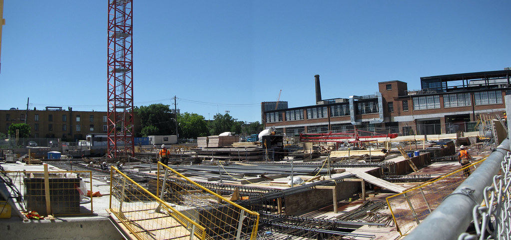
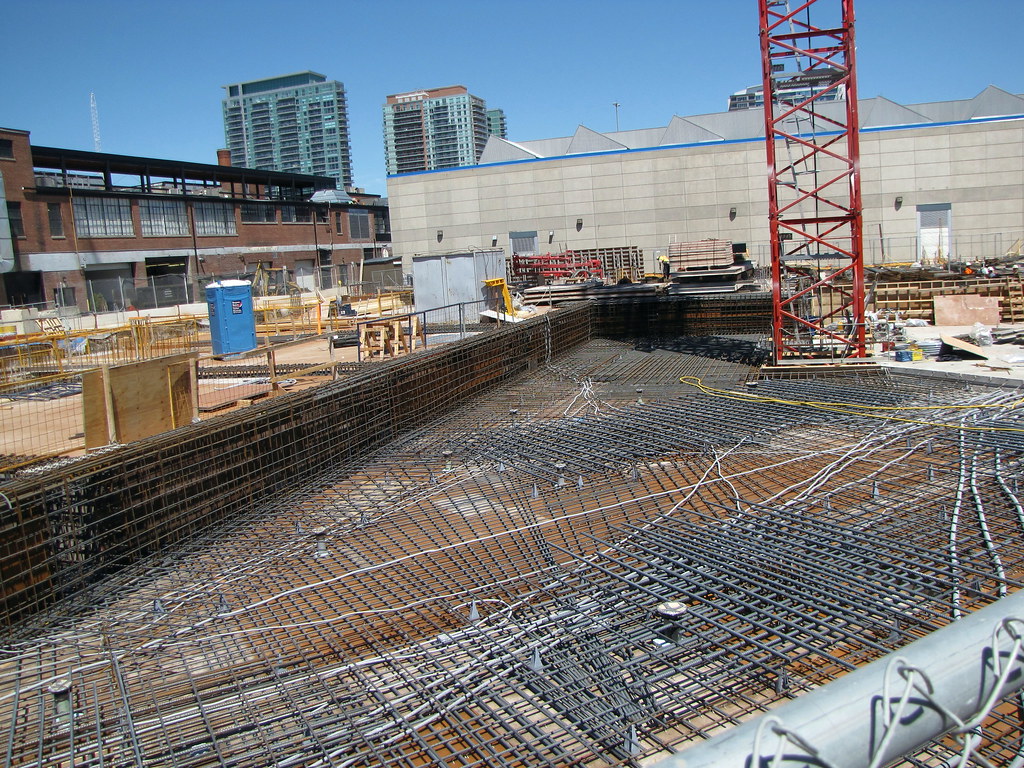
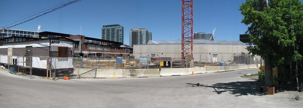
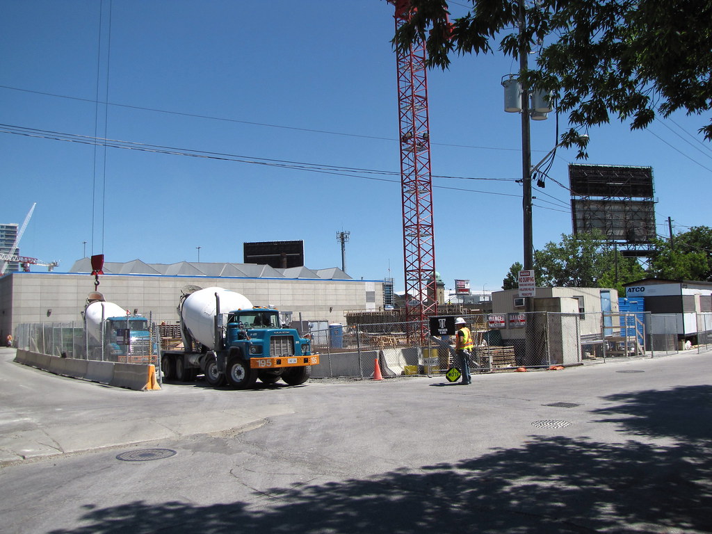
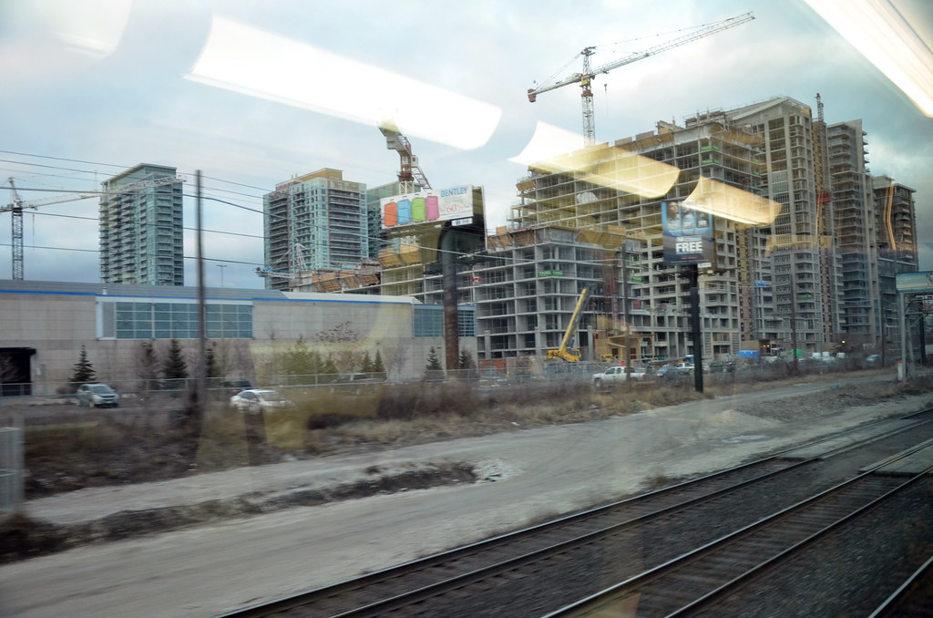
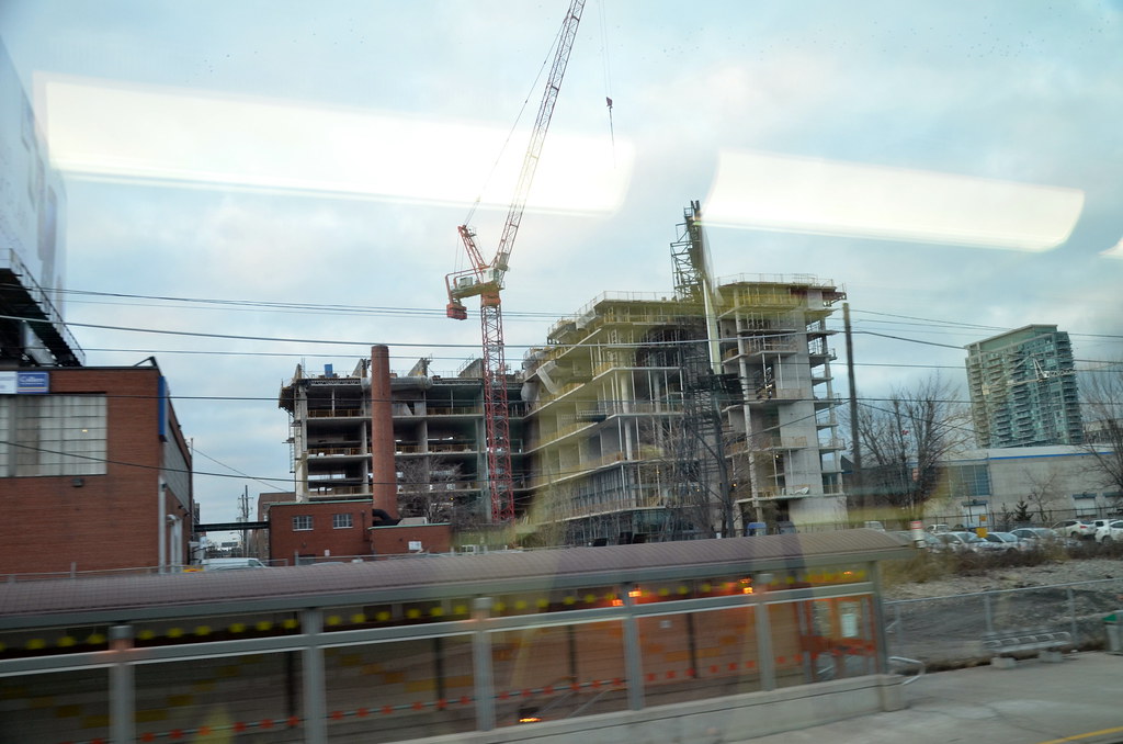
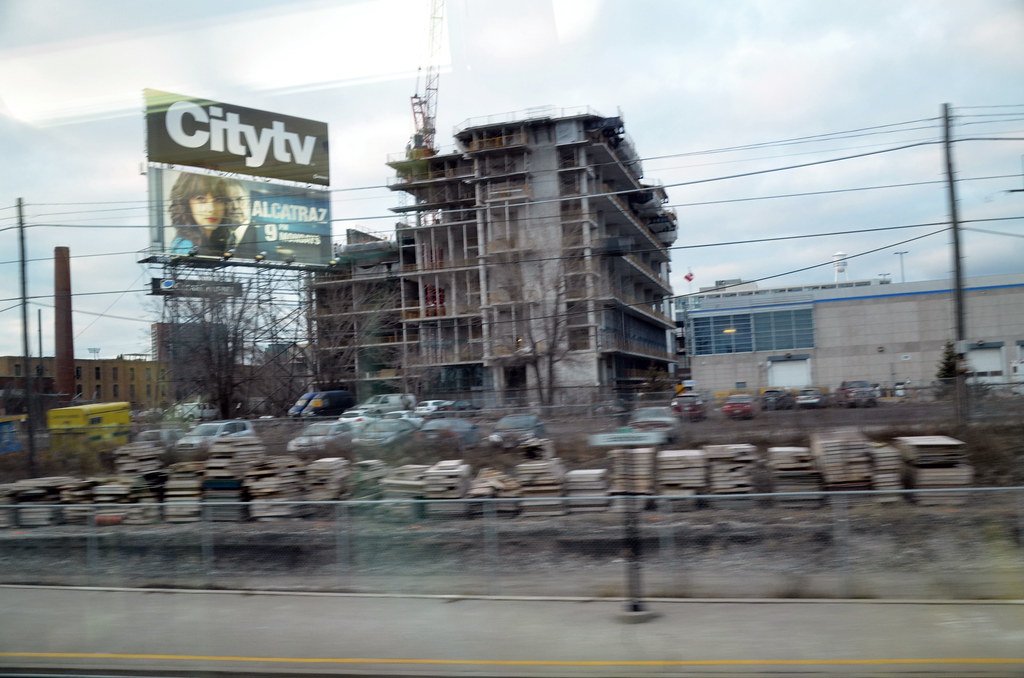
The obsession with grey never seems to end in this city but this building is uber grey. It's in Liberty Village, so why not keep it all red brick? It's the red, historic buildings that make Liberty Village attractive. The new condos on the east side just bring the whole neighbourhood down. The sad part is, it could have been a unique and beautiful part of Toronto. Developers are turning it into just another dull, grey, ordinary neighbourhood. Thank god the historic factories are staying or else the developers would put up grey, spandrel monstrosities and walk away smiling. The whole east side of Liberty Village is a complete write-off.
At least Wallman chose red brick for the contrasting box in the facade that gives the building some visual identity. It's too bad that the building seems to have been cheapened with the external grid in the earlier renderings simplified significantly. Yet even Wallman's cheapened design looks above average. The screen which crowns the roof, for instance, is a nice touch.
I totally agree about Liberty Village being a lost opportunity beyond the converted factories. It's puzzling how much crud was put up. In terms of brick, I think the current group of architects is so focused on Modernism that red brick is shunned as traditional. Black brick allows for contrast with the traditional yet also allows for a historical connection in materials to be made. It's overplayed though. Red is a superb colour of brick. It won't compromise Modern design to use red brick.
Last edited:
