The gates are an unexpected design flourish, and refer to gates/ wrought iron work that often were part of traditional Toronto buildings built before modernism took root. (Take a walk just around the corner, you will see examples) They are at once traditionally detailed, yet also finished with graphic tracery cut by a cnc router, so bring them back to today so to speak, without being unduly historicist. The unusual juxtaposition draws attention to the residential entry. I like them.

A far more eloquent way of describing what I think: they shouldn't work, but they do.

And the way that they stand out definitely brings some drama and glamour to the entrance. Highly original and well executed.
 
I like the gates, I just wish they were painted differently, with the decorative flourish, a contrasting colour, to the main gate. (maybe black & gold)
 
I like the gates, I just wish they were painted differently, with the decorative flourish, a contrasting colour, to the main gate. (maybe black & gold)

Just passed by not too long ago.. the gates are in the process of being painted black.
 
the gates are bizzare, they look totally foreign in the context of the building.
Painting it black will make them less noticable, but it will make it look too traditional like any typical wrought iron railings and fences.
The gates should be contemporary in design and maybe play off the strips of coloured glass of the facade.


some of the best executed renos in Europe (especially UK) are the retrofits of older Victorians that retain their exterior and interior features like baseboards, moldings, etc (removed/reinstalled) while completely gutting the inside for a thoroughly modern makeover.

there's nothing wrong mixing old and new if done right !


http://www.realhomesmagazine.co.uk/home-improvements/renovated-victorian-terraced-home

http://archinspire.com/search/victorian+house+modern+renovation+ideas

http://www.archithings.com/classic-two-storey-hawthorn-brick-victorian-house/2010/02/10
 
This facade is a royal mess. One of the chief problems, is that the very large pillars and the scale of the rest of the facade overpower almost everything, such that delicate items like wrought iron gates, end up being suffocated. (the lack of unity between the various elements - wood, concrete, glass, cheap aluminum window framing, wrought iron, polished stone - does not help)
 
I don't mind the juxtoposition of modern and traditional, but these gates seem like a silly afterthought.
I actually like the flat gray colour of the primer layer as it gives it a more contemporary touch (matching the gray of the concrete and window frames), but painting it black would make it look too traditional and out of place. The swirlly, damask-like motif and ornamentation is a little heavy handed and already overused and quickly becoming dated -- I would like to take those off, or at least the giant pieces on the gate doors themselves.
 
I generally love how ornate Victorian details play off clean contemporary design. Painting the gates black extends the context of alley gates on King street west of Spadina. I'd really love it if future developers incorporated black iron gates as well.

But I agree with alkay that this lone detail is being overwhelmed by overwrought contemporary elements on the facade. It might help if they incorporated similar details into street planters, or something. This would also relate to King west of Spadina.
 
Nice looking gates, but the entrance just looks confusing to me. Like there are too many different materials and styles. I'm hoping those pillars aren't a finished product. I really like this building overall, but there are some things that make me scratch my head (ie: the mechanical, unpainted balcony undersides and the entrance)

Those balcony undersides are just a continuation of the ceilings in the units. The Ceilings are all unpainted concrete so I suppose they figured if its good enough for the interior, than it must be fine for the exterior. The ceilings in these units are REALLY high though. Makes a small studio unit feel much bigger.
 
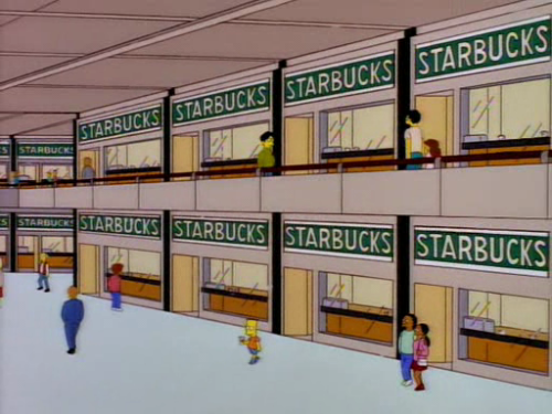
And a third one west of here at Spadina and Brant.

And there's a Timothy's across the street from M5V, which should be indistinguishable for anyone content with the swill served at Starbucks.
 
And a third one west of here at Spadina and Brant.

And there's a Timothy's across the street from M5V, which should be indistinguishable for anyone content with the swill served at Starbucks.

You mean King and Brant, south side of King.

tumblr_lh3i4m9D1b1qdoghio1_500.png
 

Back
Top