dt_toronto_geek
Superstar
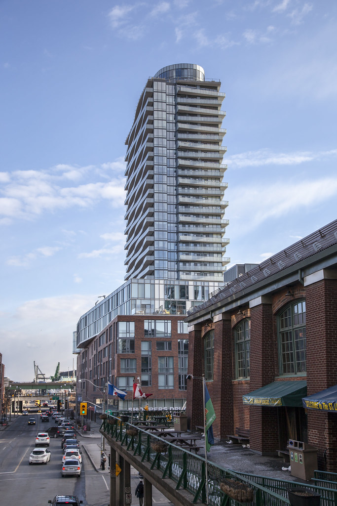
As nicely integrated as the podium is to its surroundings, the glass slab squatting on top looks way out of context in this location. Wrong material and proportions, imo--red brick and setbacks would have been much more appropriate and respectful of its neighbours. Just my 5 cents.
A fair comment but I don't think the tower portion is disrespectful. A mix of brick and glass works well, and this building is a stunner.


