Benito
Senior Member
Today.


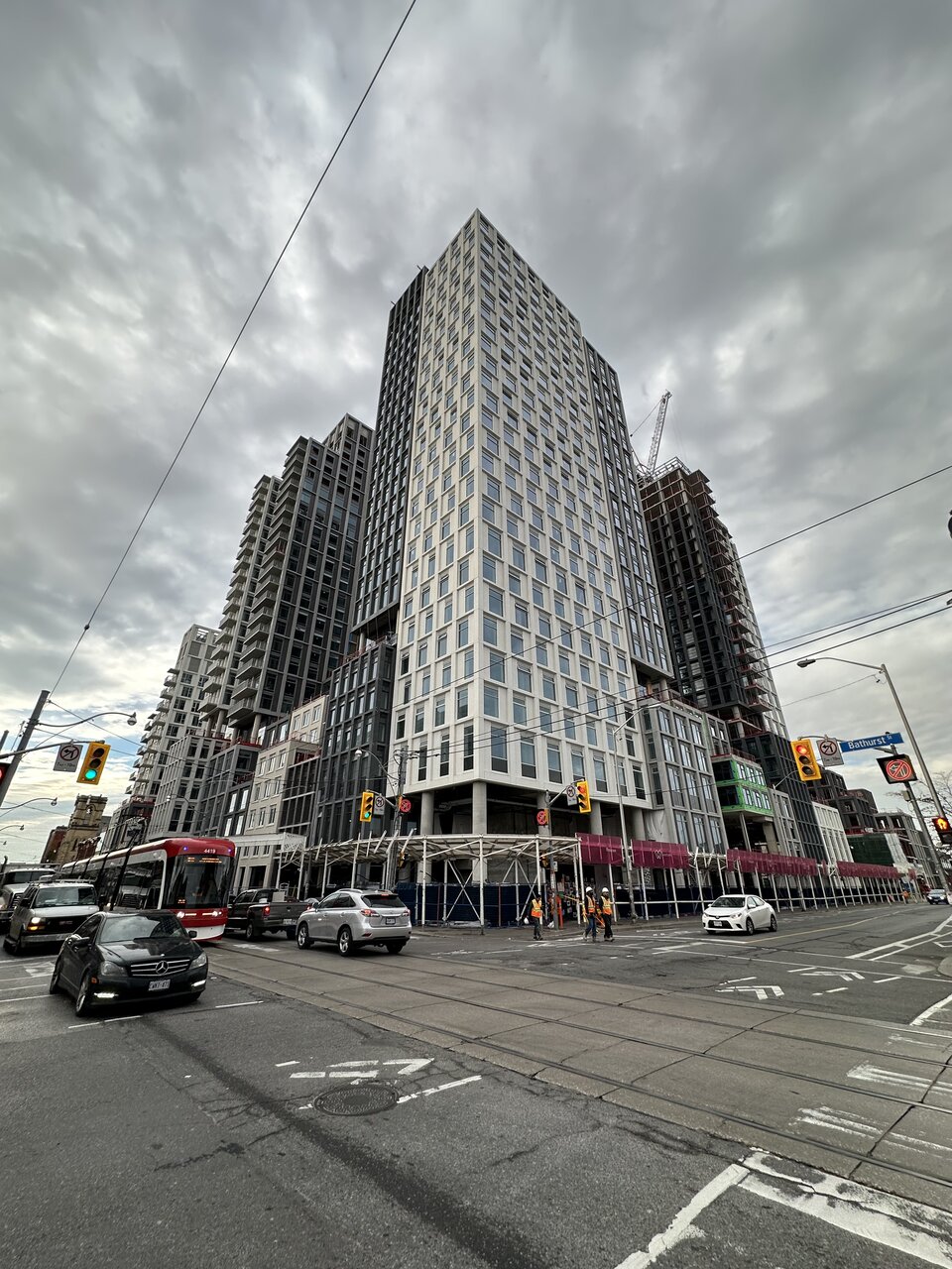
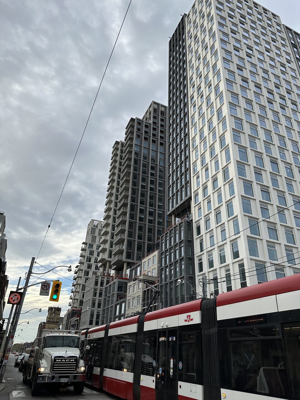
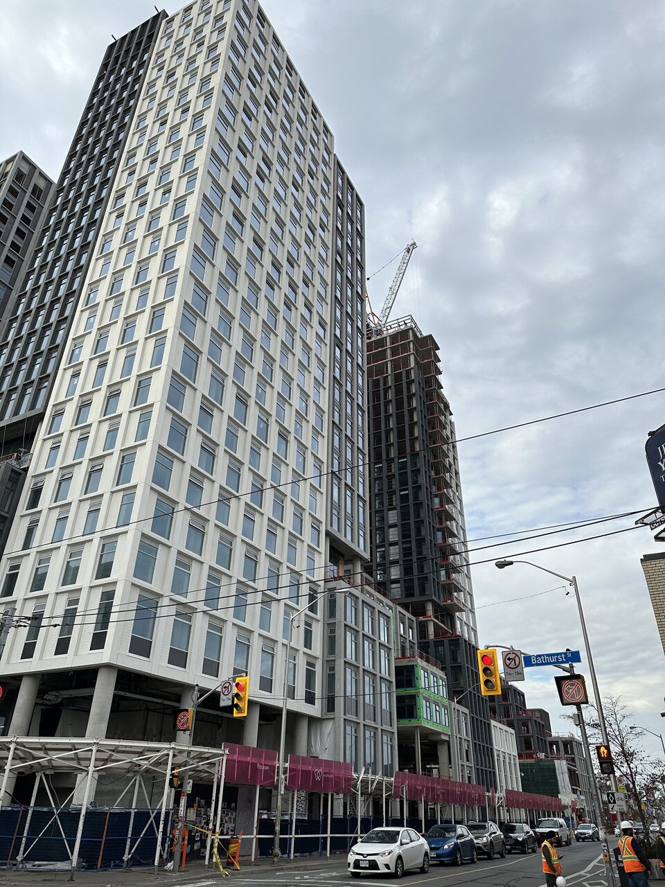
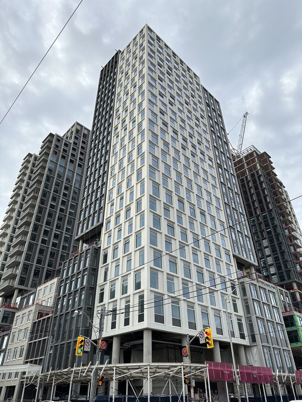
I agree. Very bland. Some red, some black some brown would’ve added to the texture of the project.If only there were also red brick portions instead of so much grey and white
That building in the foreground on Edmund Avenue with the Tudor applications is a goofy gem.
Now for the remaining pics from November 6th, 2022: (focus, Markham Street/south elevation); for the balance of the site, see above)
View attachment 437739
There is a lot to like about this project but good lord are the materials so drab. On a sunny day it looks fine, but when it's overcast or dark it looks so drab. The retail signage / landscaping / lighting is going to have to do a lot of heavy lifting to make this space inviting during the colder season.
That building in the foreground on Edmund Avenue with the Tudor applications is a goofy gem.
42