Parkdalian
Senior Member
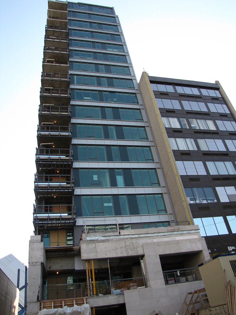
I want to punch this building in its very ugly face.
I want to punch this building in its very ugly face.
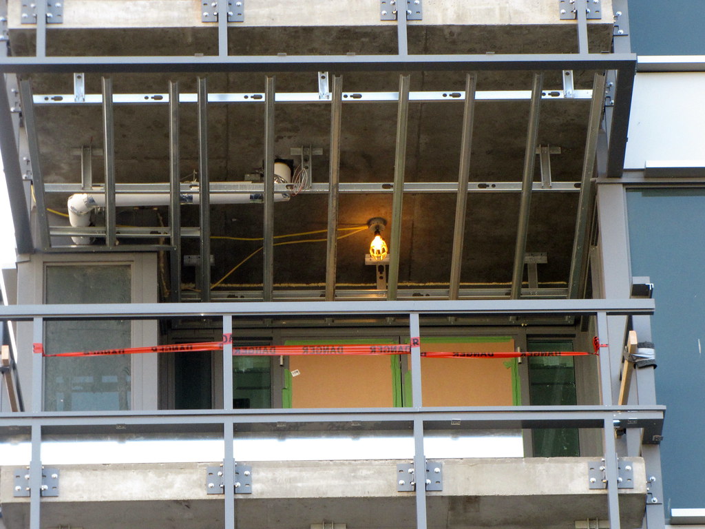
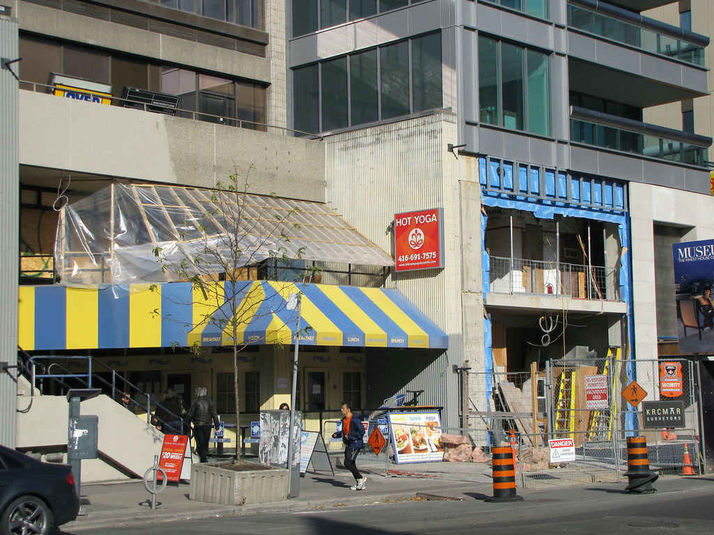
This projects just looks so wrong in so many ways (spandrels, colour, massing, west blank wall).... One Bedford in contrast in way better looking
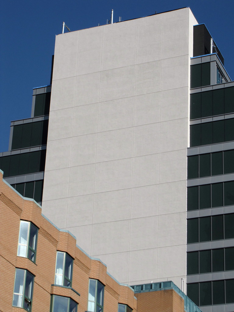
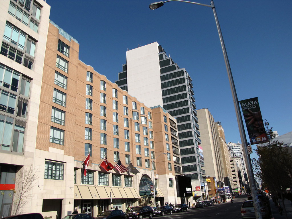
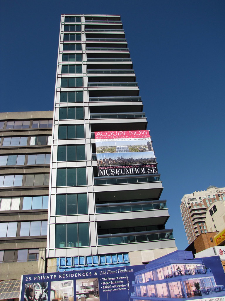
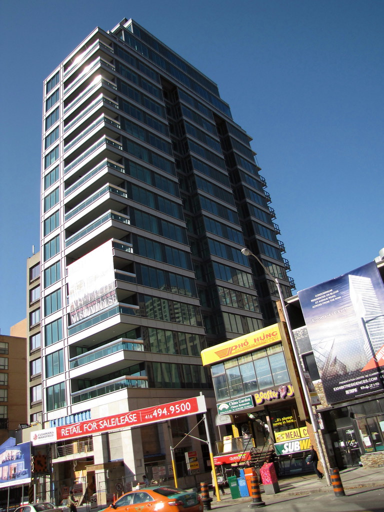
Yeah, that huge white block is really unfortunate...
Yeah, that huge white block is really unfortunate...
oh man... and i thought the beige undercoat was bad!... the white won't look so bad once it's dirty and stained. (aka. fcp's old marble)
I personally think they're waiting for something to go up on that small office block directly west of Museumhouse, hence the lack of attention given to that space.
then will have to narrow to not block the windows on Museumhouse.