Rascacielo
Senior Member
Today
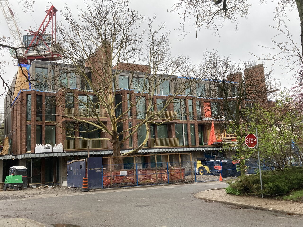
West block

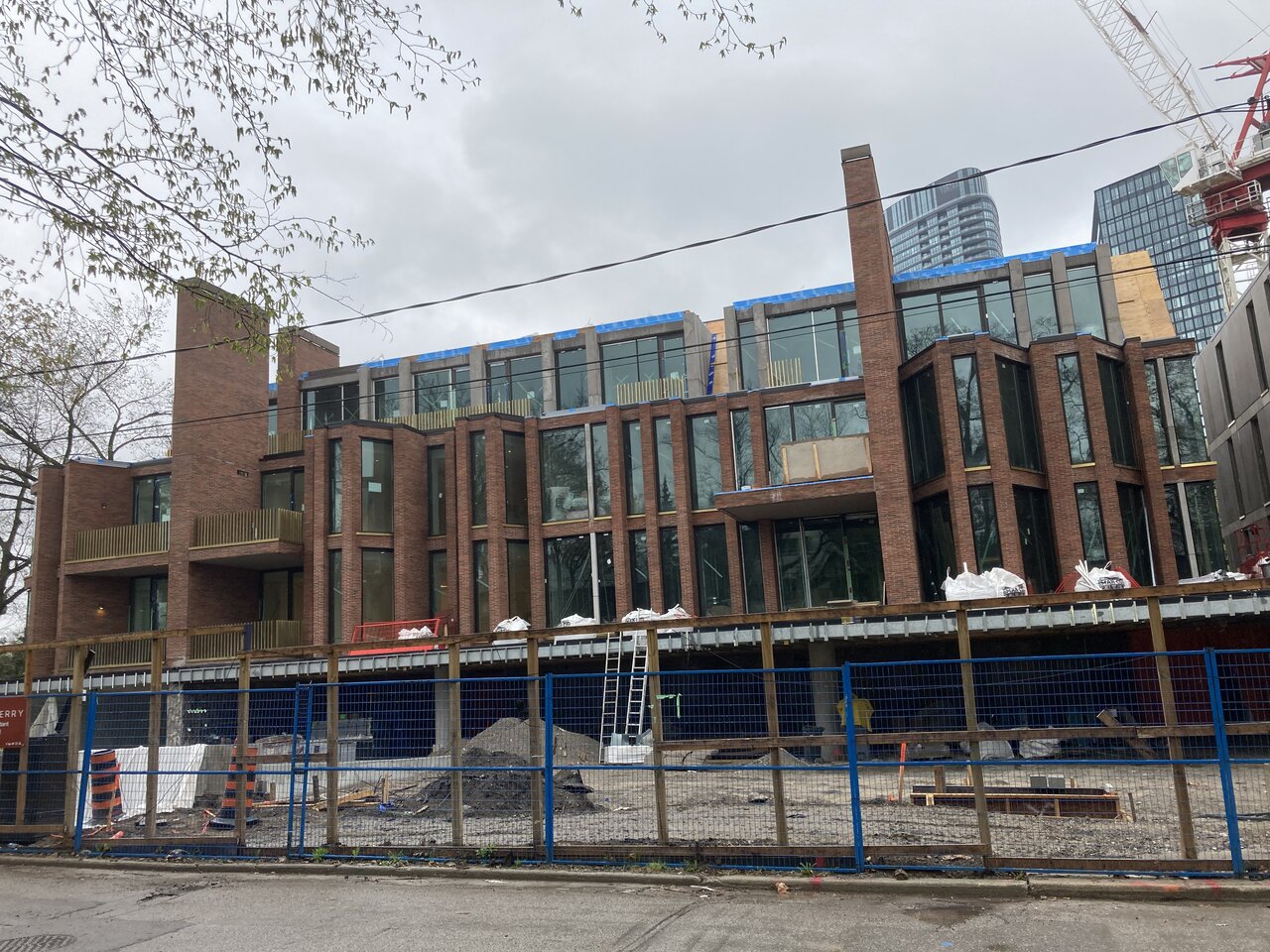
East block

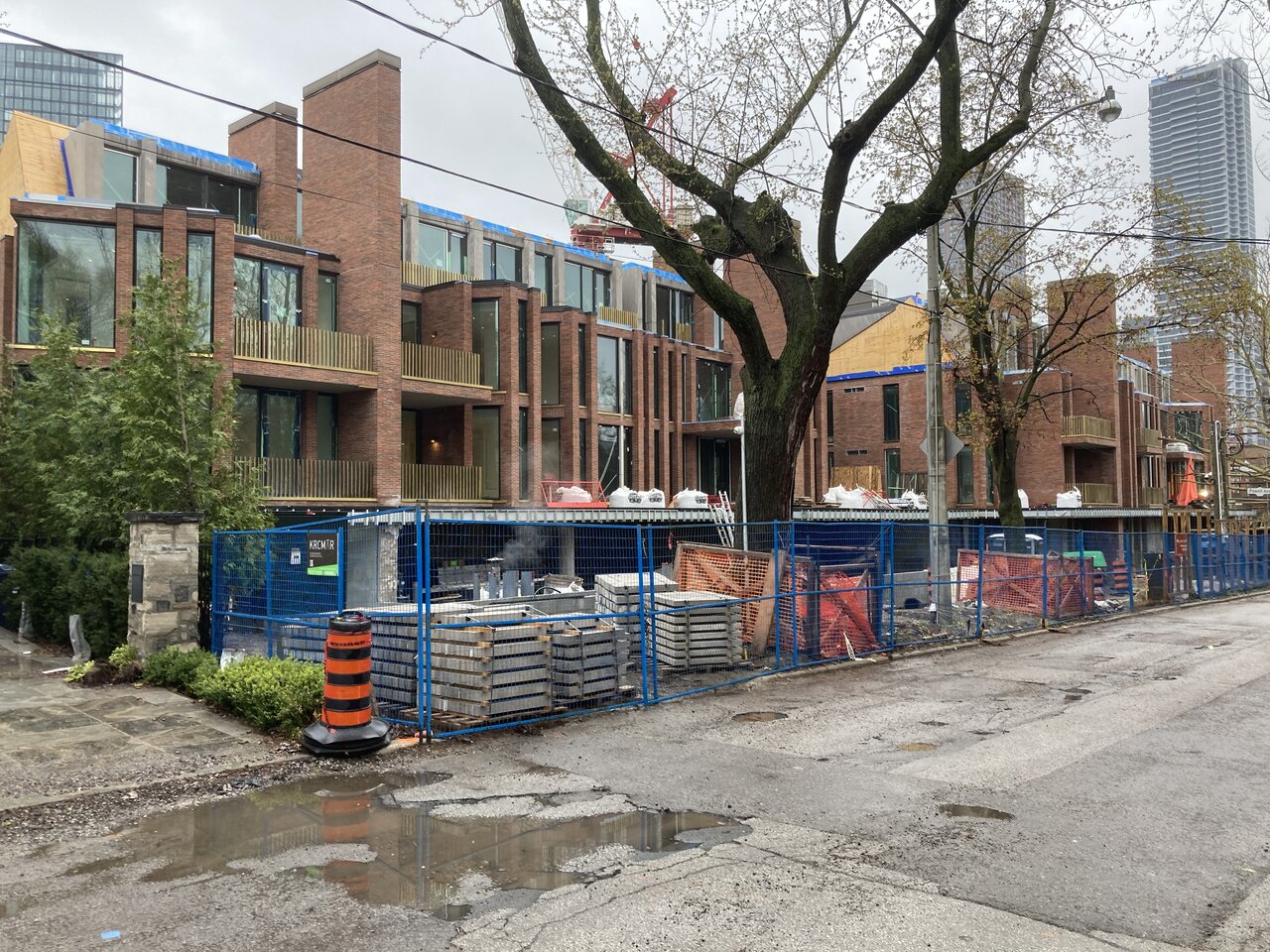
And together (looking west)

West block
East block
And together (looking west)
It’s such a nice project but they did mess up with the gold here. If they wanted a metal finish they could’ve gone with champagne or copper but not gold. Even the shade of gold is too yellowish which makes it look cheap.Today. Now that the facade is ‘cleaner’, the gold trims seem a bit much?
View attachment 484489
View attachment 484488
View attachment 484490
View attachment 484491
View attachment 484492
I don’t mind heavy articulation, but I think there may just be too many elements in the design, I.e. the pitched roofs that have little integration into the rest of the design.I find the whole façade kind of... busy? Too many columns and articulations. Even those "Bay" windows, which I'd normally be in love with, seem a bit heavy? Still think it's a great project with lovely details.
Said the same thing. If there was one thing I don't like it's the gold.Gold tinge is definitely gauche. So close to being perfect.
Yeah...busy is not always a bad thing. But I agree that quaint tiled roof seems to gives it a bit too much of a McMansion flare for me. And was not really needed material wise, IMO.I don’t mind heavy articulation, but I think there may just be too many elements in the design, I.e. the pitched roofs that have little integration into the rest of the design.
Should have been black
It will hopefully patina over time, it's a bronze material from France but I can't recall the specific name. IIRC, it's the same material from the canopy and fins at the Tom Patterson theater though it does look more yellow-y in these photos. I think there is a treatment that gets applied.I'm going to disagree. The gold is unique, and while I would not want to see it repeated too frequently on other projects (as it could get old fast), I think in the present circumstance it sets the project apart.
Should've been black, and whatever the hell this is just...shouldn't have been:
View attachment 485357