Jasonzed
Senior Member
from today


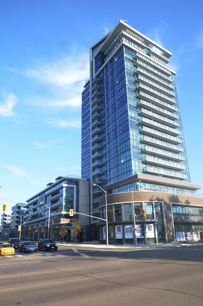
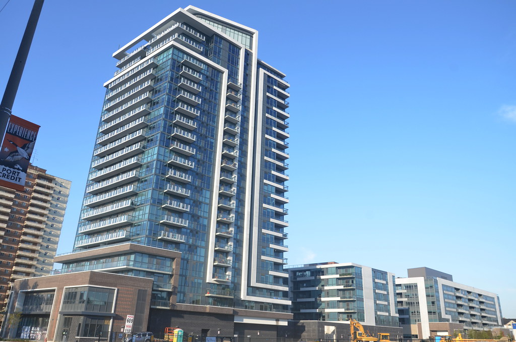
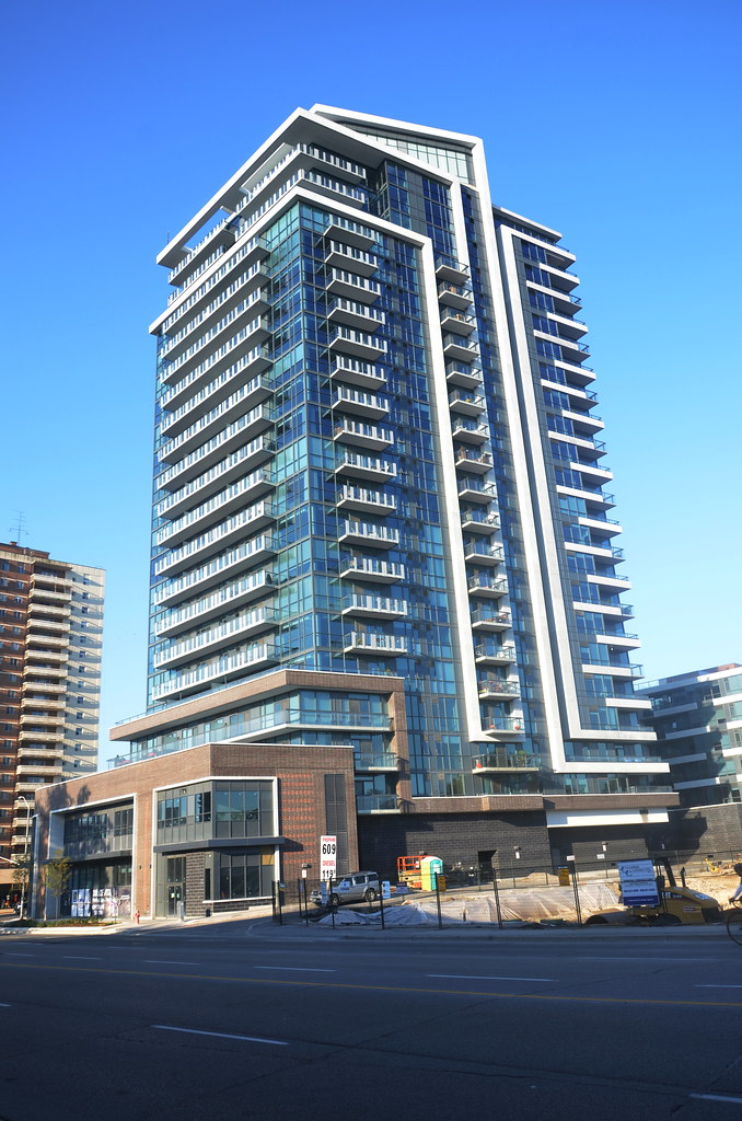
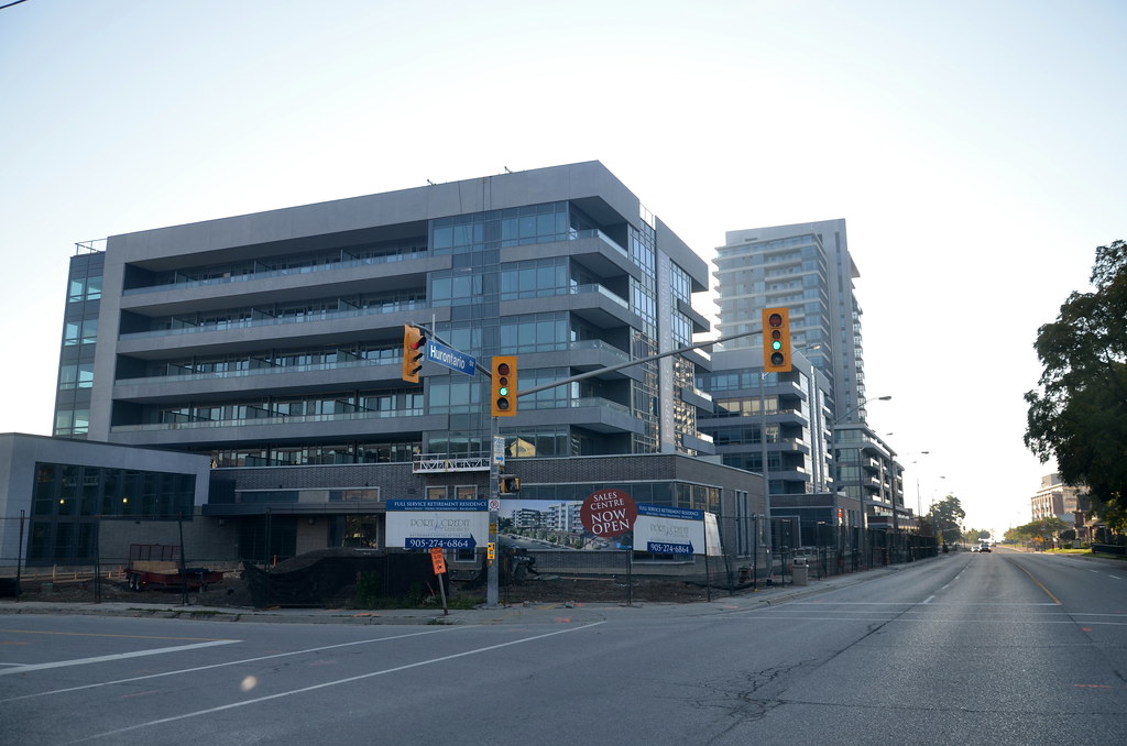
Totally agree. The original rendering, I recall, showed it as a two-level bookstore similar to the one at John & Richmond. That would have been cool too. Especially since that area doesn't have much in the way of bookstores. A bank, while useful, is pretty much the most deadening thing that could possibly go there.Too bad about the bank going in the curved part at the corner - that would have been an awesome space for a funky restaurant/lounge.