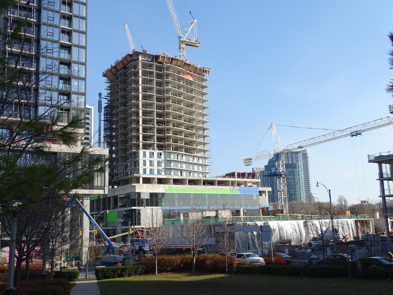
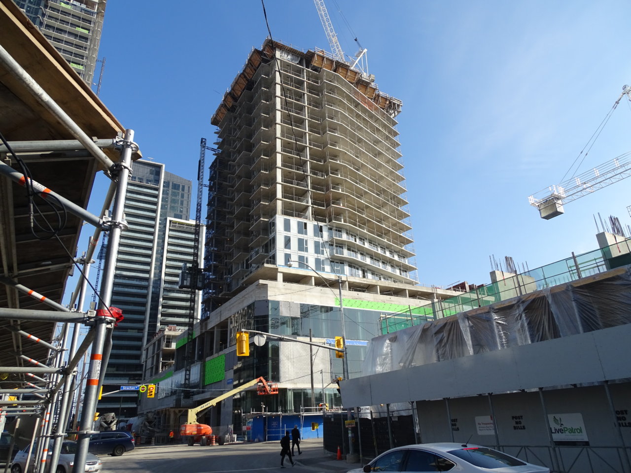
Pics from Nov 26, 2019

DSC05512.JPG


DSC05524.JPG


DSC05525.JPG


DSC05528.JPG


DSC05529.JPG


DSC05539.JPG


DSC05540.JPG


DSC05542.JPG


DSC05556.JPG
 
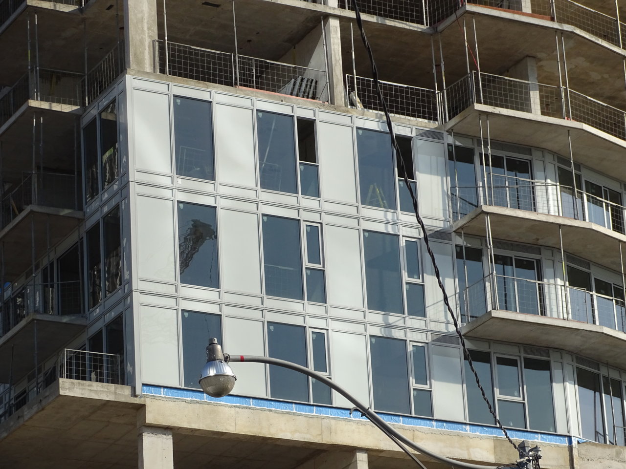
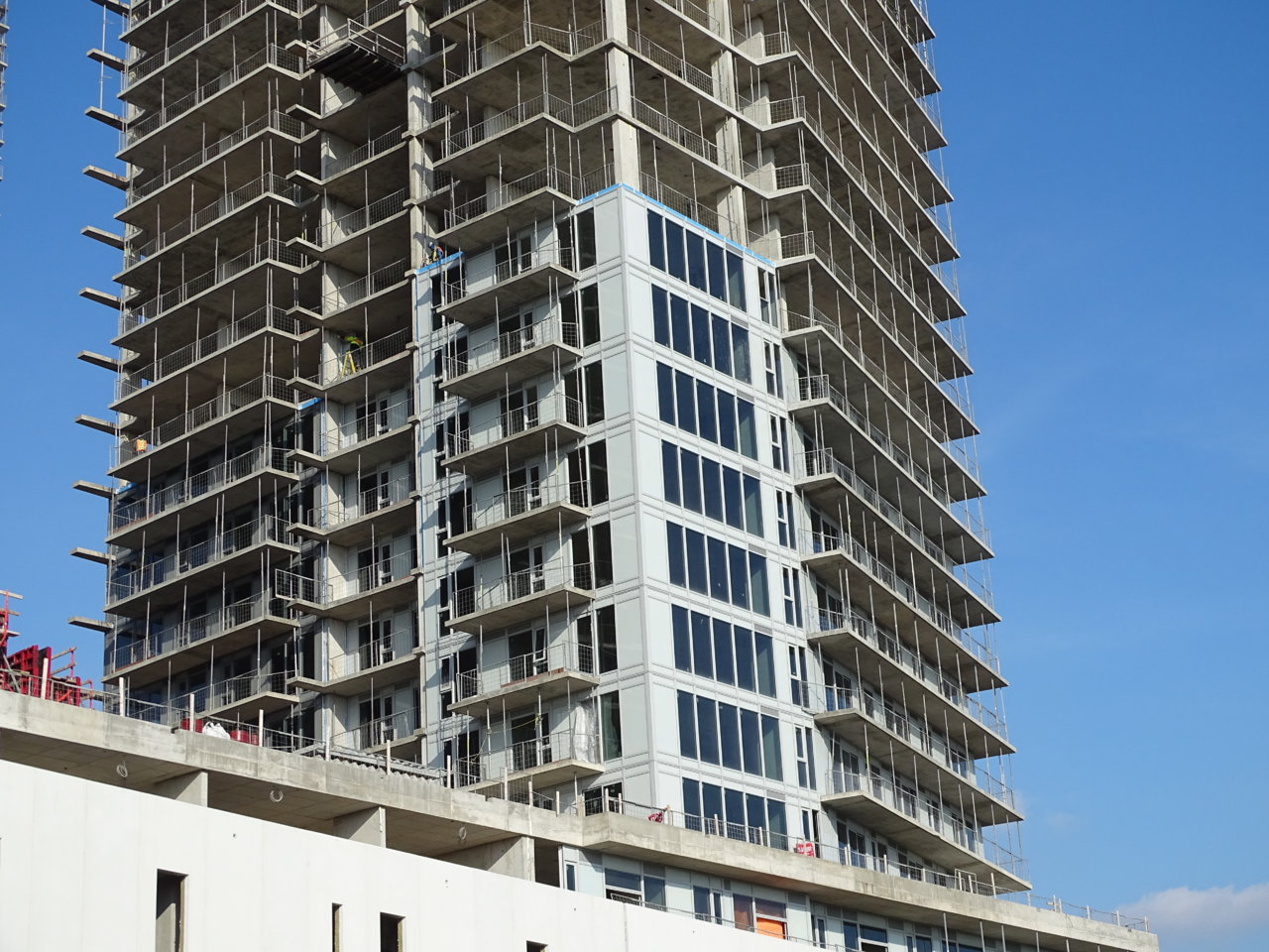
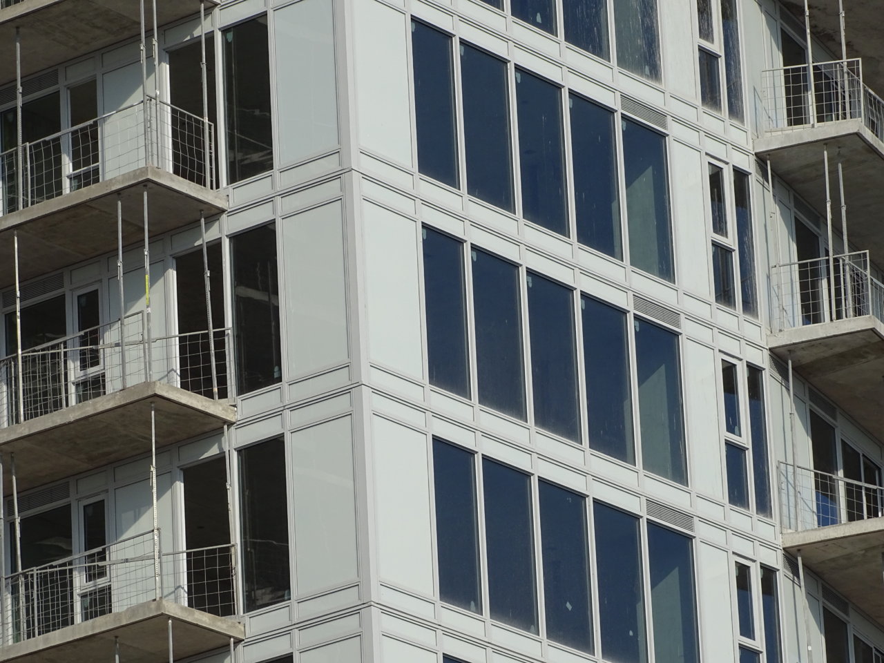
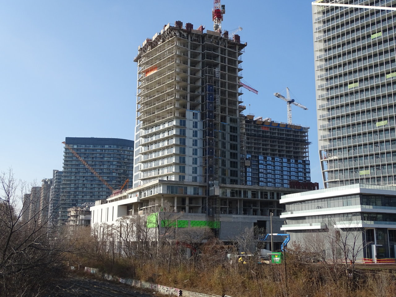
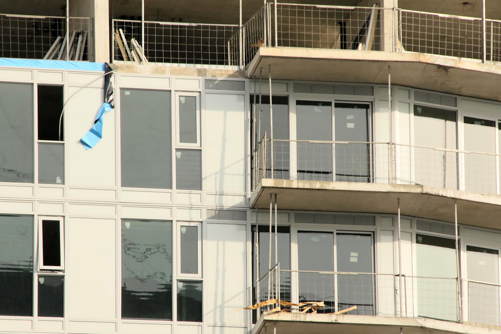
So the spandrel is a lacklustre "silky mud" (I think that colour is called that)…

BUT

there are no waist-height mullions!

Well played BentallGreenOak?!

42
 
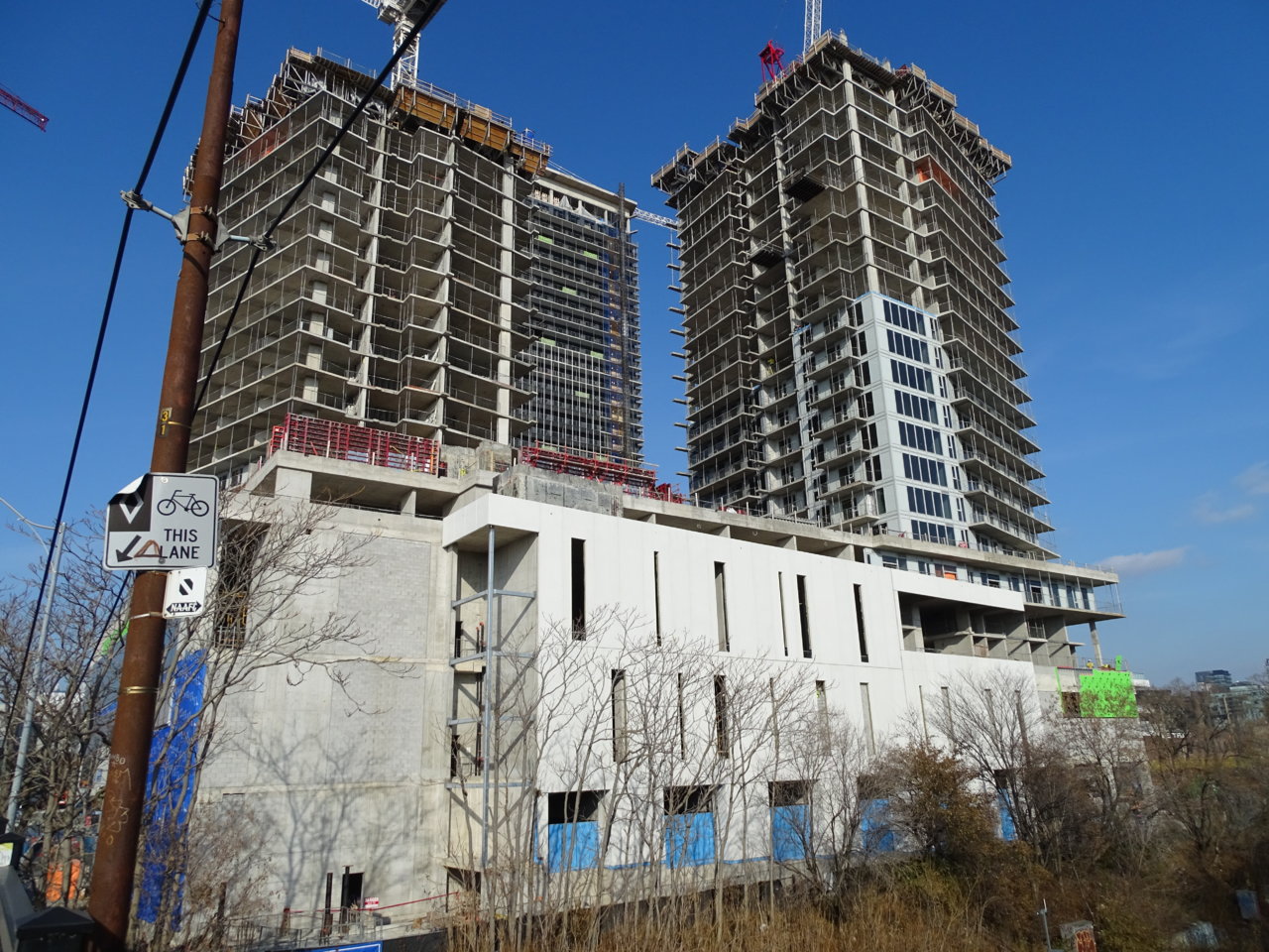
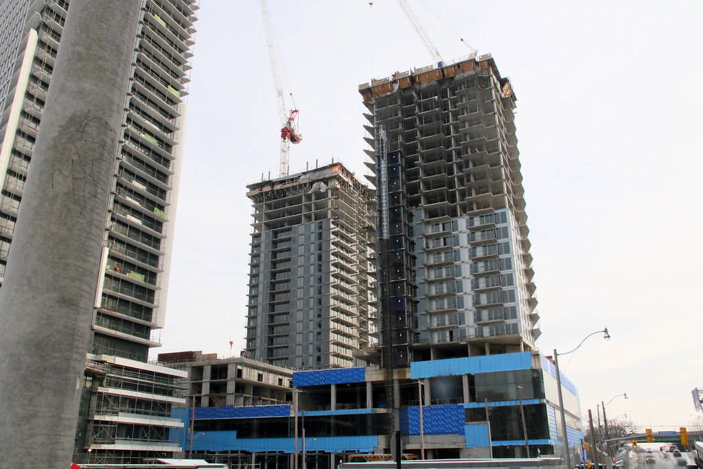
These two, much like playground won’t really come together until they start installing the railings and aluminum detailing. You can see the little bump outs in the slab edge where the trim will go.
 
Nothing says "budget build" like that light grey colour of spandrel. It's too bad those rental buildings got the shaft, the original HP plans were very nice.
 
Nothing says "budget build" like that light grey colour of spandrel. It's too bad those rental buildings got the shaft, the original HP plans were very nice.
They are rentals. Quality and variety can be found by renting the right unit in an actual condo from the owner.

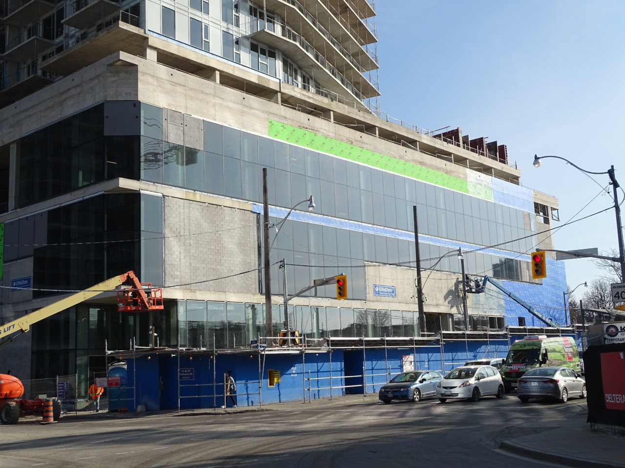
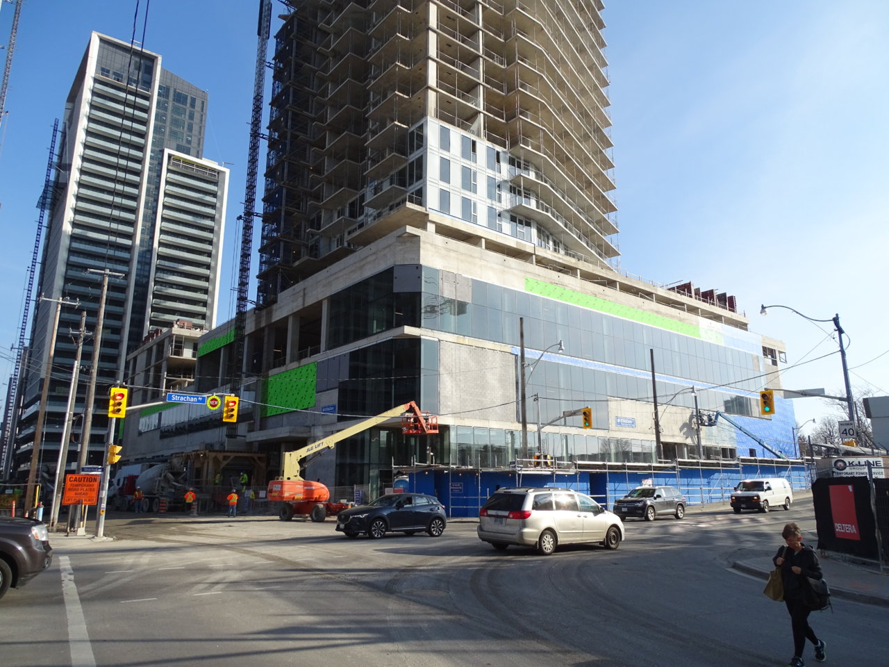
The podium (retail) area looks nice and polished. Well played.
 
I'd give this between a B-minus to B effort so far. The mullion treatment is a bit gentler than Concord's LakeFront/LakeShore. The spandrel colour is also more white than some of the mint toothpaste material floating around on other projects. Perhaps stronger contrast interplay with black would've enhanced it, although the current alignment with the dark windows does a modest and somewhat adequate attempt at it.
 

Back
Top