Great shot Darwin, I'm a fan and look forward to completion. As for the lights at Varsity Stadium, people troubled by them will just have to buy something called blackout blinds. Simple enough. That's life in the city.
I was by here today and there was an unusual minor variance sign posted for a heightened barrier or fence around a hot tub and a trellis on one of the terraces. I didn't have my camera on me otherwise I would have grabbed a snap.
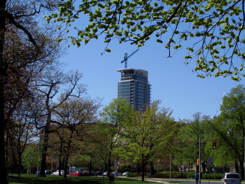
I love this firm's work, I like the form of the base and how it meets the street and I am very very comfortable with the idea of a modern point tower in this location. I am just not in love with this building though. The detailing (or lack thereof), the materials and the colours are all quite, well, blah. I do not mind polite but does it have to be so boring. Give me some details or colour or something of interest to focus on and take delight in.
personally, i am a bit surprised at how slightly shipshod the details on this building are when viewed up close--given how high-end it is pricewise. I guess i have a particular bugaboo about this but...what is it with these window walls being made up of such bitty and pokey pieces of metal? There always seems to something slightly ‘off’ about them, because the various small elements often don't line up perfectly, leaving everything looking a bit crooked or wonky…
Also, there seem to be unresolved issues with this kind of construction when it comes to the glue or putty or whatever it is that seals the edges. It gets all over the metal and is often just left smeared on the surface.
BUT still--there is no question these little metal panels are very cheap looking, and the degree of sloppiness is still surprising in a building that is priced at the very high end. One just expects a better quality of finish, and it seems to be increasingly rare.
Some astute criticisms, deepend. I think everyone here would (or should) agree that the execution of this project and others like it is disquieting, to say the least. I hope that the Icon on Wellington is the worst you've found so far. If not, we'll be feeling the same way about all our new glass boxes in 5 years as we did about our concrete boxes in 20.
Not liking this tower that much at all. Looks kind of bulky and bland and to my eyes, a pale imitation of 18 Yorkville. Now that is a one sweet looking tower....