Amare
Senior Member
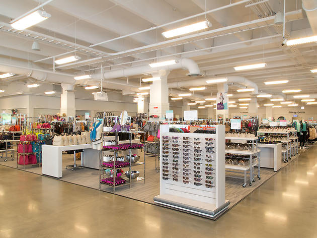
While Nordstrom's Rack stores can (and probably will) get away with it since it's an off-price model, they should revisit their little arrangement with MG2 (the design firm they're working with). The dark and dingy in-store model they've been putting in a few of their recent stores just like here at 1 BE isnt the best model. And on a side note, Winners and Nordstrom compete in the same off-price market (it's not necessarily more expensive than Winners).It's a Nordstrom Rack people.
It's Nordstrom's DISCOUNT store (it's a slightly more expensive WINNERS).
It's like people have never heard of it or visited one before.
You don't walk into a No Frills and expect Whole Foods - what did you expect?
https://mg2.com/work/nordstrom-rack/
Not all new Rack stores look this off-putting. Calgary's Rack store, and Chicago's Lincoln Park were executed better:

Calgary
by Phil Crozier
Chicago
by Brendon Brown
