If someone has a negative comment on my work, they are welcome to it.

Slapping a bit of glass to "finish" one building (Ritz) and sticking it along with a crayola Trump elevation, into someone else's photo (to the applause of a few) doesn't empower you to behave like an expert. You're a newbie and as you note above... a whiner.

I love wyliepoon's sketch-ups which offer a variety of terrific angles on the impact of new projects on the built form of our city... contributing much more than your few scribbles. You owe him an apology.
 
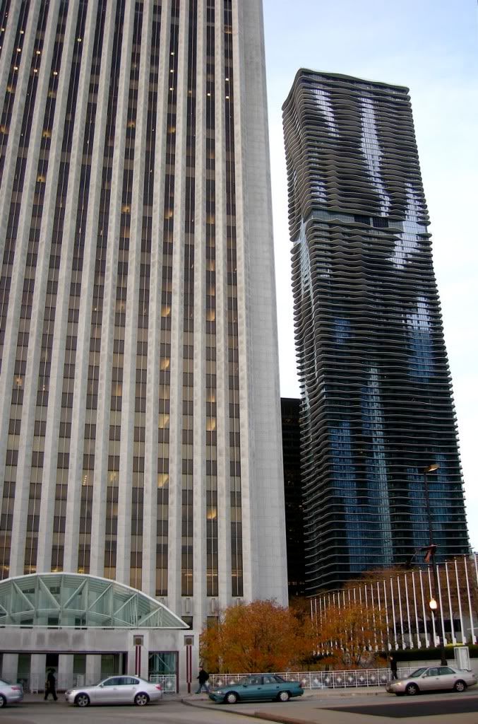
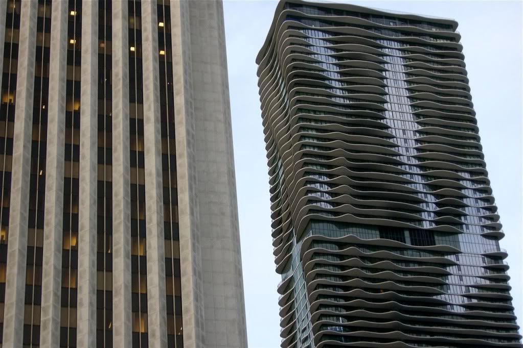
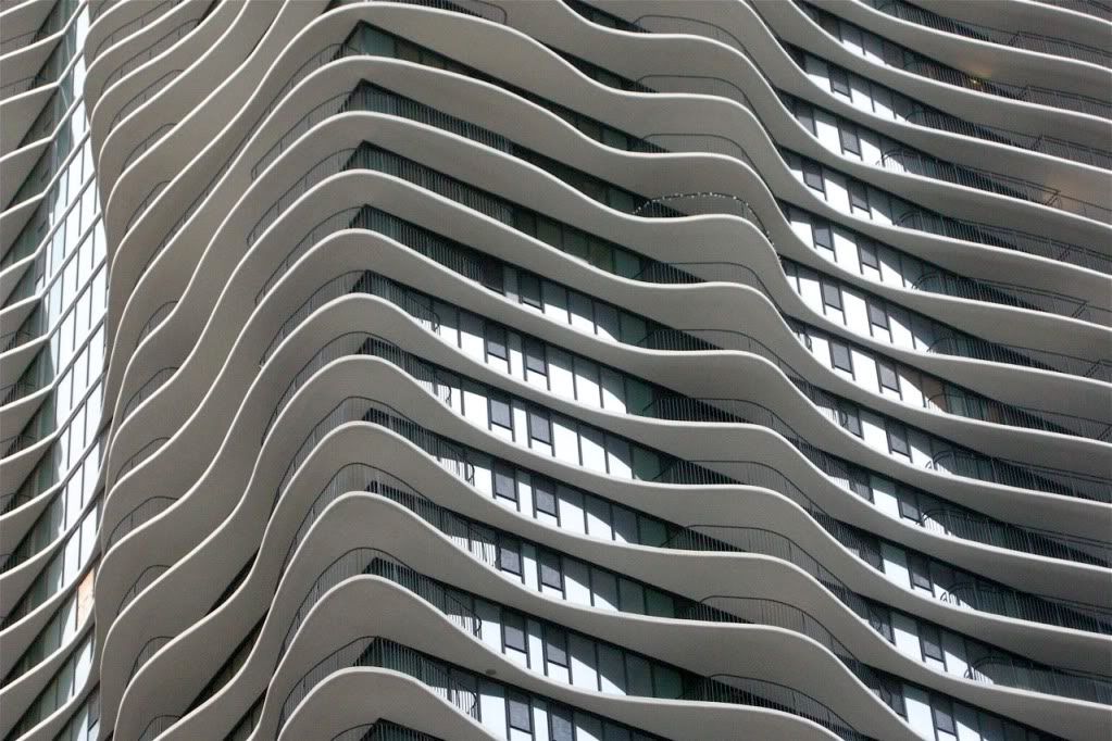
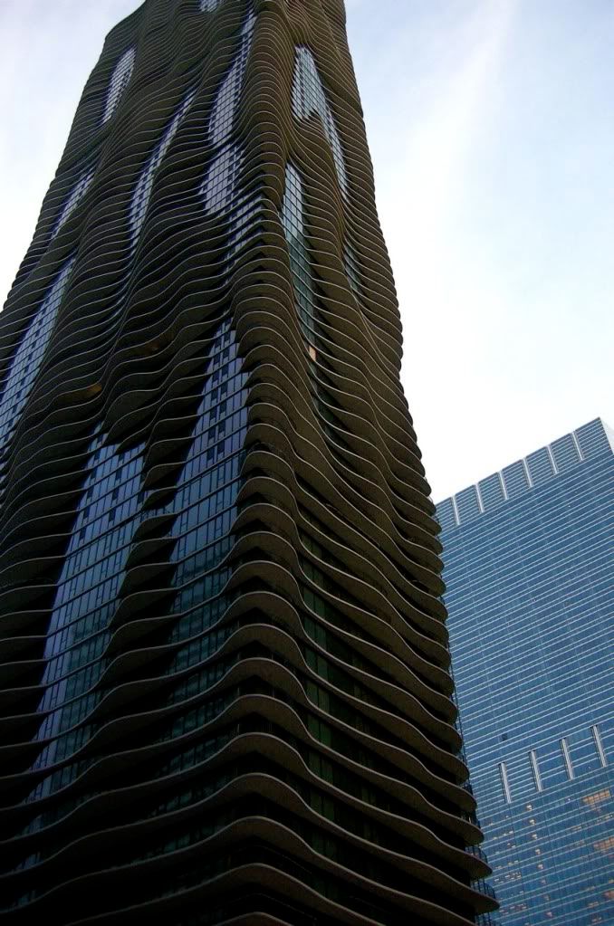
I'm quite surprised at how so many are saying this is so much like Aqua. I see how it can be reminisent, but it is nothing like Aqua... And I remember being spellbound by Aqua from all its angles.

And why do the curves have to be about waves?

4352012584_7cbf885928_o.jpg


Look at the difference. Other than balconies with curves, that's it.

DSCN5196.jpg


DSCN5197.jpg


DSCN5206.jpg


DSCN5210.jpg
 
So far, I feel a bit let down by the design. I think its a slight improvement over Bazis (vagina over penis) but comes across as more dated. It's comparable to Aqua but not in a good way.

I see two thing missing from our highrise boom's inventory. Something exceptional and a new tallest. The scaled down L Tower still has the potential to fulfill the former however, the conditions just seem to all line up on this site for something spectacular. Unfortunately, it just didn't happen.
 
Number One Bloor doesn't make my think of waves so much as topography - like a dry river bed.
 
I think rounded corners on the floorplate would be an aesthetic improvement. As to Aqua - I dislike it in the sense that it looks vaguely 'rotten' in a biological way.

AoD
 
I think rounded corners on the floorplate would be an aesthetic improvement. As to Aqua - I dislike it in the sense that it looks vaguely 'rotten' in a biological way.
AoD

AoD....I always wondered what bugged me about Aqua....I think you just hit the nail on the head.......

Anyways, I think we all need to wait to see a proper render before passing judgement on the new one bloor....we need to see the podium, and we need to see the entire building from different perspectives....fingers crossed....
 
I think rounded corners on the floorplate would be an aesthetic improvement. As to Aqua - I dislike it in the sense that it looks vaguely 'rotten' in a biological way.

haha this reminds me of something hilarious my brother said about Aqua.
He is not an architecture nut so when he saw the Aqua building he described it the only way he knew how. He said it looked like someone had diarrhea all over a building. I couldn't stop laughing.

Anyways, I think the 1 Bloor proposal looks more controlled and less random which is a good thing in my books but I still don't know if I completely like it or not at this point. I can't wait for more renderings!
 
haha this reminds me of something hilarious my brother said about Aqua.
He is not an architecture nut so when he saw the Aqua building he described it the only way he knew how. He said it looked like someone had diarrhea all over a building. I couldn't stop laughing.

For some reason, when it comes to the "diarrhea look" this came to mind

alg_gaga.jpg
 
There is a full page colour ad for this in today's print edition Star ('A' section) - same rendering....I think the ad copy said something like "This is your Fantasy"
 
I do tons of renderings as well and I don't use a computer program that does the renders for me, such as Sketch-up.... I do them by hand, often pixel by pixel. If someone has a negative comment on my work, they are welcome to it.

I am not the only forumer out there that has remarked negatively to his rudimentary drawings. You should read the remarks at SSP and SSC. The word rudimentary may seem like a slur to you, but it is accurate. Without true plans or other views, Wyliepoon has guessed from the one render we have and extrapolated his guess... so that equates to rudimentary.

That was really unnecessary, boy you sure know how to bring the mood in a thread down.
You do good work, so does wyliepoon. What you are both doing are totally different things, you are filling in details and dropping buildings into photographs very successfully while wyliepoon creates sketchup models from various perspectives to successfully give us an idea of how a building will fit into a given area offering up a handful of vantage points. Can we please show a little respect for someone else's work and play nice on UT?
 
The problem with this “design” is that the angle we are seeing now is making the glass balconies appear white. What happens from a distance when the glass balconies blend into the glass windows? – no design.

We will be back to exactly what we expected form a Canadian developer – a box – period.

And to think, there is very little obstructing height in this location – they could virtually build as high as they want – so while I guess this is as high as they want, the potential is horribly wasted. If there is a site in Canada that could handle extreme density, it has to be where our two main subways intersect.

This is my disappointment.
 
Last edited:

Back
Top