junctionist
Senior Member
The two areas have quite different personalities. So if you like one, you might not like the other.
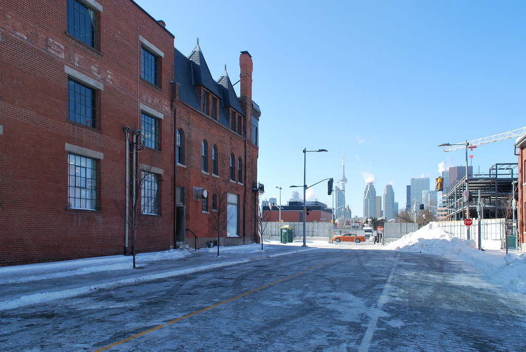
If you think the West Don Lands is grey you're going to love the new South Core area.
 Pan Am Athletes Village by Marcanadian, on Flickr
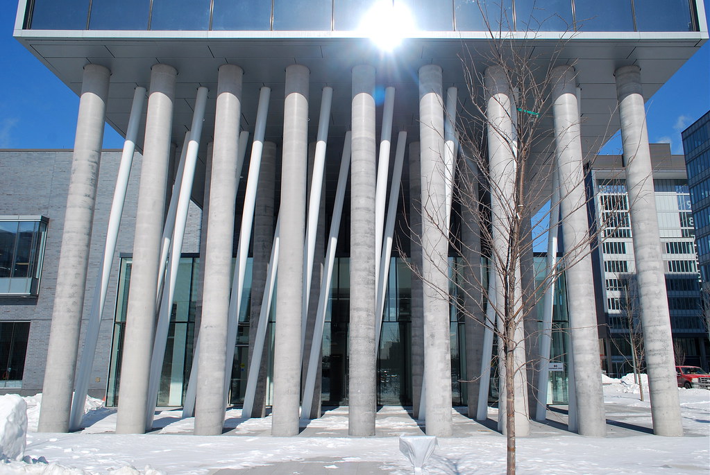 Pan Am Athletes Village by Marcanadian, on Flickr
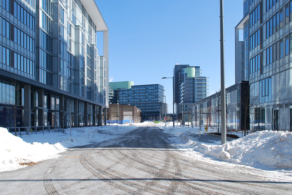 Pan Am Athletes Village by Marcanadian, on Flickr
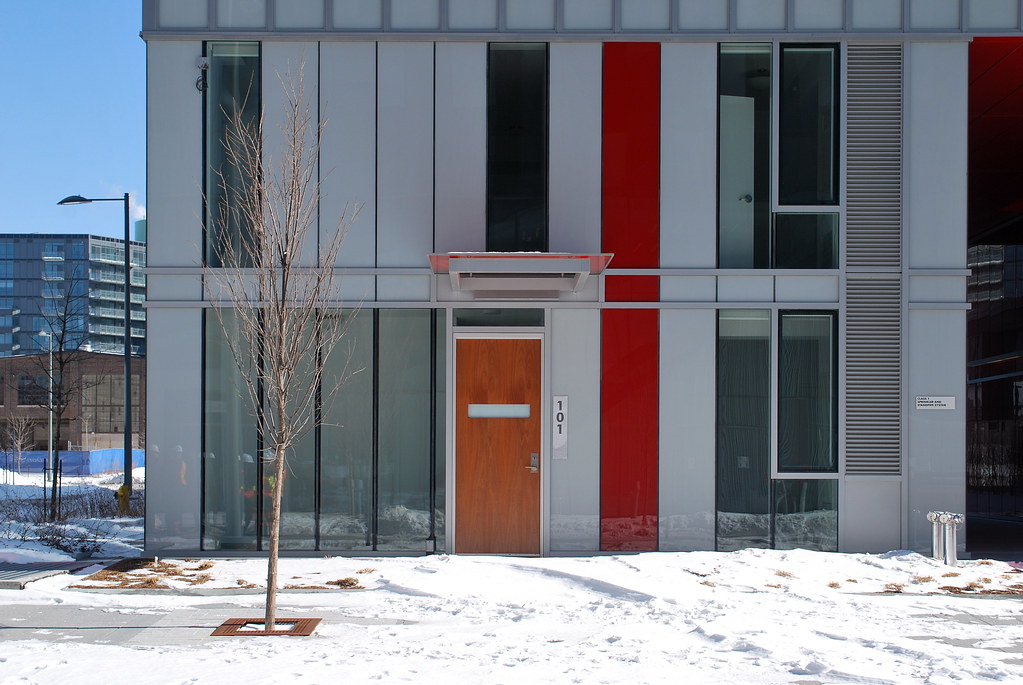 Pan Am Athletes Village by Marcanadian, on Flickr
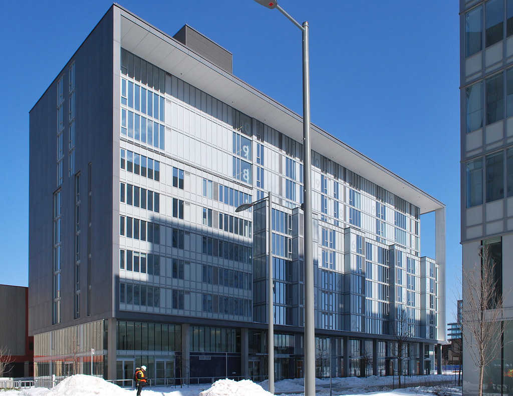 Pan Am Athletes Village by Marcanadian, on Flickr
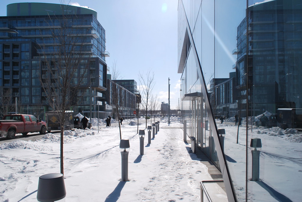 Pan Am Athletes Village by Marcanadian, on Flickr
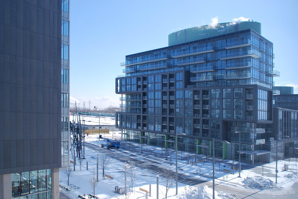 Pan Am Athletes Village by Marcanadian, on Flickr
 Pan Am Athletes Village by Marcanadian, on FlickrPan Am Athletes Village by Marcanadian, on Flickr
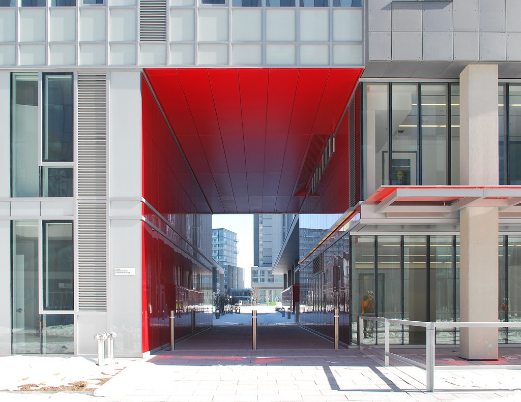 Pan Am Athletes Village by Marcanadian, on Flickr
 Pan Am Athletes Village by Marcanadian, on Flickr
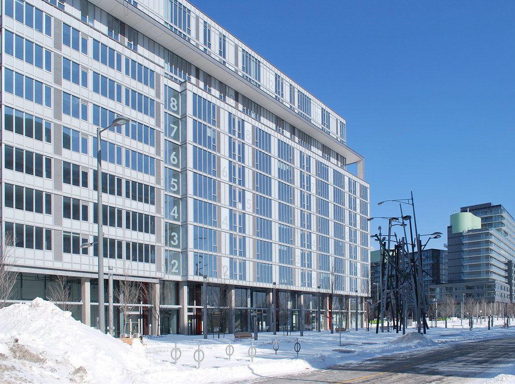 Pan Am Athletes Village by Marcanadian, on Flickr
My previous photos were taken on a gloomy day, which certainly didn't help the perception of the neighbourhood as colourless, but I went back on Friday when the sun was out:
If it is supposed to be reflective of "life in our City" about 50% will not be lit and a couple will be on 24/7. Sigh!Do all the various lights on the tornado-streetlight sculpture light up?
More color could have easily been added to this area to reduce the level of greyness. For example, in this photo, the grey rows of spandrel could have been red so that instead of just the base having elements of red (which look great), the building throughout would have elements of red. And the white with the red spandrels would look sharp!
Same thing with one of the other buildings that has green at its base and at the roof (mechanical?); if green (similar to what its at the base) was incorporated into the rest of the building, it would have made a big difference.
Such small details - had they been considered more thoroughly - would have been a big boost to the visual appeal of this area.
Thanks for the lovely photos, marcanadian!
How did you get access to the site?