emphurent
Active Member
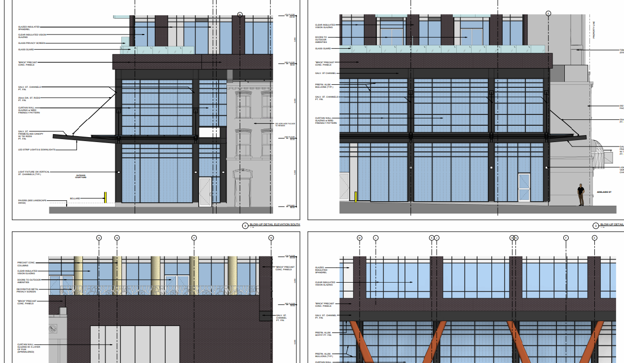
Another development, another project whose material documents are inaccurate or non-specific or dated as to make it harder to get an idea of what we will end up with. We really need more accountability on the materials going to be used (I understand it's a thing the province doesn't wanna put it's hands into, but this bait and switching also occurring within city documents where the most accurate information should come from is just frustrating), because this feels like a last minute decision to switch the brick colour leaving to a less than stellar quality of chosen brick panel.
There was a render somewhere that I can't find that showed a red podium which made me a little suspicious. But the only available documents to show materials for the past year have been the elevation drawings which are also extremely non-specific.
Even if you are someone who enjoys red brick, there are two problems you should also be able to agree with me on here:
1. Giving mixed signals about materials in city documents is frustrating and
2. From what we've seen, the panel quality is some of the worst I've seen in a while. They are so incredibly flat with no texture at all. Just all around disappointing they chose to go with a dated 2004 red brick over something more classy.
I was actually quite enjoying what BBB Architects had designed before the cheapening. It was simple but had a basic Quadrangle feel to it. Here's to hoping that mews still turn out nice and the materials look okay from a distance.