what a strange remark.
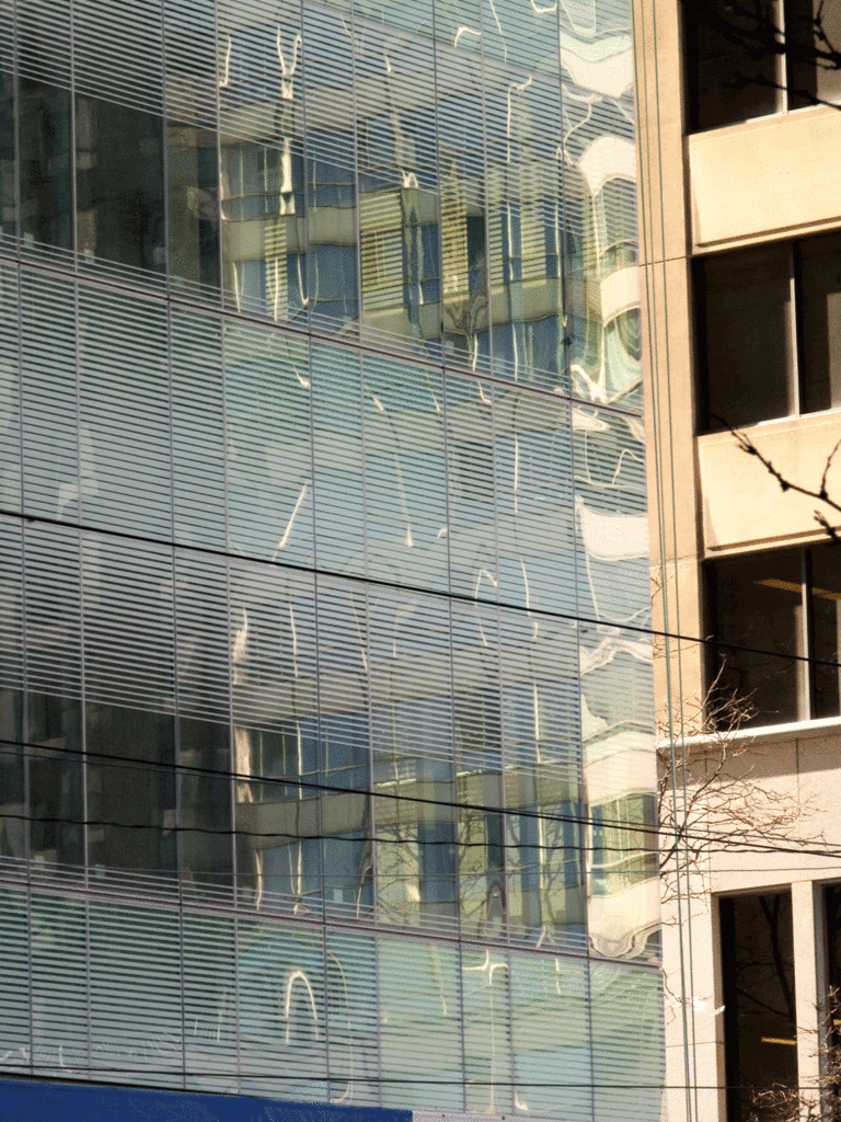
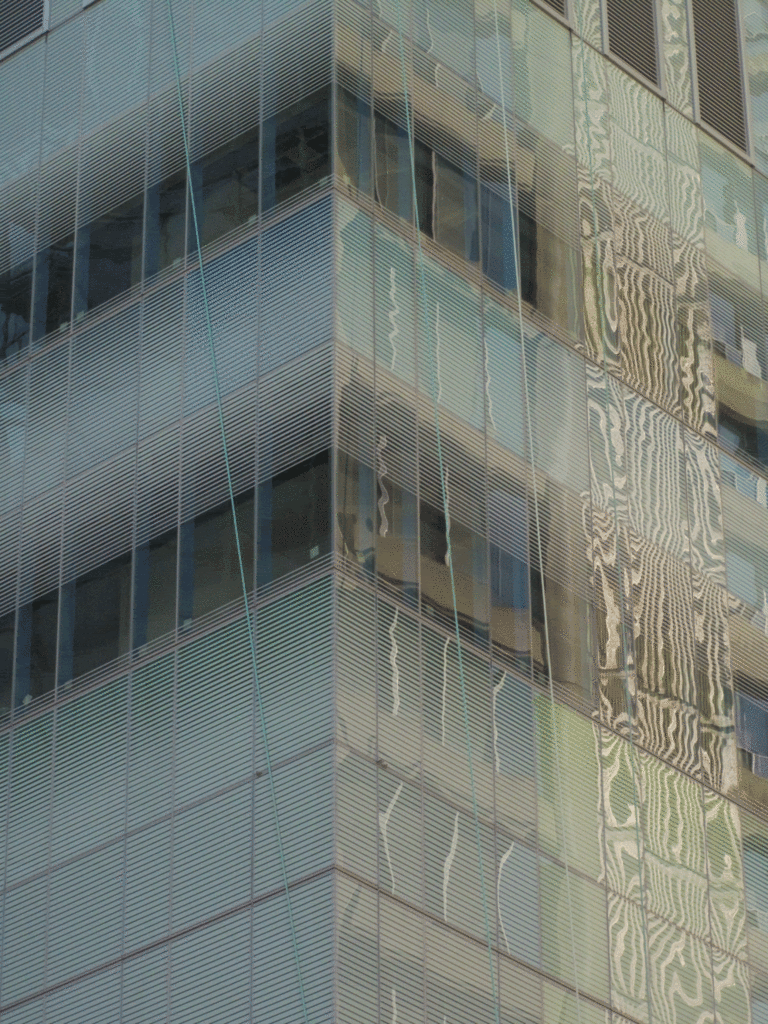
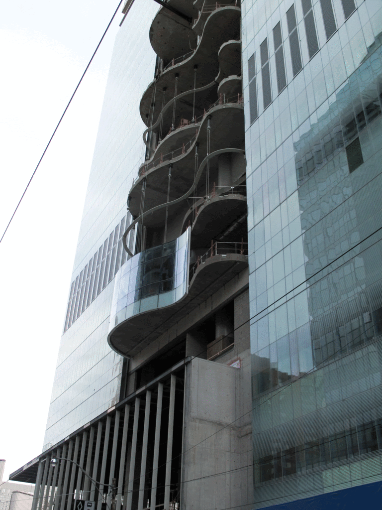
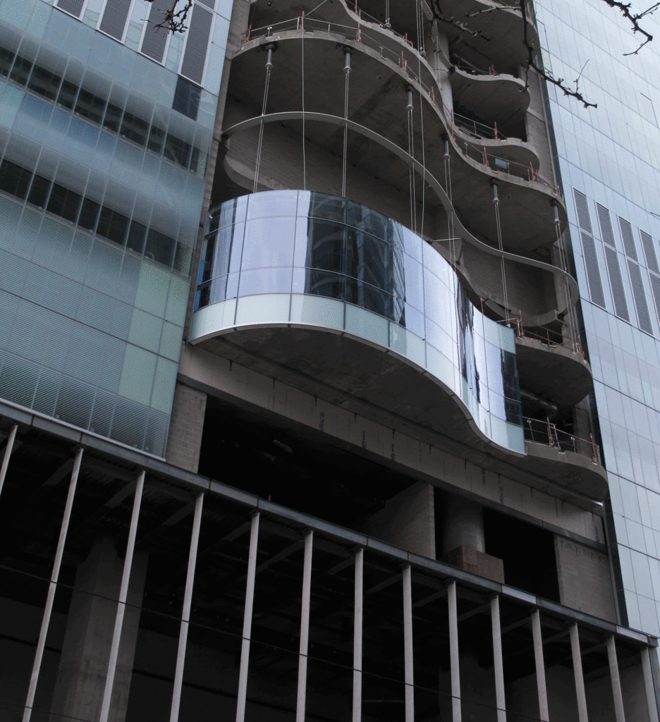
there isn't a building in the city with a more complex and subtle appearance at the level of colour, and the rich and muted palette is not remotely reminiscent of the substance you've unfortunately linked it to.
mainly what one perceives is a gorgeous glass curtain wall that has an extraordinary luster and gleam, with the primary colours being a shimmering pale ice-mint green, iridescent blue-white and hints of light yellow, all experienced in the form of gradients, due to the white fritted glass being deployed.
not the kind of building or palette i would associate with your off-colour reference.