modernizt
Senior Member
That's not what he said. He wished the panes of glass were larger (as depicted in the rendering; i.e. no mullions).
Good point. I can agree on that although larger panes can be problematic, mostly in terms of cost. I do prefer how the windows on 60 Richmond appear punched-out as opposed to the ones at Picasso, but I think Picasso looks great nonetheless.


 Studio
 Studio
 Studio
 Studio
 Studio
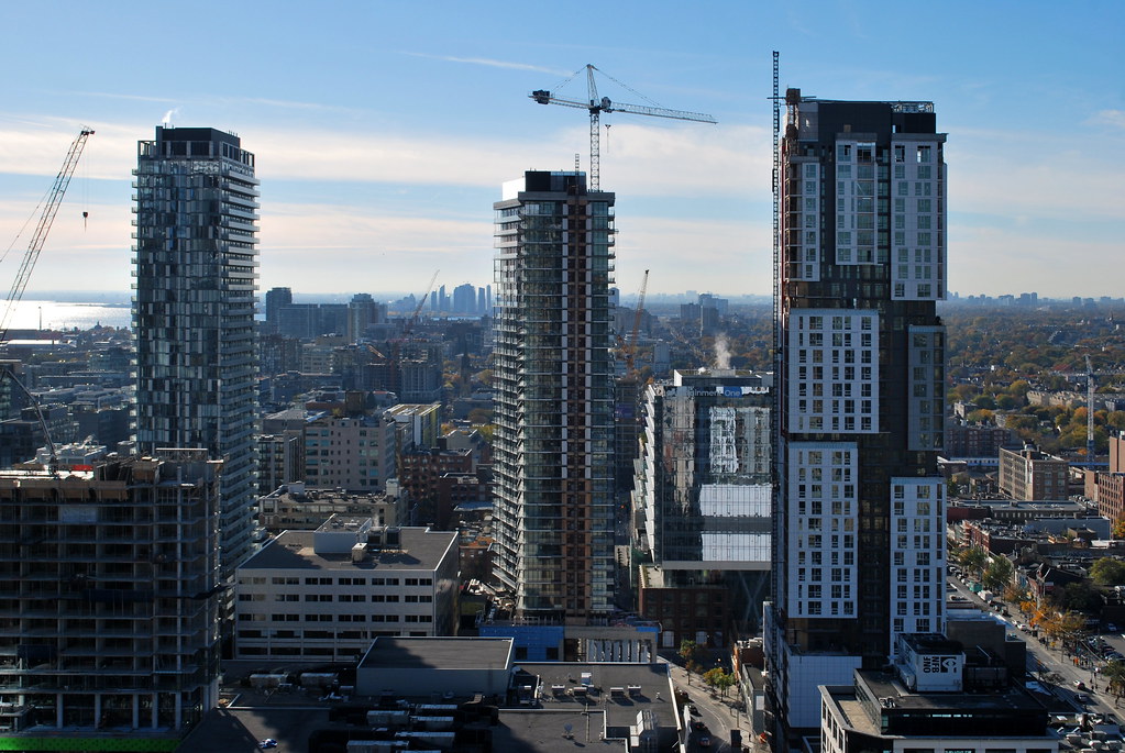 Studio
 Studio
 Studio
 Studio
 Picasso
 Picasso
 Picasso
 Picasso
 Picasso


")
 Aura
Aura