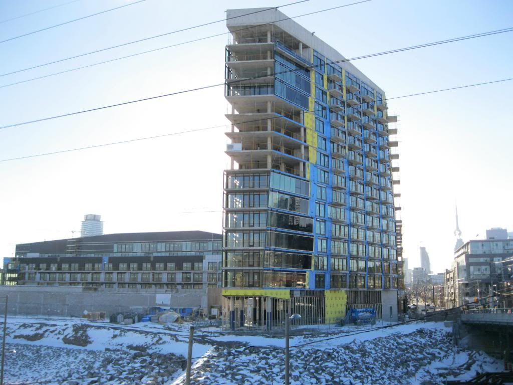
26 December 2012:

20121226150928.jpg


20121226150945.jpg


20121226151053.jpg


20121226151433.jpg
 
Came across this on Youtube. A very diligent manner of capturing construction progress.
[video=youtube_share;j8CTyfCsk6Q]http://youtu.be/j8CTyfCsk6Q[/video]
 
Last edited by a moderator:
The 2 bedroom floorplan/model "E1" at the east side of the building is striking with 3 sides of glass...and every unit is a different square footage. It's certainly looking beautiful.

IMG_2537_zpscef44380.jpg
 
Nice pic!
 
In my dreams every development in the city adheres to such high standards of design and refinement. We're getting better though, and this project just keeps impressing me.
 
The details on this project are great. Definitely one of the best overall new developments in the city. I can't wait til the entire district is complete.
 
As posted in the Aura thread:

Sorry to be off topic, but am I they only 14 year old here. And 1 other thing, thanks to you all for helping me learn about architecture. :)

HotStuff,

Welcome to one of many threads about good architecture. I hope you find it inspiring.


This building is successful architecturally because it has:

Unity

Clear methods - proximity, similarity, rhythm, alternation of a basic theme the maintain unity and visual interest

Good balance

Proper scale

Engaging contrast in size, positioning, and shape

Source: http://en.wikipedia.org/wiki/Design_elements_and_principles


Also:

It is lovingly executed, with top-quality materials and wonderful attention to detail.

It creates context where none existed before, serving as a portal to the new West Don Lands neighbourhood and defining a clear edge to the street via the principles above.


Let's see now what other posters have to say.
 
Last edited:
Also a note to HotStuff,

Generally don't listen to urbandreamer as he will slag off anything that isn't aA and red brick.
 
Better yet just don't listen to anyone on this site (except interchange since you don't mess with the moderator lol). Seriously though, look at the pictures, learn about the terms and techniques and make your own damn opinion. So many useless fanboys, jaded pricks and arrogant know-it-alls on this site. Listen to them and you'll turn into them and you don't want that.
 
Thanks to so many Users, First off, Condovo. Thanks for the good lesson of what this building has to offer, but I just don't get what you mean by good balance? Wolfewood, I agree with you, I should trust myself in good architecture. I wouldn't consider myself as a know-it-all but I do have to admit, When I have nothing else to do when I'm done studying, doing my homework, exams(etc) I always just look up buildings. People call me a waste, just because I only look at buildings everyday, as other people would say it ''i have no life''. My personal favorite Architect is Daniel Libeskind. I get that he has a lot of triangular shapes in his buildings. But you have no clue what goes on in my head. It's happened to me many times where i have to clean my desk because i flooded it with sketches and sketches of what others would say''weird and squiggly''.

This is a version i made myself, but you guys should know what architect drew this.
IMG_0174.jpg
 

Attachments

  • IMG_0174.jpg
    IMG_0174.jpg
    112.6 KB · Views: 536
Better yet just don't listen to anyone on this site (except interchange since you don't mess with the moderator lol). Seriously though, look at the pictures, learn about the terms and techniques and make your own damn opinion. So many useless fanboys, jaded pricks and arrogant know-it-alls on this site. Listen to them and you'll turn into them and you don't want that.
interchange42 is an administrator, not a moderator ;)
 

Back
Top