Thanks to so many Users, First off, Condovo. Thanks for the good lesson of what this building has to offer, but I just don't get what you mean by good balance? Wolfewood, I agree with you, I should trust myself in good architecture. I wouldn't consider myself as a know-it-all but I do have to admit, When I have nothing else to do when I'm done studying, doing my homework, exams(etc) I always just look up buildings. People call me a waste, just because I only look at buildings everyday, as other people would say it ''i have no life''. My personal favorite Architect is Daniel Libeskind. I get that he has a lot of triangular shapes in his buildings. But you have no clue what goes on in my head. It's happened to me many times where i have to clean my desk because i flooded it with sketches and sketches of what others would say''weird and squiggly''.

This is a version i made myself, but you guys should know what architect drew this.
View attachment 9954

Hi HotStuff,

I love your sketch!!! It shows a loose hand. You're not afraid to let your imagination run wild. That's awesome. And it's great that you daydream about buildings. Daydreaming's important. It's productive. It's a way for you to process ideas.

I appreciate your question about balance. I think it's essential for all of us to drill down to first principles to try to figure out what makes some buildings beautiful and others ugly. There's lots of room for subjectivity here but it's not an entirely subjective exercise. There are timeless and universal "ingredients" to consider, as touched upon in my previous post, and it takes some study to understand them and, by extension, to understand architecture.

Balance in design can be described as "a state of equalized tension and equilibrium, which may not always be calm."
(Source: http://en.wikipedia.org/wiki/Design_elements_and_principles)

I think the River City buildings achieve balance due to their success in attaining another design principal, namely

Clear methods - proximity, similarity, rhythm, alternation of a basic theme the maintain unity and visual interest

In other words, all the principles of design are interlinked. One is dependent on the other.

Have a look at the images in this thread. What do you see?
 
Last edited:
Condovo, thanks for the lesson. It was hard for me to understand at first because i'm not as intelligent as you and other forumers. But after reading it I got that meaning of balance. UrbanDreamer, I know it was a compliment. I've been checking out your website for since 2011, and your renders, i don't know how you do them but i know it takes time and effort, and thats awesome!! I really like your renders., I know every render , but a couple, the small ones i don't find attractive.
 
AlbertC's last photo from January 8, 2013 (#451) is particularly eye-catching to me as it really captures the profound shape and curves of the northern building of River City, while subtly including that of another exciting project going up in this city at the same time in the distant background - L Tower.

... It makes me feel like I'm driving west on King Street East.

Nice shot.
 
Condovo, thanks for the lesson. It was hard for me to understand at first because i'm not as intelligent as you and other forumers. But after reading it I got that meaning of balance. UrbanDreamer, I know it was a compliment. I've been checking out your website for since 2011, and your renders, i don't know how you do them but i know it takes time and effort, and thats awesome!! I really like your renders., I know every render , but a couple, the small ones i don't find attractive.

You're a lot more intelligent than I was at 14. Nice to have you here on Urban Toronto. :)
 
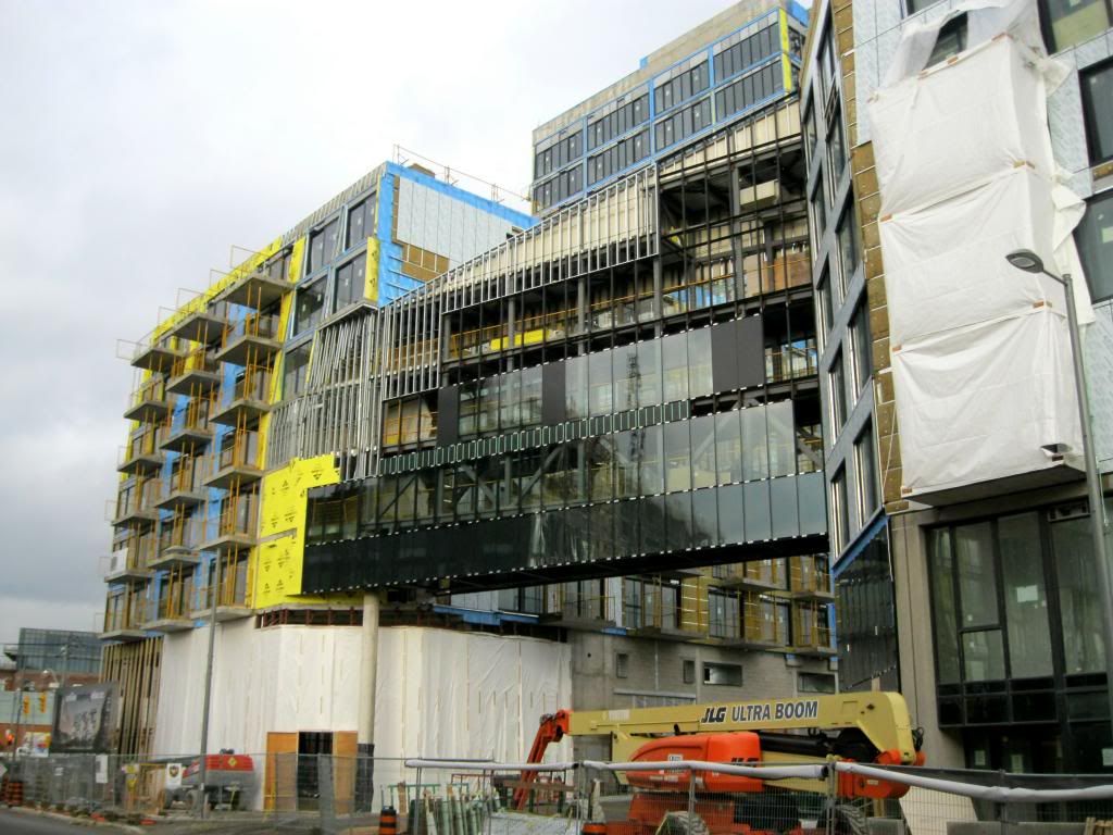
The bridge is looking very interesting. As mentioned in a previous UT article, the King St building is higher than the River St building, so the 4th, 5th, and 6th floors in the bridge are on an angle. This is the route that an occupant in the King St building gets to their parking (staying indoors, of course); so it will make for a scenic, daily walk across it.

IMG_2550_zps362a2efb.jpg
 
Sensual, precisionist, subtle but with some monumental cues - it's turning out to be a unique, completely engaging building.
 
Agreed. I received a letter recently from Urban Capital saying that Phase 3 is in the design stage at this point...so perhaps a 2013 sales launch? Hoping for 30+ storeys here.
 
Agreed. I received a letter recently from Urban Capital saying that Phase 3 is in the design stage at this point...so perhaps a 2013 sales launch? Hoping for 30+ storeys here.
30+? Why is that? What they're doing so far is surprisingly urban and I'd hate to see that ruined by an poorly executed highrise. Not to say that highrises can't also be urban, but this city seems to struggle with that these days.
 
30+? Why is that? What they're doing so far is surprisingly urban and I'd hate to see that ruined by an poorly executed highrise. Not to say that highrises can't also be urban, but this city seems to struggle with that these days.

For the simple reason that, the rendering looks about 30 storeys (you can count the floors like I did). Although, as stated...NOT the final design. There will be more balconies, too. And who really thinks that it's going to be a poorly executed high-rise? I don't see anything being ruined by this Team, frankly. But I tend to be biased about this project after all. Maybe someone else can weigh in...
 
Last edited:
Looking at these photos makes me wet - because I just did a spit-take. Gadzooks! This project is slicker than my wildest pipe dreams.
 

Back
Top