SC south can get quite busy in nice weather, the north one much less so. I reviewed the park design of the latter in the Problematic Parks thread and stand by what I had to say there. The South Park mostly works people, its main detriment being that people don't want to use the lawn when it's soggy.
I was referring to SC North. South is much better but it's surrounded by buildings that are boring & ugly overall and have poor retail design next to the public realm. The lawn is useful but doesn't have any amenities that you would expect with a lawn, such a soccer nets. My guess is they would be good for the people that live there. This place is theoretically walkable and not made for cars but doesn't give people a reason to go out on a stroll here. I believe that the only truly well-designed building in East Bayfront, as of now, is Aqualuna. Its attention to the ground level is pretty decent, and the expression and materiality create a unique identity for what will soon be a spectacular, diverse slip and a gateway to ferry travelers coming to Toronto. The other buildings have failed to achieve this. I'm not dismissing their positive qualities but, if you ask anyone who isn't into planning or architecture, they give off a typical condo/commercial vibe. They're certainly not worthy of the waterfront.
I have yet to see it super busy, but it does ok....mainly the play equipment and the dog area though. the main feature being a one way climb of a modest hill, it really isn't conducive to large groups of people.
Aitken Place Park isn't terrible aesthetically and has nice flowers that grow on the side of its hill. However, the overall idea for it is very lazy. There's a hill that goes up and a concrete area to the south of that hill, with a few lonely benches with a bizarre design. Why does it exist and what exactly are people supposed to do there? There's also a public art installation that looks good at night but, during the day, is just an oddly-shaped mirror cube. It might seem decent when you look at it on the internet but, when you're there, you realize that it's a pretty uninteresting park that, unlike Sugar Beach, wasn't designed for life in mind. If the designers were looking for something more secluded and local, they haven't achieved that either.
Overall, it doesn't feel like a destination park or like a local community amenity. It's very unclear what this place is for and doesn't give a great reason for people to go there... even for the residents of the adjacent condos.
I am likewise optimistic about Parliament Slip.
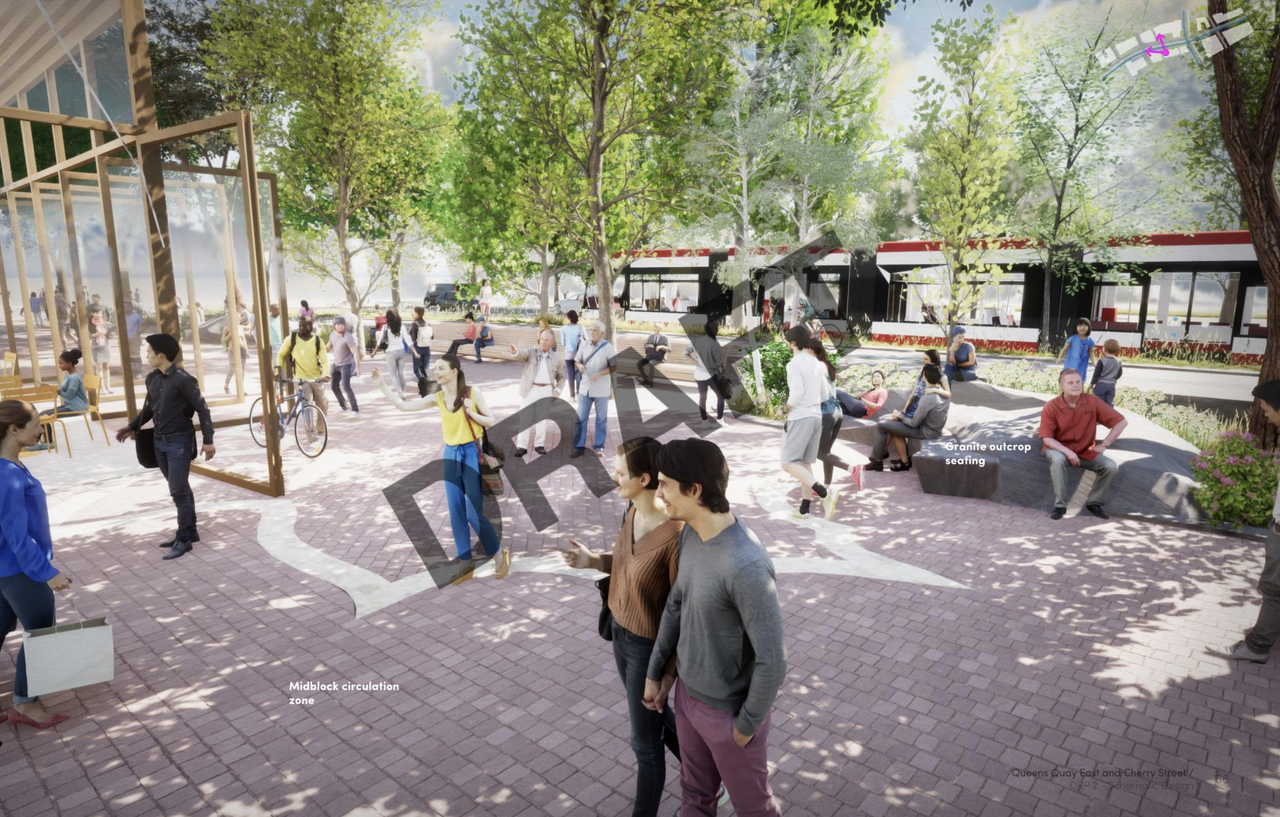
Me too! I spoke with Yvonne Lam, a partner at DTAH and the organizer of the East Bayfront Jane's Walk, about Parliament Slip and Queens Quay East. I told her that Parliament Slip is one of my favourite public realm projects in Toronto and encouraged her to keep its elegant curves and composition as the design progresses. I also said that West 8 + DTAH have done great work in laying the foundation for a new design for Queens Quay but they could learn from PUBLIC WORK's design for segment 2B (east of Parliament). Their vision for Queens Quay is a place to meander and to linger, as opposed to a flow through. It also has far more landscaping, both in quantity and quality, and has a cottage country theme. I referenced the long benches, sidewalks that are organic and wavy, granite seating, and variety in amenities and landscaping that corresponds to context; as opposed to one street layout/expression for the entire length of the project. West 8 + DTAH did very good work on the side streets, such as Parliament Plaza that'll lead to the slip and I encouraged her to extend that approach to their segment of the Queens Quay East project.

(Segment 2B by PUBLIC WORK)
PS, you should post comparison photos when you're making comparisons. Makes it easier for people to see what you're talking about.
Definitely, but I didn't take enough pictures on that day.