Not to say aesthetics isn't important, but I think the experience with original Yonge/BD, as well as the subsequent experience with the Spadina-Yorkdale extension disproves your thesis - people want to use transit because it is sited at advantageous locations, not because a station is attractive and unique per se. Besides, do we really need say double height platform levels at all the stations? Or overbuilt bus terminals?

AoD

I agree that location is way more important that aesthetics (ex. all of New York's subway system).

However I think bus terminals are very important and necessary for suburban subway stations like these, which will be dependent on busy bus lines feeding into them (and parking).
 
Not to say aesthetics isn't important, but I think the experience with original Yonge/BD, as well as the subsequent experience with the Spadina-Yorkdale extension disproves your thesis - people want to use transit because it is sited at advantageous locations, not because a station is attractive and unique per se. Besides, do we really need say double height platform levels at all the stations? Or overbuilt bus terminals?

AoD

Double height platforms? How are the platforms on TYSSE higher than standard?
 
The point is moot. The stations are almost complete, and people are going to enjoy using them. The main takeaway is to build attractive and unique stations everywhere you want people to use transit. Inevitably, planners will look at costs. They can decide to build smaller stations or build surface-level stations. They can have lower budgets, but they should remember that the look of stations affect how people perceive the experience of taking transit.

My barbershop is crusty and looks like crap, but their prices are good and they do a great job - so I keep going back. Similarly, all the stations I've regularly used I did so because it was handy, not because the building was unique or attractive. I'll agree overcrowded stations can turn people off (something stations like Hwy 407, VMC, or probably any TYSSE station would never experience). Not to mention dingy and dark stations are somewhat off-putting (which is more a maintenance issue). But spending scarce capital on frills and flair is a bit wasteful, especially considering the costs involved, and that we have numerous projects that are awaiting funds or have been dropped entirely. It's not like we're talking about some art installations atop an LRT stop - cost-wise one TYSSE station would be like three or more St Clair ROWs. So it's possible that the difference between a standard station and TYSSE station could buy us an entire streetcar line (though that's just a guess).

As well, we want people to use transit everywhere. So does that mean every new station henceforth must be palatial and "unique"?

The interior of the TYSSE stations appear fairly standard. I'd expect the ECLRT to be similar.

I guess our last subway project was Sheppard, so it's hard to gauge. But are the interiors standard? For me they seem quite unique and extravagant, particularly the northernmost three.
 
Eglinton will have less space to work with so by necessity it will have to have mostly smaller stations that are more integrated with the streetscape & buildings.
 
I guess our last subway project was Sheppard, so it's hard to gauge. But are the interiors standard? For me they seem quite unique and extravagant, particularly the northernmost three.

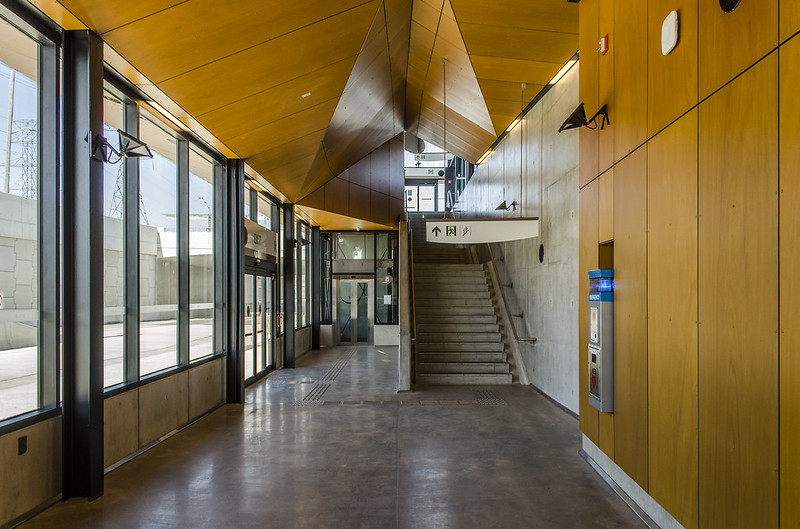
Here's Vaughan Station. I'd say this is the most extravagant feature of TYSSE. It's no more extravagant than Downsview, Eglinton West or Yorkdale, imo.
VMC_Entrance_Interior_Street_Level.jpg


Pioneer village station:

Again, not unusually extravagant. It reminds me a lot of the Mississauga Transitway, just on a much larger scale.
PV_Bus_Terminal_Exterior.jpg


16927354481_539426fa53_c.jpg

Mafalda

Highway 407 Station is nothing noteworthy, in my opinion.

I know a lot of people have voiced concerns over the grandiose size of these stations. I have no idea what the square footage of these station are and how they compare to the rest of the system. However, I've always known renders to exaggerate the size of buildings. I'd expect them to be less grandiose in person. Also, consider that large stations aren't unusual in Toronto. For example, Finch, Sheppard-Yonge, York Mills, Downsview, Wilson, Spadina, Lawrence, Kennedy, Warden and I'm sure others are all rather large.

The complaints about the designs of the station are a distraction. This is a multi billion dollar project. Making the stations smaller, with less thought put into design would've saved a relatively inconsequential amount of money. The true extravagance of TYSSE lies within the tunnels, where we're paying billions of dollars to built an underground RT line that would've worked perfectly fine on the surface.
 
I don't mind if we've splurged a little and built one or two eyecatching stations, considering how utilitarian the network is overall. I agree that bland/functional should be the norm.

Does 'interesting' have to be expensive? Isn't there a comfortable middle ground? Utilitarian/bland isn't necessarily low cost, either.

I would be much more concerned about operability than esthetics. eg - the durability and cleanability of the interior surfaces. And the provision for future changes to utilities. The photo above with all the wood and funky lighting is going to look like crap in twenty years, partly because tastes always change, and partly because by then there will doubtless be some modification. Imagine the same picture with two new ugly electrical conduits run down the wall because the spec's changed on ticket machines, or PA systems, or wifi, something. How will that flooring have held up after a few years of salt and machine scrubbing? What about the cost of cleaning that multi-angled ceiling after a few years' diesel exhaust and brake dust have collected? How much scaffolding (and scaffolder's time, electricians don't build scaffolds) will be needed to replace the florescent bulbs in those high-ceiling fixtures? Can kids scratch their initials into the panelling? How much time and money will it take to clean out the pockets at the base of the protruding vertical I-beams - machine floor scrubbers won't reach in there, dirt and sand and salt will collect there.

I'm on a roll, but you get my point.

- Paul
 
I agree that location is way more important that aesthetics (ex. all of New York's subway system).

However I think bus terminals are very important and necessary for suburban subway stations like these, which will be dependent on busy bus lines feeding into them (and parking).

I don't think anyone is complaining about the presence or importance of busbays - but some of the proposed ones for the TYSSE is just plain excessive - the one for Highway 7? Two (!!) for Pioneer (one York, one TTC)?

AoD
 
I really cant comprehend why the people at TTC have a hard on for opulence and excessive grandeur when they can't afford
to spend extra both in time and money. All this open air design and the need for art is just superficial and IMO egotistic. Why can't they just do what they did for their original stations? Imagine how much quicker it would be for construction if they had followed a more utilitarian approach.
I'm pretty sure that the majority of the general public after the first initial weeks post launch won't give a damn between VMC and St Patricks over the fact they can
get downtown in 1 go. At least on the ECT it seems that they are following a somewhat more cookie cutter approach for station design

I think it's important to draw a balance between utility and aesthetics - and we seem to be stuck at the two extremes. The one issue that bugs me the most is the lack of an overidding design aesthetic - *every* new station have to stand out on its' own without reference to the greater system.

AoD
 
What's with all the whining about a pittance being spent on a station we have to live with for a century. Montreal does much better than this, and their stations often cost less than ours. It's not a significant cost.

Besides, look at all the money they've saved making them big open-air spaces, compared to having to fill it all in like they used to.
 
I think it's important to draw a balance between utility and aesthetics - and we seem to be stuck at the two extremes. The one issue that bugs me the most is the lack of an overidding design aesthetic - *every* new station have to stand out on its' own without reference to the greater system.

AoD

Agreed. I hope that if they build the DRL or the yonge extension to RH they will follow a cookie cutter design (that has a balanced design) to save time and money
 
What's with all the whining about a pittance being spent on a station we have to live with for a century. Montreal does much better than this, and their stations often cost less than ours. It's not a significant cost.

Besides, look at all the money they've saved making them big open-air spaces, compared to having to fill it all in like they used to.

clearly you are ignorant about engineering. You do know that to design open air spaces as large as the ones they have cost much more time and money than doing something that the rest of the world has done and is continuing to do for decades.
If Shanghai did every station as open air it would take them forever even with their labour force to build 4 lines (which took them less time btw than our meagre expansion)
 

Back
Top