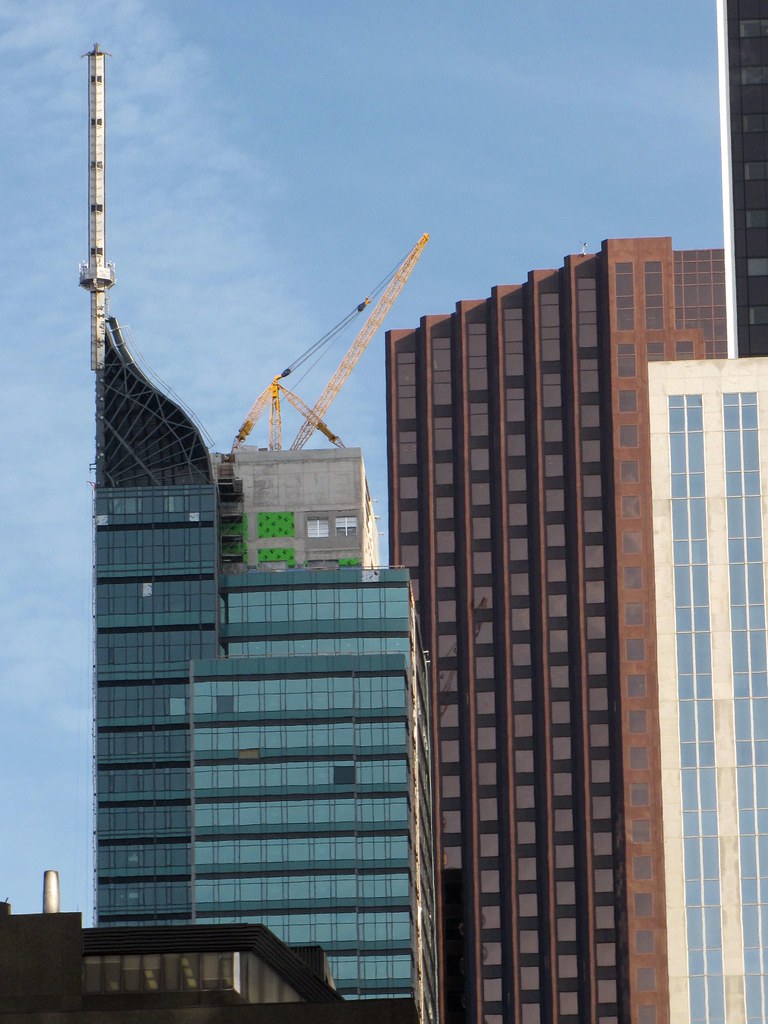
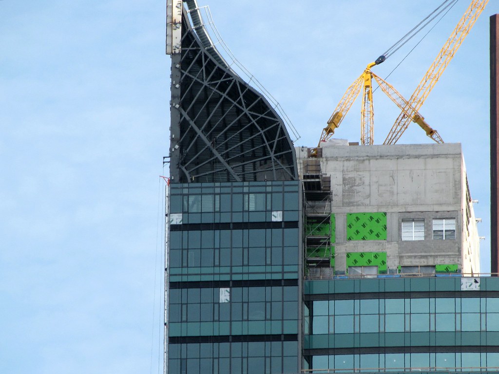
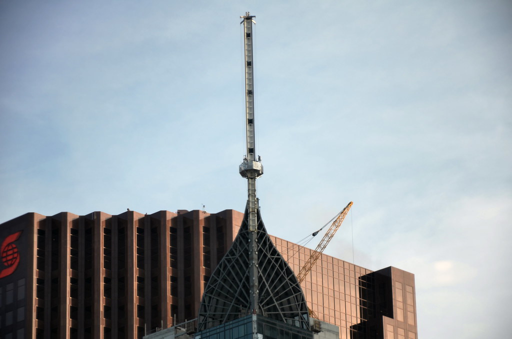
The tower Trump,
Once a concrete clump,
Now looks like a pile of junk.
The designer should be a considered a dunce,
For pulling off this whacky, insane, architectural stunt!

He's not a dunce. Zeidler has given Toronto a number of important buildings that are influential in the larger world of design, and we should show some compassion - this is no way for a man of his talent to wind down a stellar career. I think what'll happen, with time, is that his association with this building will be conveniently glossed over when his oeuvre is discussed, out of respect for his wider contribution to design culture.
 
I think the TT looks great. It adds to the skyline of Toronto, not just another flat top structure.
 
yeah, that old proposal was inappropriate for Toronto... i don't know how people expected that thing to be approved by the city!
 
29 November 2011 I was astonished:

053sgl.jpg
 
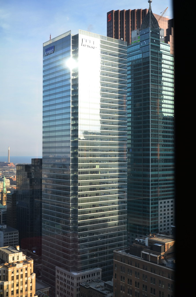
the pics from the Sheraton are epic!.. i think that;s one of the best places to view it... it elevates the look of the city for the tourists/non-torontonians and makes our city look more "manhattan/american city"..
whatever goes up on the Canada tower site will almost completely block this view,
 
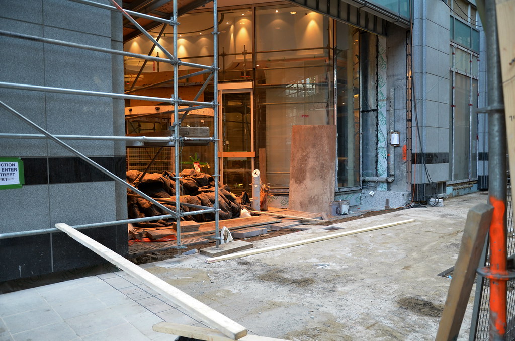
Good they not apply the sidewalk treatment right up to the man hole cover ... looks pretty bad as is.

Having said that I actually like the colour !
 
the pics from the Sheraton are epic!.. i think that;s one of the best places to view it... it elevates the look of the city for the tourists/non-torontonians and makes our city look more "manhattan/american city"..
whatever goes up on the Canada tower site will almost completely block this view,

I think I echo the frustration of other members when I say I don't wanna look like Manhattan (or any American city for that matter), I want to look like Toronto.

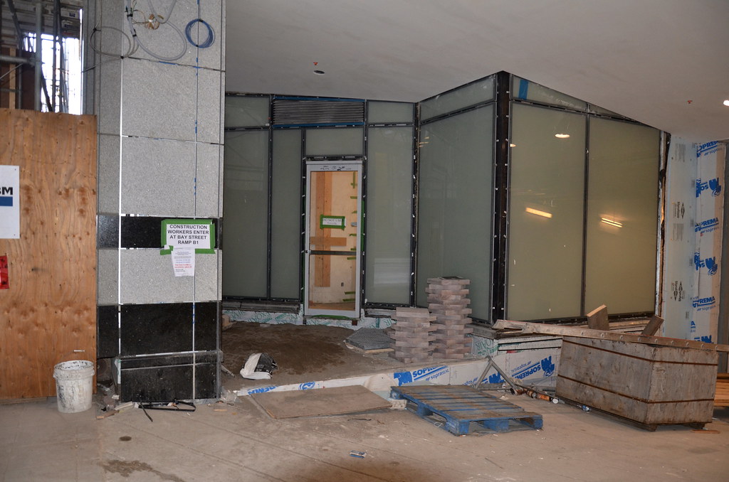
Having said that, I'm not the biggest fan of this building, but I like it more when I consider other designs that could have been used on this tiny footprint. Just seems like a difficult spot to work with, especially when your height is limited. However, I think more than other buildings, it's one that really needs to be 100% complete before we can fully appreciate it. I think (hope) the way it'll look when lit up at night and its addition to the Bay St. theatre at the street level is ultimately enough to call it a success.
 
I can't wait to see the spire fully clad and all lit up. Also looking forward to the final treatment of the dome.


This building is adding some visual interest to the Toronto Skyline.
 
I think I echo the frustration of other members when I say I don't wanna look like Manhattan (or any American city for that matter), I want to look like Toronto.

Having said that, I'm not the biggest fan of this building, but I like it more when I consider other designs that could have been used on this tiny footprint. Just seems like a difficult spot to work with, especially when your height is limited. However, I think more than other buildings, it's one that really needs to be 100% complete before we can fully appreciate it. I think (hope) the way it'll look when lit up at night and its addition to the Bay St. theatre at the street level is ultimately enough to call it a success.

+1 It is really frustrating to see constant comparisons between Toronto and New York. Both cities have their own unique identity and character, but the two should never be compared. I am personally a big fan of this building, it is partially due to the increase in density and the height in the area but i would agree its a success. I'm also excited to see how the spire looks once fully clad and lit.
 
I think I echo the frustration of other members when I say I don't wanna look like Manhattan (or any American city for that matter), I want to look like Toronto.

but the thing is, I don't think Toronto has a distinct style.. it's more like an American city rip off if you ask me,

BTW Wopchop (or whoever knows this)... when is the big fin on the Adelaide side coming up??? the big upper fin on the bay street sign has been up for like 6 months!
 

Back
Top