December 24th, 2023
1704052985298.jpeg

1704052999077.jpeg

1704053009726.jpeg

1704053018390.jpeg

1704053029680.jpeg
 
Feb 22
Lot more up on my sites from various angles along with shots on the 20th as well

Another hum hummer
53547354837_b19422b462_b.jpg

53548668025_4e5fc13ccf_b.jpg

53547353927_d4b8249ec3_b.jpg

53548559999_0bc773260f_b.jpg

53548418518_0ba7fc498f_b.jpg

53548230186_115b32b3d7_b.jpg
 
Bit off topic, but the clock tower at Mississauga civic centre as seen in Lake Ontario’s excellent first photo directly above is a strong contender for one of my least favorite buildings in the GTA. It’s so hopelessly ugly and hokey, and will only feel increasing dated as the area modernizes. Reminds me of one of my other least favorite buildings in the GTA, 110 Davenport..

IMG_0375.jpeg


The green glass actually looks great in this photo, but the tower is so so bad. Someone needs to put both of them out of their misery.

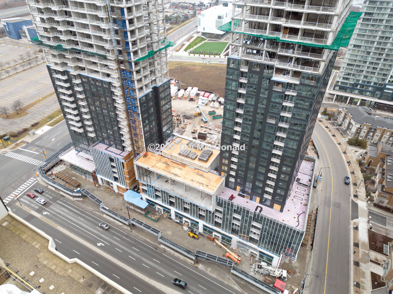
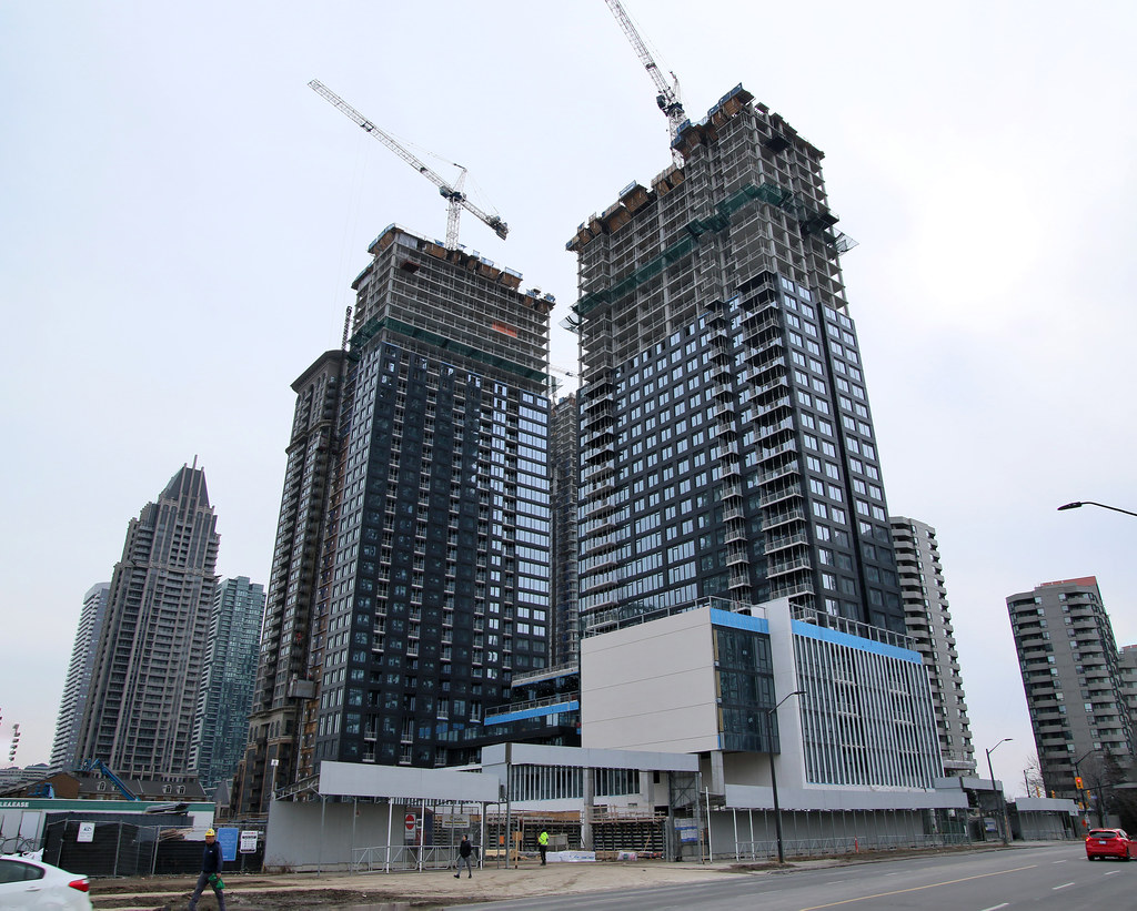
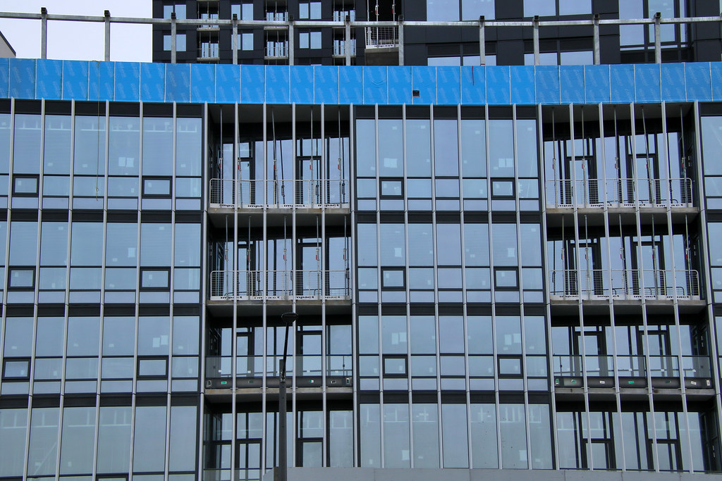
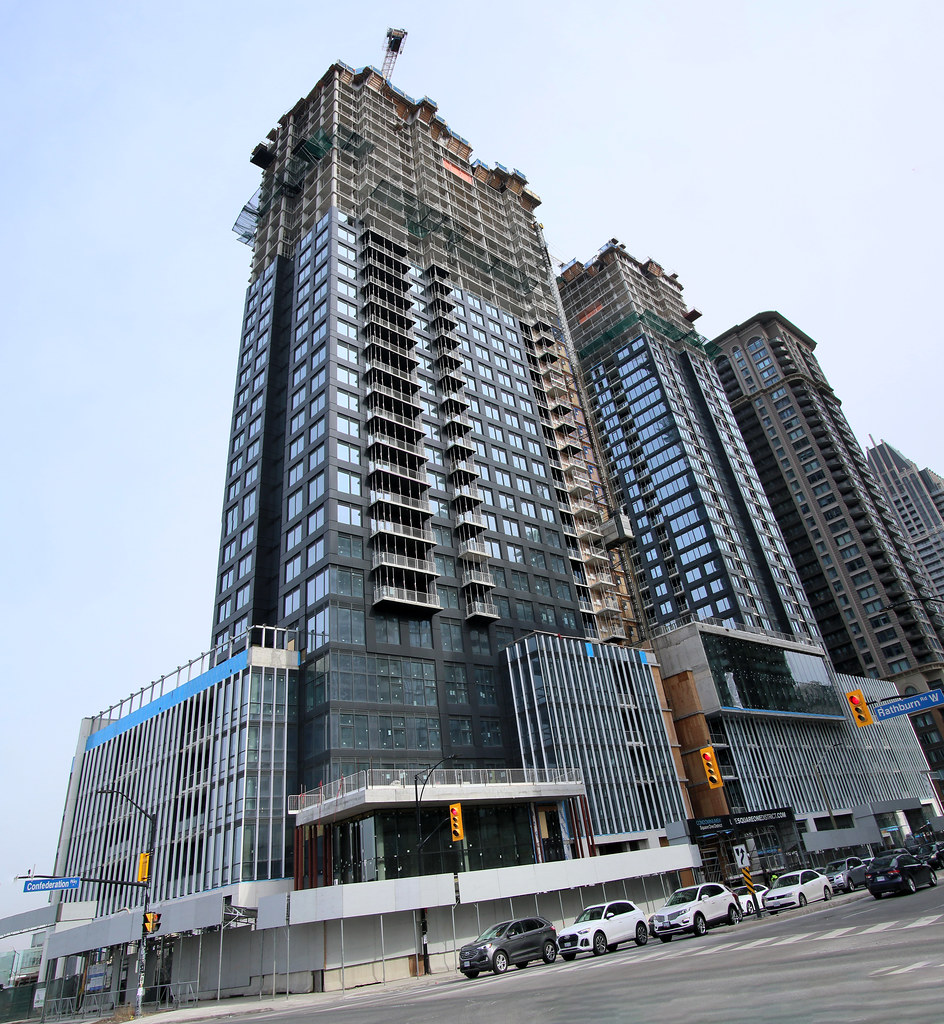
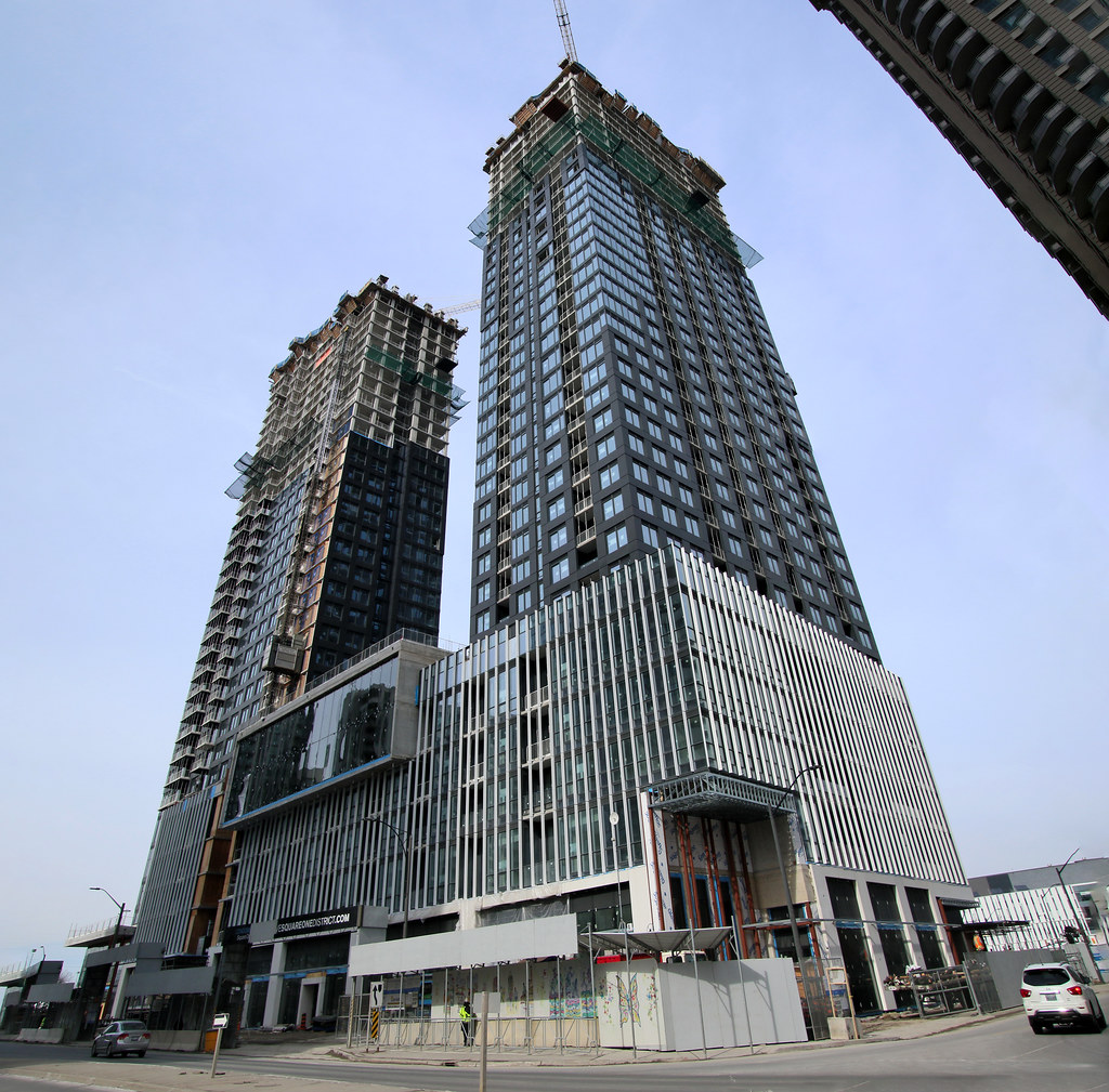
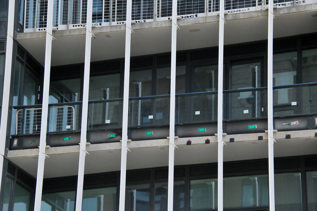
This project, Square One phase one, looks.. fine. Cladding is decent, reminds me of 8 Wellesley.
 
I'd take that any day over something like "Design" Haus...

...a bit more back to the jurisdiction of this topic though: A lot of those building before the current tower boom including that civic centre where sign of times when being built. Where PoMo was a thing...which resulted in some interesting experiments and textures. Some looked fabulous...while others look freakish - a bit of hit and miss if you asked me.

Anywhoose, it is what it is. I am more concerned about the grey glass box shite they're putting up today.
 
Bit off topic, but the clock tower at Mississauga civic centre as seen in Lake Ontario’s excellent first photo directly above is a strong contender for one of my least favorite buildings in the GTA. It’s so hopelessly ugly and hokey, and will only feel increasing dated as the area modernizes. Reminds me of one of my other least favorite buildings in the GTA, 110 Davenport..

View attachment 545222


The green glass actually looks great in this photo, but the tower is so so bad. Someone needs to put both of them out of their misery.

This project, Square One phase one, looks.. fine. Cladding is decent, reminds me of 8 Wellesley.
It's a brilliant little Barton Meyers (who lived right around the corner at 19 Berryman) composition from 1991. You'll find few allies on that opinion around here.
 
And the need of self-importance to pointlessly tell us that...

...oh, where were we? Oh right, Square One District Phase One development thing.
 

Back
Top