You are using an out of date browser. It may not display this or other websites correctly.
You should upgrade or use an alternative browser.
You should upgrade or use an alternative browser.
- Thread starter nicetommy
- Start date
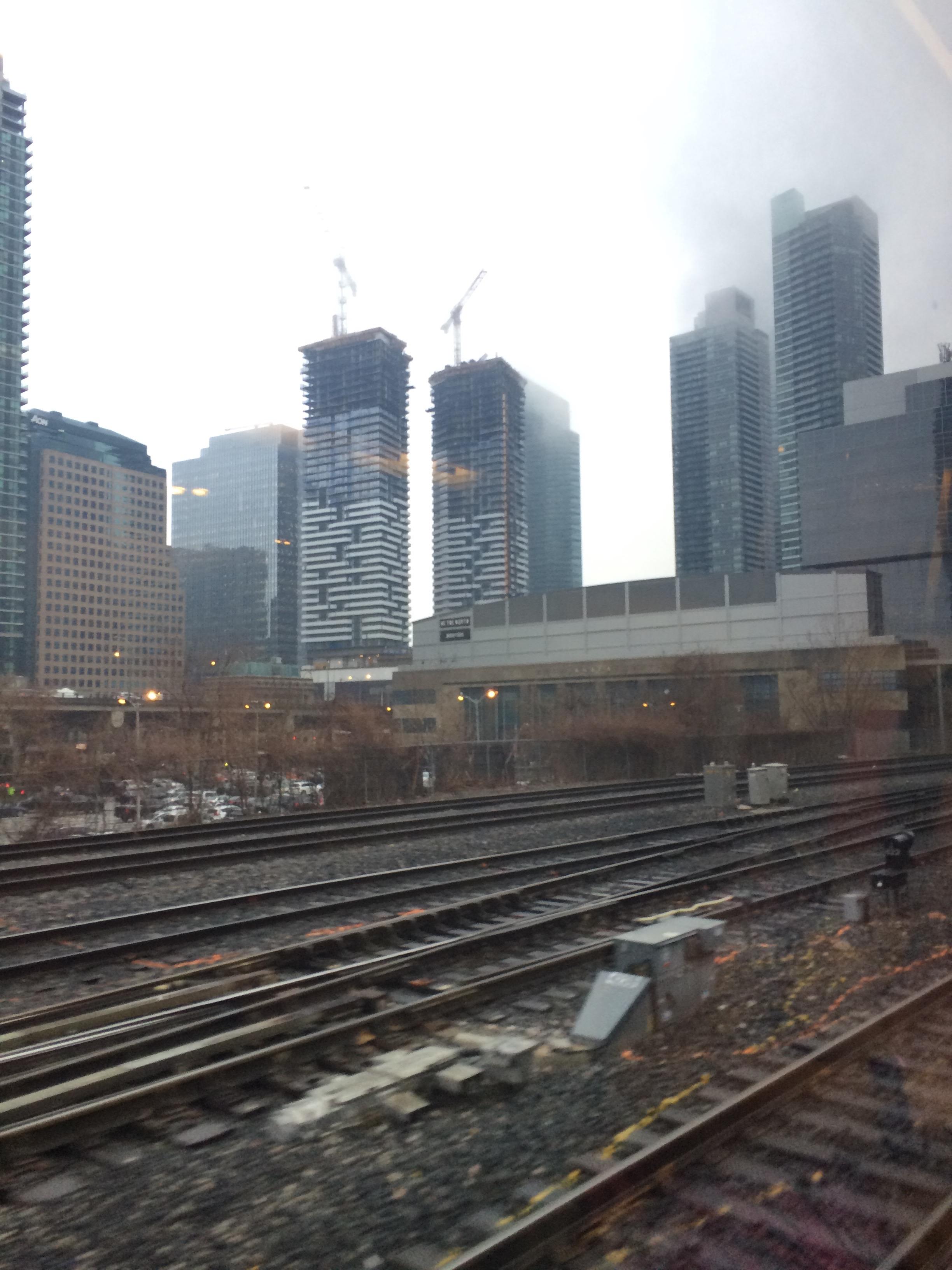
This is a pair of towers that I would not have been sorry to see go to 80 storeys, or you know, higher than whatever the next post says.
42
42
skycandy
Senior Member
...how about 90?
G.L.17
Senior Member
Attachments
ChesterCopperpot
Senior Member
ProjectEnd
Superstar
And bit less clear today
Cloudy day at KS?
agoraflaneur
Active Member
From yesterday

ADRM
Senior Member
Such a refreshing blast of non-blue/green on the skyline. And, God, those Maple Leaf Square towers are awful.
someMidTowner
¯\_(ツ)_/¯
sixtysixdays
New Member
cd concept
Senior Member
Those twin towers would look great even at 100 storeys. We need a different variaty of coloured facades for this area. Instead of the blue green look! I like the Deep blue windows in contrast with the white balcany. Just immagine if One Bloor East used this shade of blue for their windows in contrast with their balconies. That building would even look more stunning than it is!
Miscreant
Senior Member
Alright, I'll stick my neck out--the office tower, even from the south, is a study in elegant simplicity. The white framing itself is just right on point. The glass is top notch. I think it's a solid addition.
Gphorce
Active Member
Couldn't agree more. I don't think it's the kind of building people would point out for being iconic, but it disappears into the skyline, which is what modernism is supposed to do. It's handsomely proportioned and the materiality is top notch. Well done.Alright, I'll stick my neck out--the office tower, even from the south, is a study in elegant simplicity. The white framing itself is just right on point. The glass is top notch. I think it's a solid addition.
A Torontonian Now
Senior Member
The office tower is good, the condo towers even better. This is not a development that I anticipated would turn out so well. It's nice to have a project exceed expectations!


