Only the podium

urbantoronto-4034-21198.jpg
 
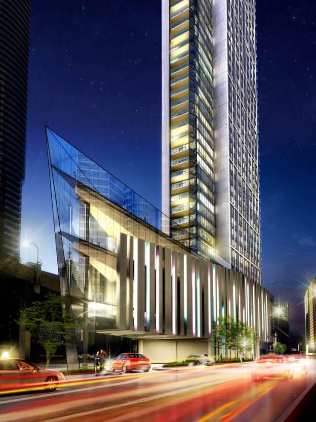
The tower itself looks somewhat keystone shaped in some of the renders. Is that the case or is it a rectangle rising from a triangular podium?
 
I was also under the impression that it was sorta wedge/ keystone shaped rather than rectangular, but I agree it would be nice if it came to a triangular point facing west.
 
Wow! there finally at ground level this building is going to look great when completed. Does anybody know what colour the curtian glass wall is going to look like?

This is a Tridel development, so don't get too excited until we see how it turns out.
 
It could be best described as a keystone shape, which is a triangle or wedge with truncation and a couple chamfers. Add some staggers for texture, and you get this:

ph10-key.png


42
 
I prefer the somewhat wedge shaped floor plan to the hypothetical triangle. Among other things, it makes the western units on each floor more useable internally than would a triangle. The triangle may be striking when viewed from a distance, but imagine placing your furniture in a triangular room. The western side of a wedge would be more liveable, IMO.
 
This is a Tridel development, so don'trtil we see ho rns out.
I would like to know why you think this project is going to suck! At least it's not another box like structure going up. The keystone look is real awsume. I hope they don't use blue for the curtain walls.
 
I would like to know why you think this project is going to suck! At least it's not another box like structure going up. The keystone look is real awsume. I hope they don't use blue for the curtain walls.

Nothing wrong with a box, and you answered your question there with the post you quoted, as, architecturally speaking, Tridel's record is not a particularly impressive one.
 
A lot of people in ICE will now have a lovely view of the broadside view of this building, moreover that great view from the lake and islands of those two dramatic Ice towers will soon be blocked by this one. But maybe tridel will come through and dazzle..?
 
Ugh- yes that was a Wallman project they really made a hash of with drab and cheap looking facings, quite appalling for such a prime location.
 
My godo_O, so negative

It's not "negative", it's calling a spade a spade given how that previous project turned out. Don't want negativity? Stop selling a project as iconic (see below) if you don't want to be judged by said standards:

Every so often a building captivates the imagination of a nation. A truly iconic condo building that becomes a defining pinnacle of greatness
...
An architectural marvel, this statuesque beauty soars dramatically up from a triangular-shaped wedge alongside Toronto’s major city artery.

Honestly, did they use the UPX speechwriters?

AoD
 
Last edited:

Back
Top