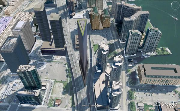
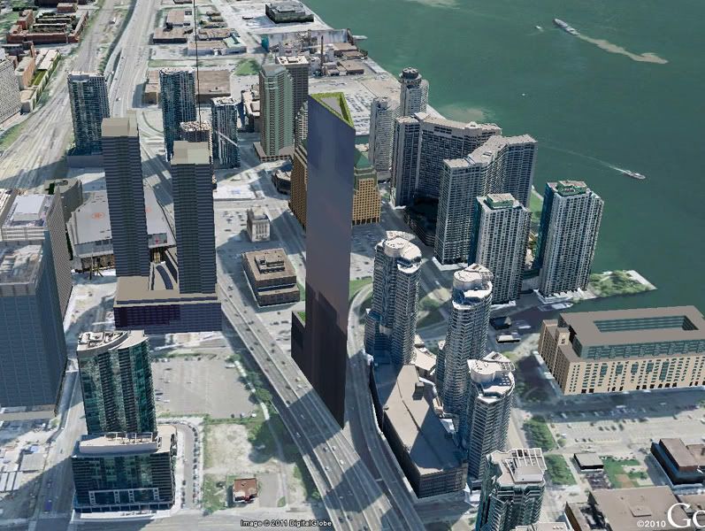
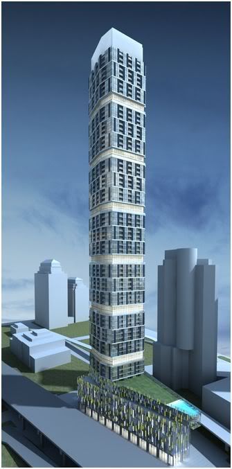
I guess I'll be the first to say that I like the new version. It is a rather striking design and certainly different from any of the other towers in the area. Although we are told that it will be a week until renders of the FINAL final version are released, so I assume that what we see next week will be at least slightly different from what we have seen so far.

I am just wainting for Canadian National or Wyliepoon to produce a sketchup render of the view including this tower, the Ice towers, the twin 90 Harbour towers, the WaterPark Place III tower, the Delta hotel and Bremner tower, etc.

And then do it again when we know what is happening on the 60 Harbour plot -- and again when the (presumably new design) 45 Bay tower is made public -- and again when the Toronto Star land towers are released...
 
:

120harbour.jpg

I dont normally applaud box designs - they are so overdone and generally boring - but this does show at least an attempt to differentiate the building. As said earlier, I suppose over thte next few years before construction starts, many things could change.
 
I can't much say I like this latest render. It's an awkward, hedging sort of thing that denies all the best aspects of the site. Unsophisticated - it doesn't even seem to play well to it's own height.
 
Last edited:
I like the original render a bit more, as it really played off how tall this tower is.

That being said, I love both and this will be great if the product is like the render. :)
 
the idea of tapering the building and fitting it to the flatiron site looks a lot better, but I imagine that is more expensive to do, and internal market research probably suggests that most potential buyers will not reject the simpler/cheaper design. I'm not an expert but I suspect that developers do not like to vary the floor plate too much because then all of the utilities (pipes and electrical) and walls can't be lined up so easily to make workable unit floorplans, and is slower and more complicated to build for the crews. The main variations I've seen are with varying the balconies, where there are no utilities. Absolute has the same floorplate rotated so the same forms/processes can be used. Is my interpretation of this correct?
 
Last edited:
My understanding is that you are right. Many, probably most of the people who post here seem not to understand the very important role of construction costs in the decision to proceed or not proceed with a given project. Sure, a particular building (such as 120 Harbour) could be made more visually appealing with a more complex design, but the increased construction costs are likely to render it uneconomic to build, given the projected housing market for that particular location. The number one rule of construction is to not build something that loses you money, and unfortunately, many of the typical suggested improvements made on this site would do just that.
 
Well, from what I know, the main utilities can be grouped around a core which can be standardized for a great many floors at a time. Only minor utilities around the outer edges need be altered a bit if the plate shrinks gradually. So - all your HVAC, plumbing and the like can be the same, whereas the placement of outlets and other minor things might change around the edges.

Depending on the shape of the outer building skin (in this case, an imagined gradual taper), the floor plans could be alike, say, in stacks of ten floors at a time. With the start of each new stack you'd need to make some adjustments to floorplans and the like, to fit the new available size. But in a building like this, that wouldn't be too difficult or pricey. I imagine Absolute World would be far more complicated. I think the biggest cost might not be in what to do with the utilities, but coming up with and using adjustable concrete formwork.

A building on this site would not need to taper back from the base, though - it would be striking even if it went straight up from the sharply angled 'prow' of the site. It'd be shaped like the base of the first Pure Spirit tower in the Distillery district. Then there'd be no need for price-raising or complicated readjustments at all.


yorka.jpg


yorkb.jpg
 
Last edited:
Aside from one render coming to light on one day and one coming to light a few days later, do we have any firm reason to believe the former is the "original" design and the latter is a subsequent revision and not vice versa?
 
The great benefit of the "flatiron" version noted above is that it would stand out if executed with the appropriate cladding. I can't say I'm a big fan of the new version.
 
Agree. was hoping that they will play with the angles like the following (don't mind my poor drawing. secretly drawing on paint coz at work lol


Last edited by a moderator:

Back
Top