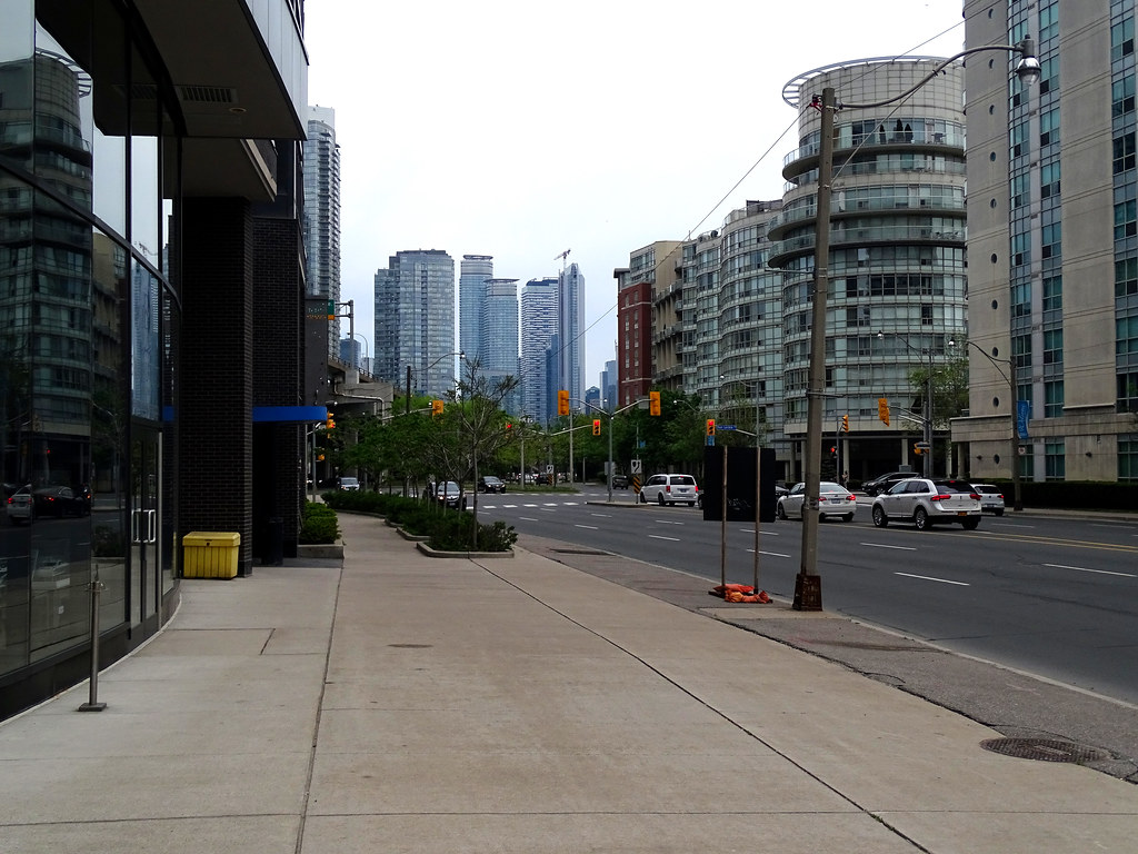
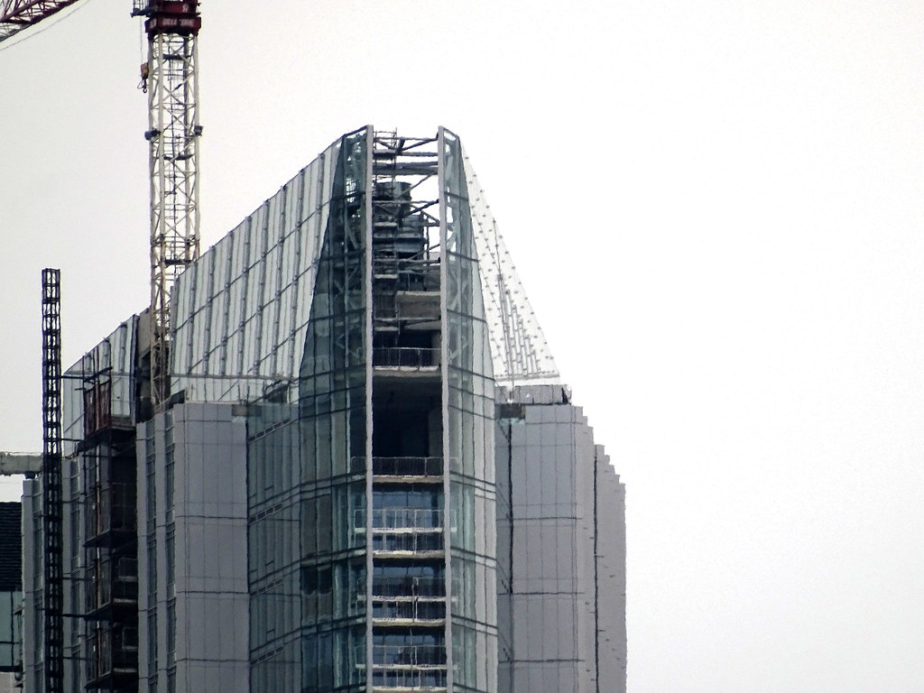
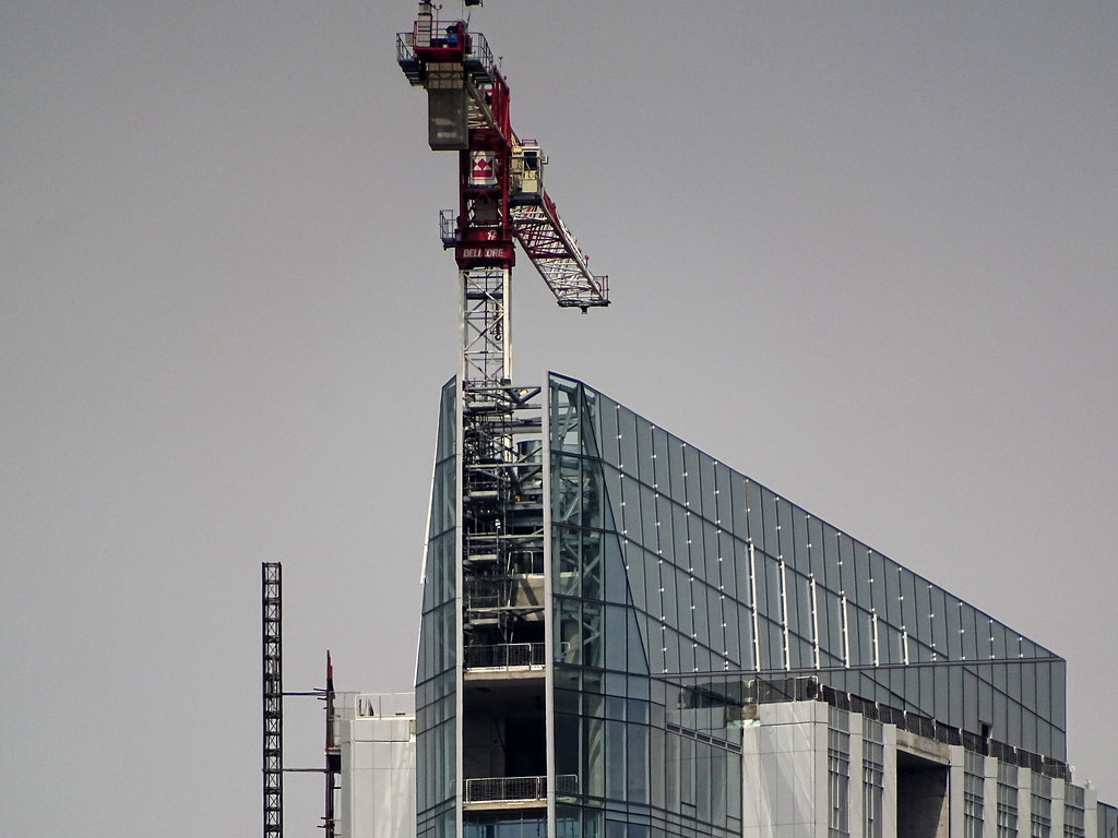
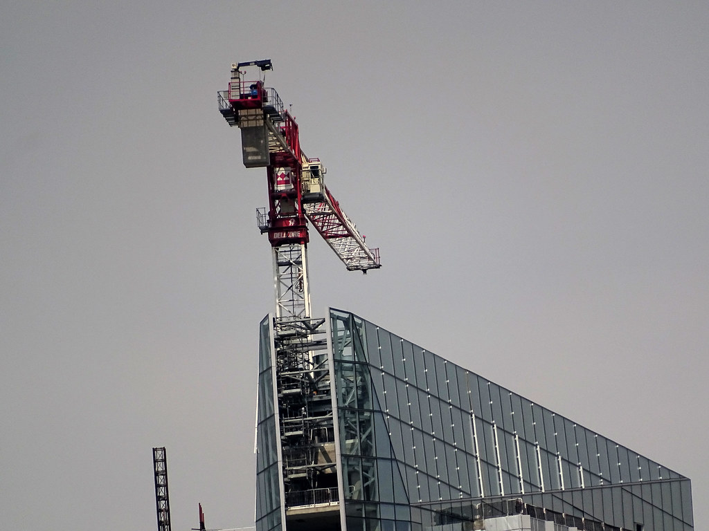
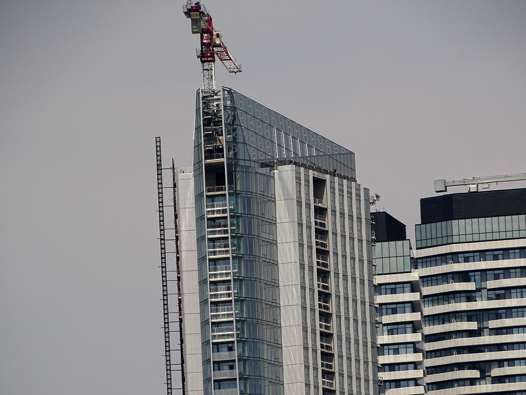
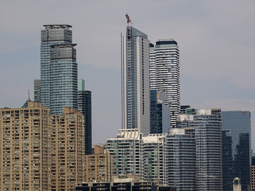
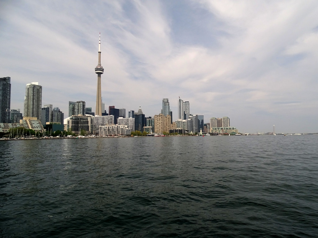
As I said, the most attractive angle is from the north west, which is what your photos highlight. The rest of the building is bland with no cohesion and no distinct lines to slim the building. They should have focused on the one interesting architectural element and highlighted it.
 
Ten York certainly grabs my attention more than its neighbours. Dramatic angles, and it's not a twin, unlike everything else nearby.

20180601_195241.jpg
20180601_200224.jpg
 

Attachments

  • 20180601_195241.jpg
    20180601_195241.jpg
    293.2 KB · Views: 759
  • 20180601_200224.jpg
    20180601_200224.jpg
    251.9 KB · Views: 1,413
I like Ice and Harbour Plaza for the record. I think this being a single non twin tower works in its favour. approaching the city from the east this is way more eye catching. Its thin triangular profile really stands out.
All and all I think it's a great cluster (hate all the mullions on the infinity towers though) I just think the flat iron side of this, and its singularity makes this stand out a bit more.
I do really love how jetson-esque the Ice towers are, and I love that harbour plaza's balconies look like the joy division album cover.
This looks like a blade.
 
I never thought i could ever say this but the so called 'three ugly sisters' complement the glass cluster in a strangely pleasing way in the second last pic above.
 
It's bland and largely inoffensive. Some colour to allay the dullness might have improved the performance. Time to move on.
 
I never thought i could ever say this but the so called 'three ugly sisters' complement the glass cluster in a strangely pleasing way in the second last pic above.

I mean they provide some contrast between the glass buildings, but that’s about the only nice thing they provide.
 
  • Like
Reactions: DSC

Back
Top