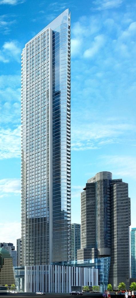
Most projects don't end up back to the drawing board when 90% of the units have been sold in a rapidly cooling market.
 
For a building of this size and unique shape I'd expect a sharper design too. I don't understand why a big builder like Tridel can't do better than this - not that it's bad, but it's not great. I want stunning, and this is Wallman which also ups my expectations.
 
For a building of this size and unique shape I'd expect a sharper design too. I don't understand why a big builder like Tridel can't do better than this - not that it's bad, but it's not great. I want stunning, and this is Wallman which also ups my expectations.

Considering how prominent a place this tower will have on our skyline for the next hundred years, if it ends up turning out as mediocre as many fear, it will be a big slap to the face of the City of Toronto from Tridel.
 
I relly hope some folks in TRIDEL that make big decision are reading posts on this forum. Some of us want the type of design like the cylindrical 1 Yonge building to be at this vantage point.

After AURA, I believe Toronto deverves better. If TenYork is going to block the ICE Towers, then it should by far exceed the beuty of ICE.

Can someone kindly put up a survey on this forum on re-design? Thanks !!!!!!!!!!!!!!!!!
 
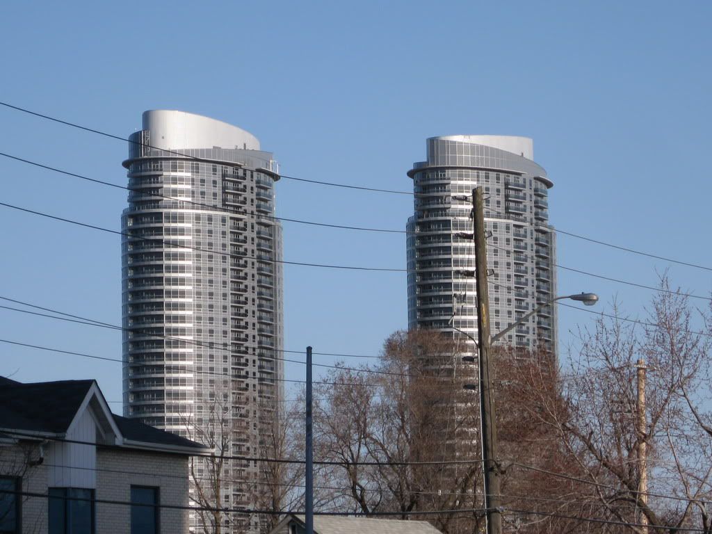
So this uniquely shaped design is blasted while the equally tall, horribly unoriginal twins next door at Harbour Plaza have everyone singing the praises of Menkes and aA.

I realize Tridel has built some real crap, but I sense a bit of a bias.
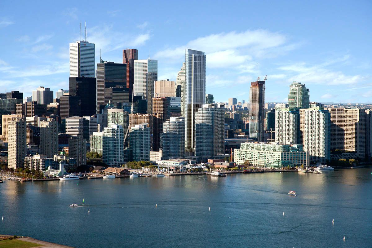
 
This is definitely not a bad project- it could clearly be improved in some places but the rest is fairly solid and unique.

I definitely agree with the sentiment about Harbour Plaza. The podium is the worst part- it's bland and antiurban. I definitely hope those twins don't go ahead until the next cycle.
 
So this uniquely shaped design is blasted while the equally tall, horribly unoriginal twins next door at Harbour Plaza have everyone singing the praises of Menkes and aA.

I realize Tridel has built some real crap, but I sense a bit of a bias.
Of course there's bias and rightfully so. Tridel has done nothing but build crap in this city. A part from Hullmark, which has turned out quite nice, what has Tridel built that truly stands out (perhaps Reve)? Aristo, Argento, Atria, West Village are just some of their under construction marvels. Look what they did to 300 Front - a complete disaster. Even when contacting them to find out what their logic was behind the disaster that is 300 Front, they simply forward you to the "proper department", only to never hear from them again. Builder of the year? I find that hard to believe. Sure their customer service and quality finnishings deserve phrase, but a part from that their developments are generally eyesores and way too conservative.

To me, Ten York is nothing but a glorified Solaris at Metrogate. I don't care if they use curtainwall, it will still end up looking like a Tridel build - esp. with their love for white precast.

Tridel-Ten-York-condominium-1200-px-AERIAL-MATCH_0936_CAM_landscaped01.jpg


IMG_5206.jpg


Perhaps I will be biting my tongue when Ten York is finally built, but I am the first to admit that I do not have high hopes for this development. I truly believe that such prominent locations should have mandatory design competitions. If Concord can do it with their Signature Tower development and Pinnacle can produce something spectacular with their 1 Yonge St. development, why can't Tridel go above and beyond and produce something truly awe inspiring? #blahdel
 
We have a feature story up about the evolving design of this building. It comes complete with a number of renderings you won't have seen before.

42
 
I don't know about everyone else but I think Tridel should have improved on this design because it's waaay beter than the final one.
To me this one had a potential to be something original and exceptional with a little tweak.. !!!!!

That said, this location deserves much much better than what Tridel is trying to slap in the face the ICE Towers and the New Delta Hotel.

urbantoronto-7878-26485.jpg
 

Attachments

  • urbantoronto-7878-26485.jpg
    urbantoronto-7878-26485.jpg
    21.3 KB · Views: 514
Last edited:
kweku, I could not agree more. I'm not a fan of the final version. The one you posted looks really good. Although the design& architecture gurus of ET will probably disagree.
 
fedplanner:

No offense, but the rooftop design elements look rather gratuitous - cheap even. A well-executed version of the final design should prove most handsome, in a timeless way. Not referencing the unfortunate 300, etc. of course.

AoD
 
Last edited:
The older pattern of boxes, and the original northern lights patterns looked pretty good.....now that the Design Review idiots have made their "improvements", it's beginning to look a lot like AURA.......doesn't the massive spandrel running up the sides resemble Aura??

render from the front page
urbantoronto-7878-26490.jpg
 
Last edited:
yyzer:

Hence the disclaimer about the materials - but even then, this design is far cleaner, far more pleasing in its' form with clear lines and rhythm than Aura the dog's breakfast.

AoD
 
The sad part is, that this tower is going to block out Ice, on the skyline and Ice is a much better design than this.
 

Back
Top