Skyjacked, is there any chance you can take some pics towards the East showing The Berczy? Thanks.

It's a terrible angle and I can never figure out how to shoot it so it looks straight. Doesn't look much different from last time.
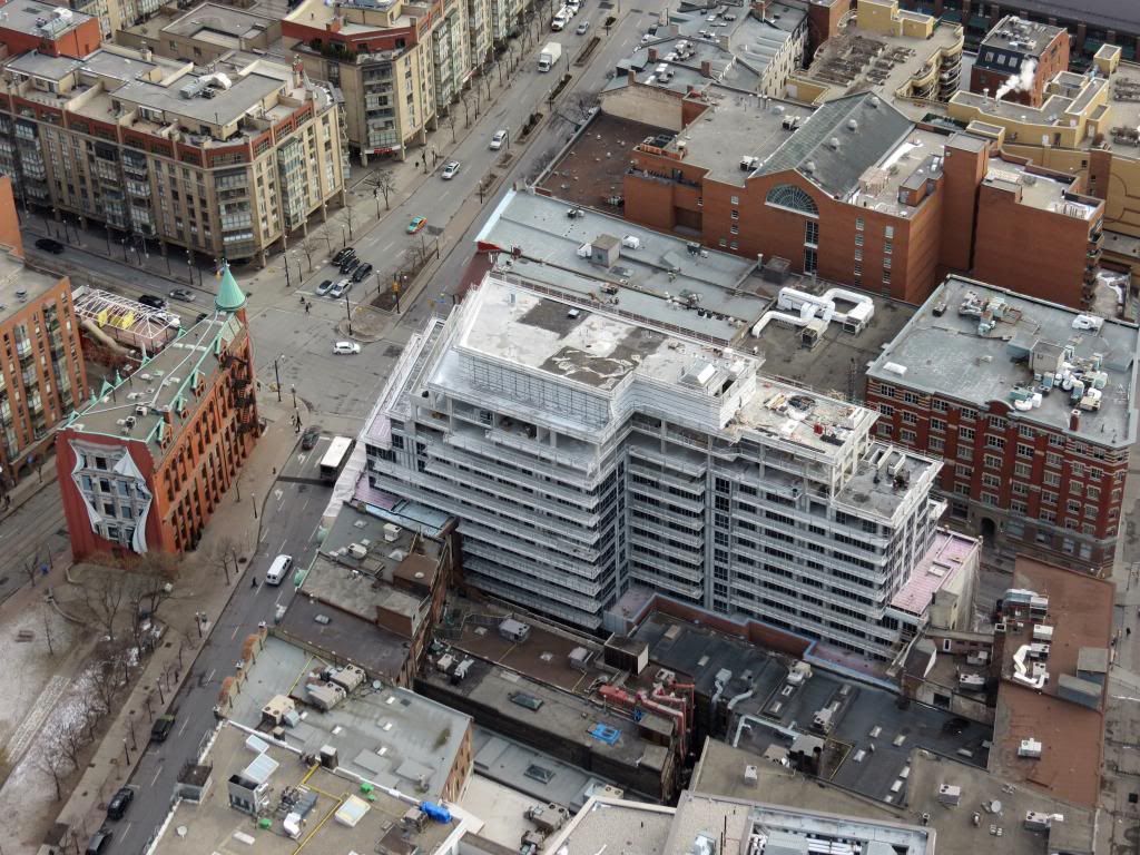
IMG_2611.jpg
 
It'll look less bad when window dressings are in, and there's less stark contrast between the grey spandrel and living areas.

But yea, looks like that's where they cut the budget.

Backpainted glass would have made a huge difference here, even with the same grey colour. Not a huge hit on the budget either in the whole scheme of things.
 
Let's face it, the portion atop the setback is trash - and trash at one of the most important corners of the city is damn near unacceptable.

AoD
 
I think that greyish portion was supposed to lighten the top and make it less noticeable but it does exactly the opposite. Because it's so glaringly different from the brick, your eye can't help but go there. Then you realize how out of proportion the building is to its neighbours. The grey spandrel really ruins what would have been a very attractive building. The way the roof is handled is unfortunate too. I would have liked it more if the roof was pitched or had a distinctive feature. A flat roof is just too mundane.
 
Considering that 88 Scott is another Concert development and P+S is affiliated with IBI Group, this building so far indicates some causes for concern regarding poor cladding execution.
 
Considering that 88 Scott is another Concert development and P+S is affiliated with IBI Group, this building so far indicates some causes for concern regarding poor cladding execution.

Agreed, it's not looking very promising. But things might turnaround with the balcony glass and the window coverings should soften the sharp contrast with the dark windows. On the bright side (excuse the pun) it's great seeing some exterior lighting on the brick portion. I wonder why they did not carry the same fixtures down the Church Street side? Seems odd to mix it up.
 
It's that first setback on the north facade that's the main problem. They could have used brick without making it look too heavy. Then the gray on the upper setbacks wouldn't have been as noticeable.

Let's just hope the residents of this building are balcony gardening enthusiasts.
 
Beyond the unfortunate choice of materials, they should have moved the mass southward away from Front and compensate with a slight increase in floors/height.

AoD
 
^ They did move the mass back from the original plan but the locals were against a taller tower at the south end of the site.

Let's face it, the portion atop the setback is trash - and trash at one of the most important corners of the city is damn near unacceptable.

Well said. Not looking forward to 60 storeys of this at 88 Scott.
 
Oh my! What went wrong? Not checked back for a while, and now I'm wishing I hadn't. It looks like 300 Front farted on top of the wonderful brick base. I'm struggling to understand how anyone thought that top cladding was acceptable, especially at this location.
 
The ground level frames and windows are being installed; the east slide looks like it's being cleared of construction material.

10 floors of glazing completed, balconies are starting to be installed, and you can see installed pot lights and wall sconces on the 2nd floor. Looks like drywall is being put up on the 4th floor.

IMG_00000006.jpg


IMG_00000008.jpg


IMG_00000010.jpg
 

Attachments

  • IMG_00000006.jpg
    IMG_00000006.jpg
    68.3 KB · Views: 565
  • IMG_00000008.jpg
    IMG_00000008.jpg
    71.2 KB · Views: 591
  • IMG_00000010.jpg
    IMG_00000010.jpg
    57.2 KB · Views: 572

Back
Top