junctionist
Senior Member
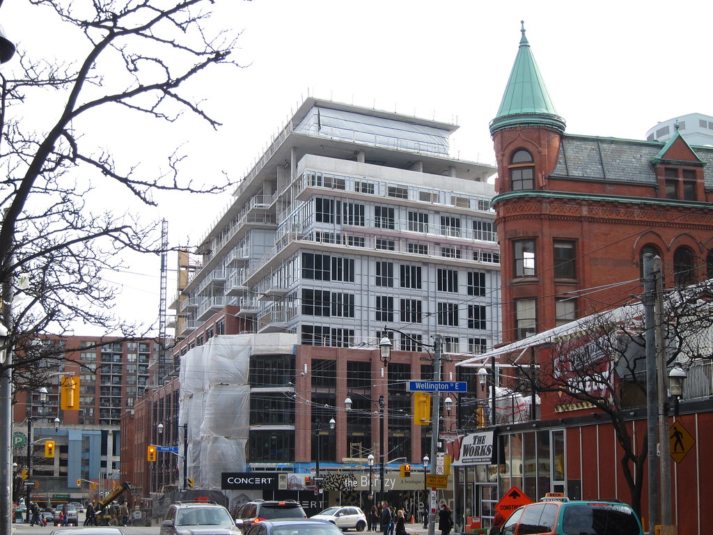
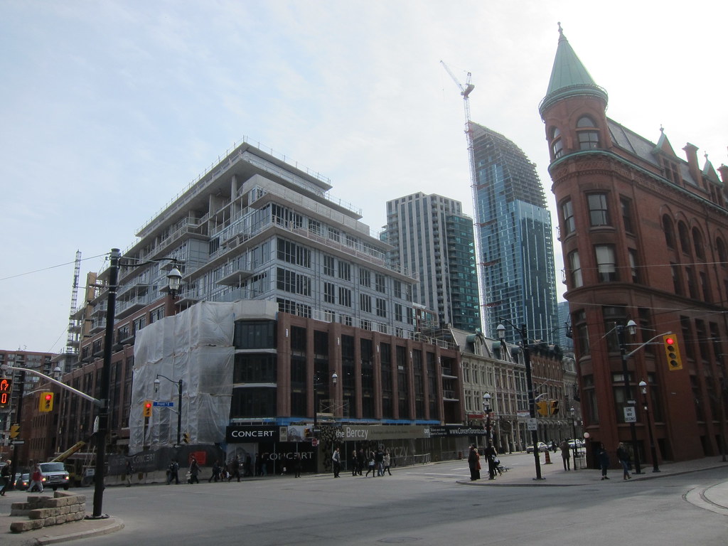
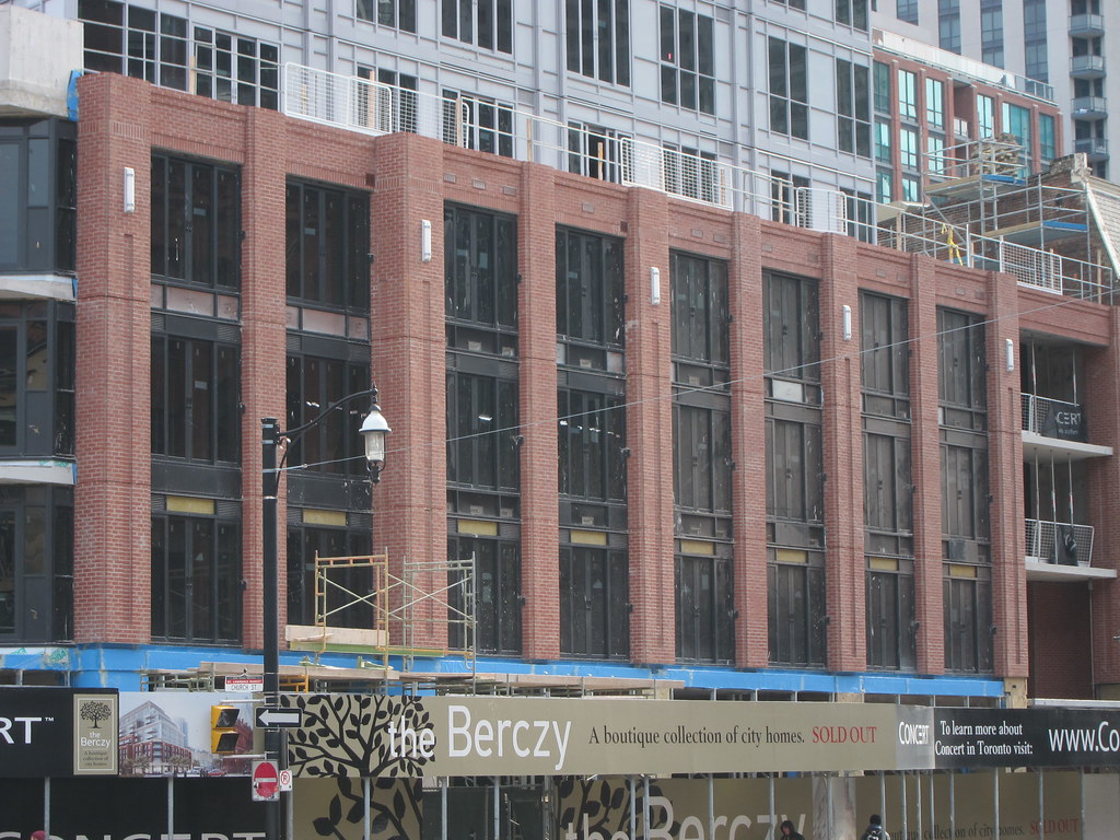
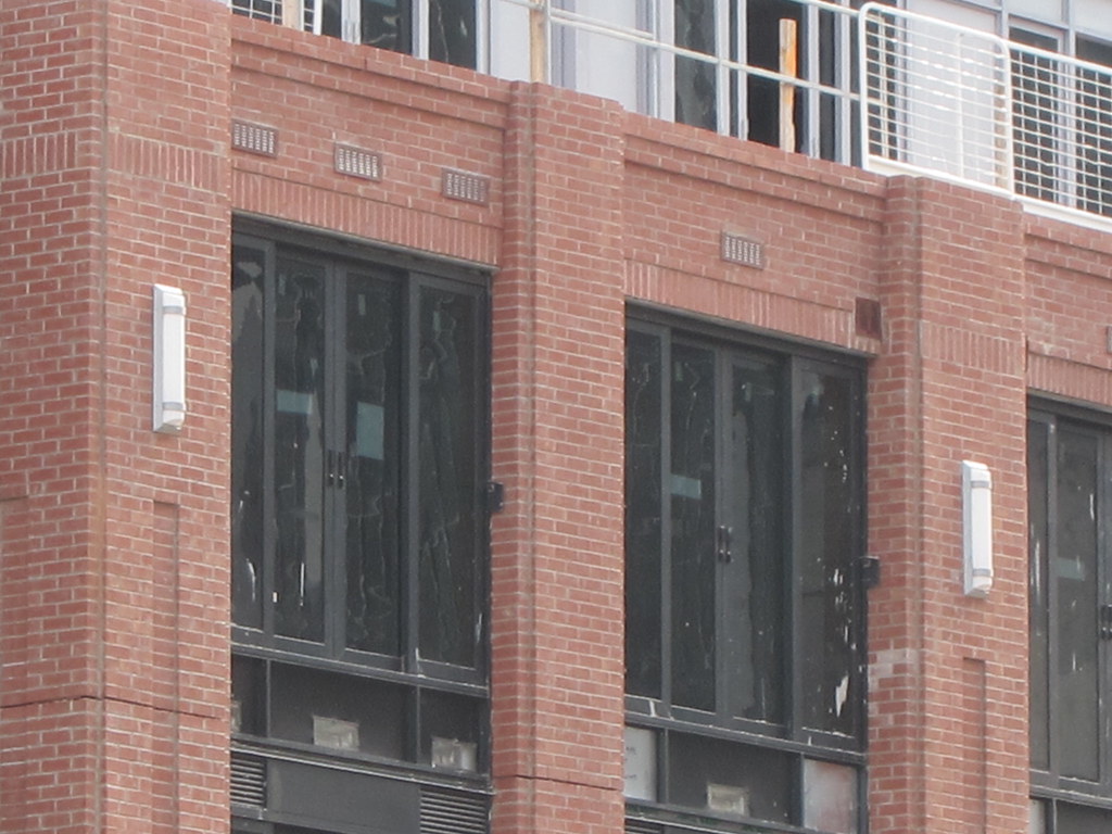
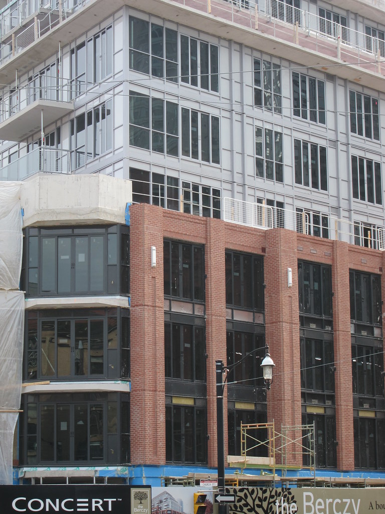
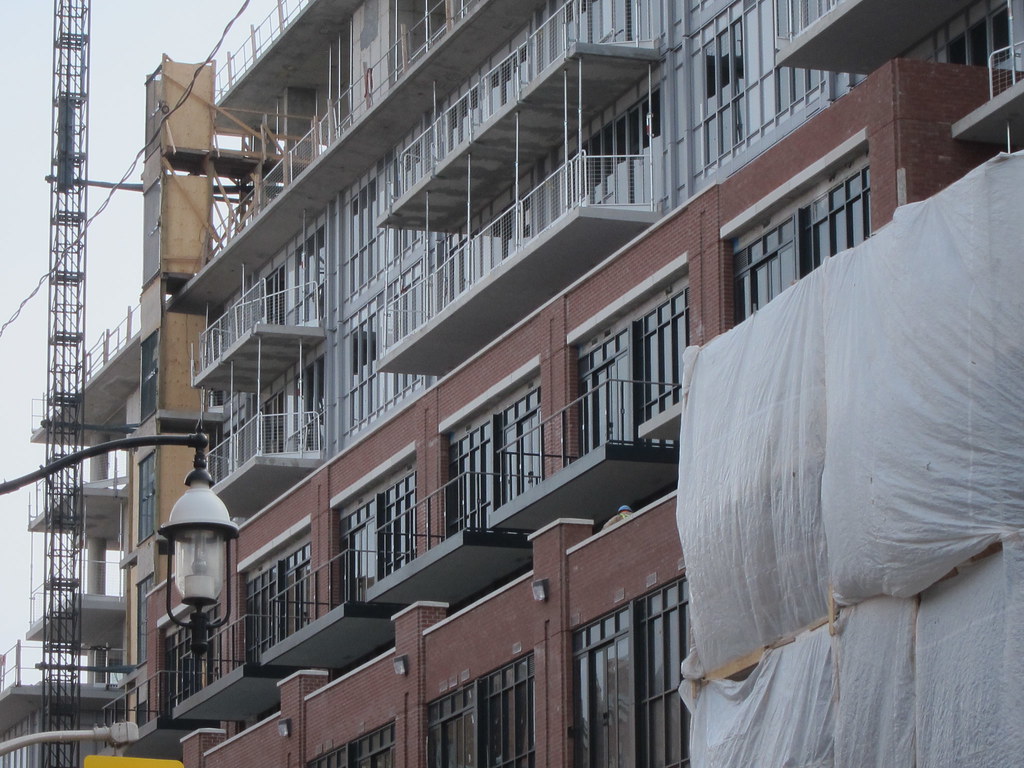
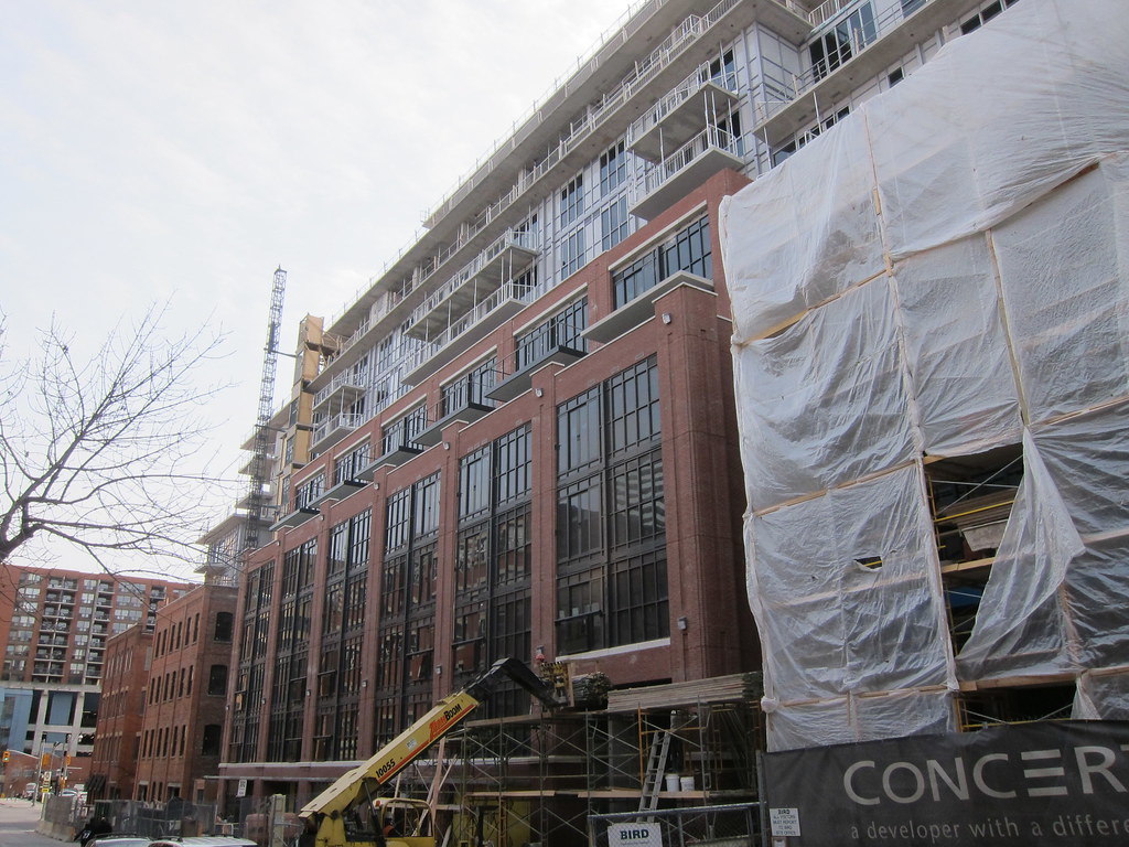
This project cannot be said to be a disaster, but this corner should have gotten something a lot more sophisticated given its prominence. The podium is the most attractive part of the building, but it doesn't even fit in with the traditional streetscape on Front Street in spite of making an effort. It doesn't match the roofline of the neighbouring blocks on Front Street, which have mansard roofs. The brick facade looks neither modern nor traditional, and doesn't even make references to the architectural traditions of the area.
