iDANIEL
Active Member
I love TAS so much. The library and this development will kick off this side of Dupont in a similar way that Bianca will east of here.

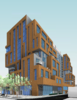


The third and fifth images above look like the back to me, and yet those will be facing the rather cool new park that Metrolinx is cooking up for the Davenport Diamond grade separation. The building's east wall should be designed to engage with it, not ignore it.
42