You are using an out of date browser. It may not display this or other websites correctly.
You should upgrade or use an alternative browser.
You should upgrade or use an alternative browser.
- Thread starter urbandreamer
- Start date
UtakataNoAnnex
Senior Member
...and the developers, along with the architects, likely didn't want to have a podium that both distracted from the both heritage portion as well as the tower itself, for good or bad.You know I was thinkin’ the exact same thing. And while that portion of TD Terrace kinda does just makes the rest of the building on the ground level look kinda off to me. But in my opinion, it does not ruin the overall look/aspect of the building itself. Just that specific area along Front Street, but I can see why you don’t like it all that much.
skycandy
Senior Member
Sunrise at B and Y…
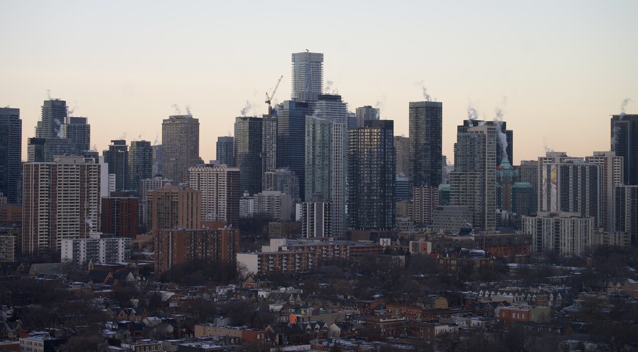
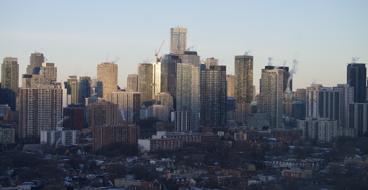
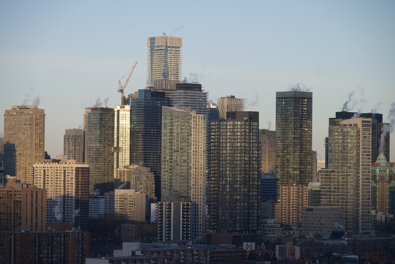
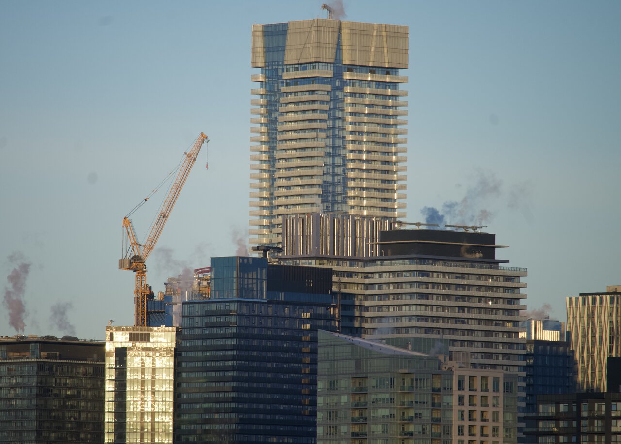
The vast ‘wall of windows’ at B and Y.
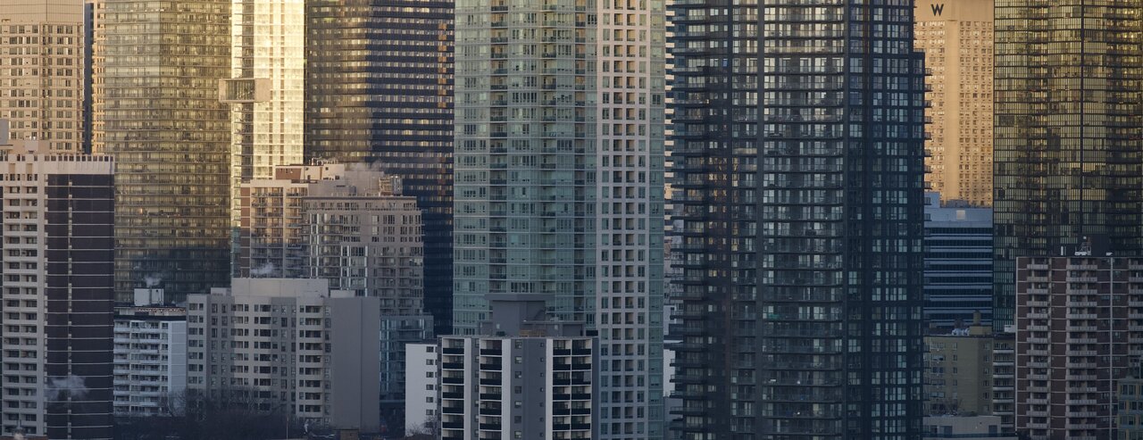
The vast ‘wall of windows’ at B and Y.
BloorMan
Active Member
On Friday, they poured the columns. These photos are from yesterday (Saturday). The workers were putting orange tarps on top of the columns. I notice that there is some form work going on lower down in the corners, where the diagonal beams are.
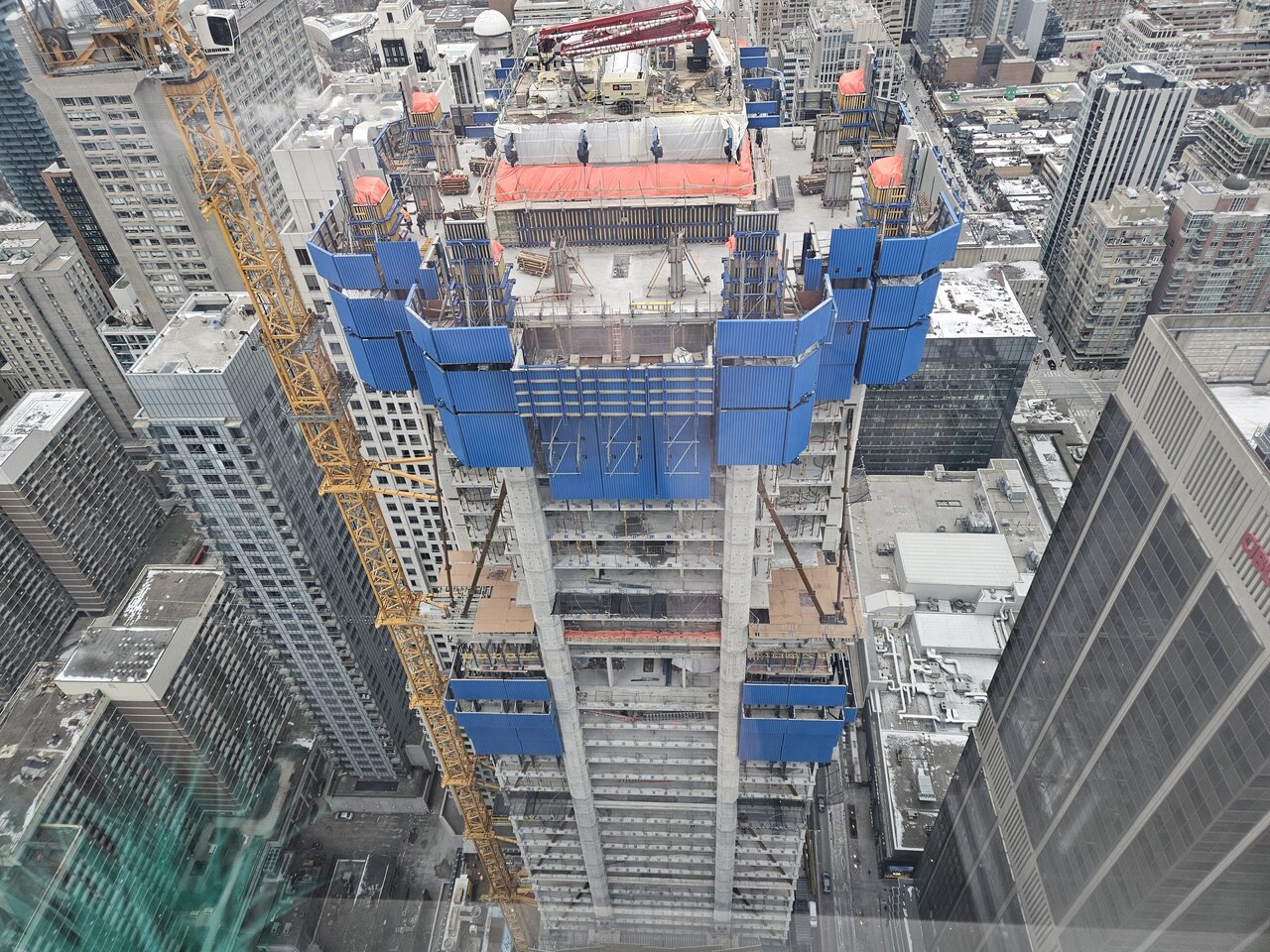
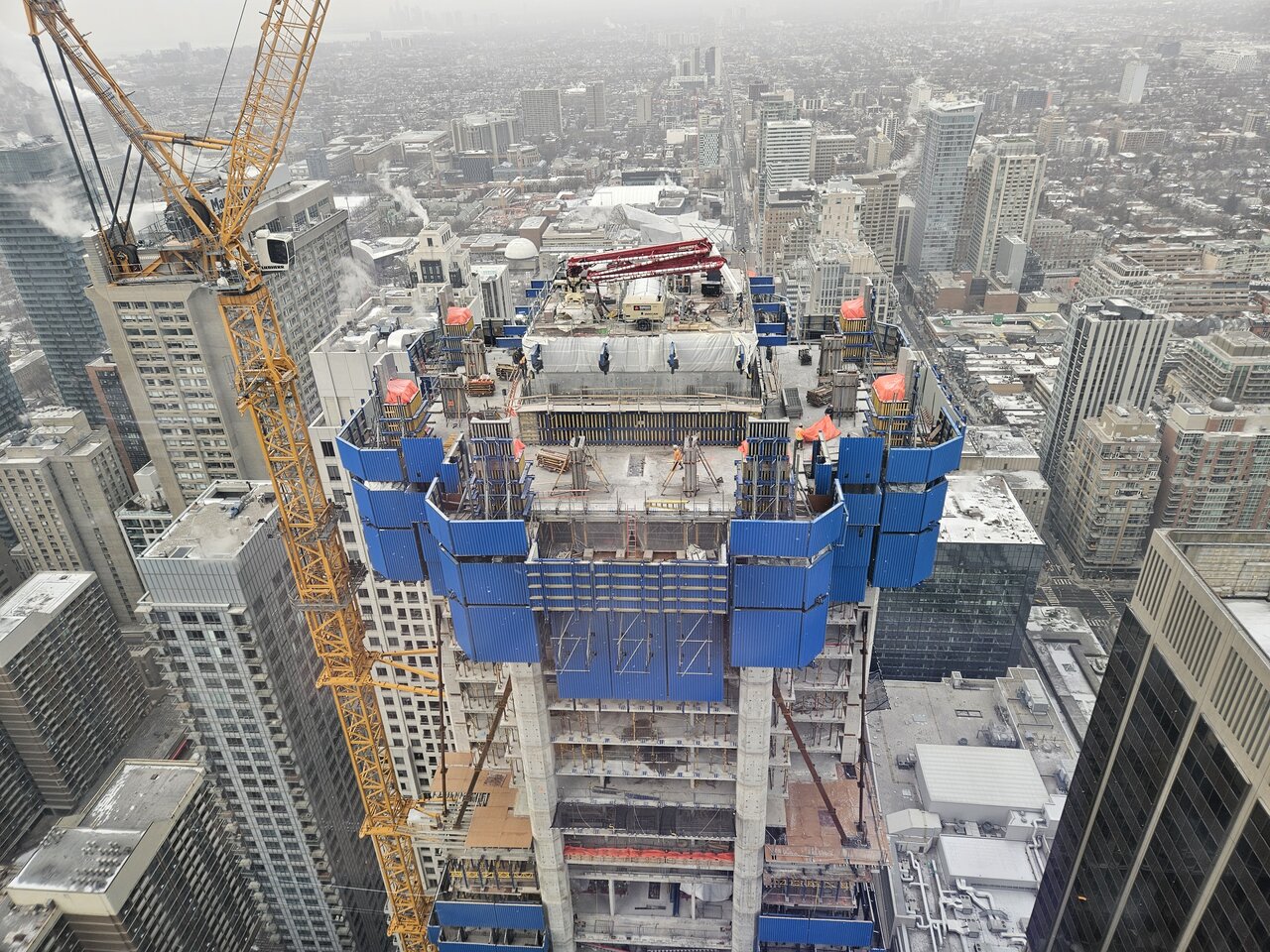
Last edited:
Civdis
Active Member
Has anyone heard what the receiver plans to do with the existing purchase contracts? We have heard nothing yet.
UtakataNoAnnex
Senior Member
...I am not sure how that works when the units looks like they're still being constructed. Unless, what we're seeing being built here is a 91 story empty shell or something.Has anyone heard what the receiver plans to do with the existing purchase contracts? We have heard nothing yet.
FastidiousHack
New Member
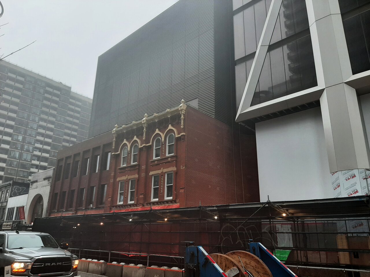
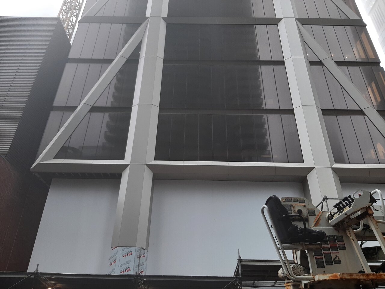
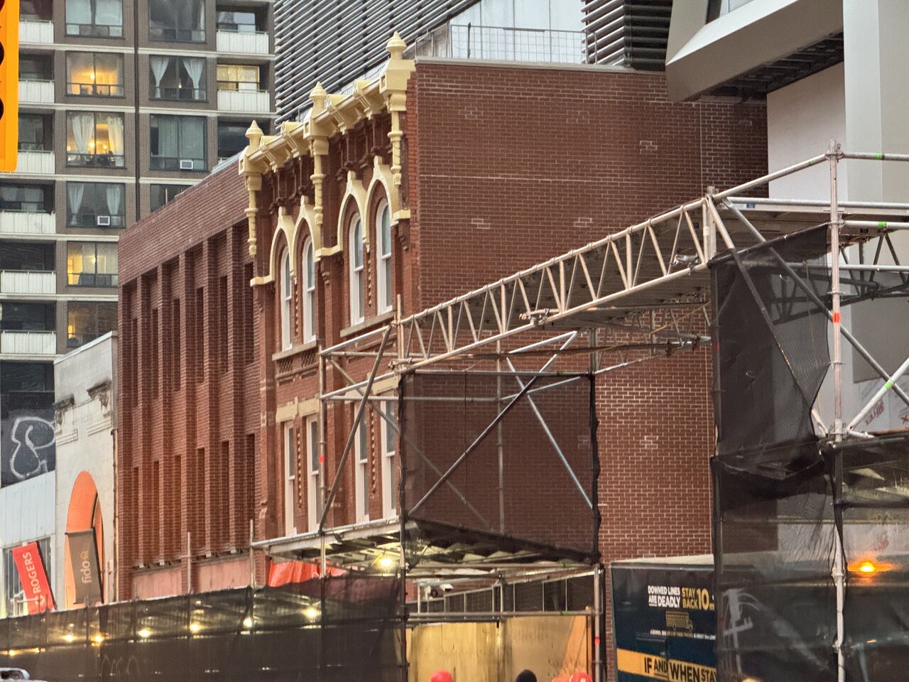
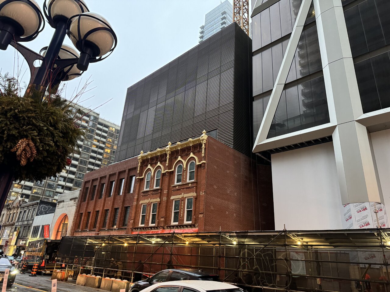
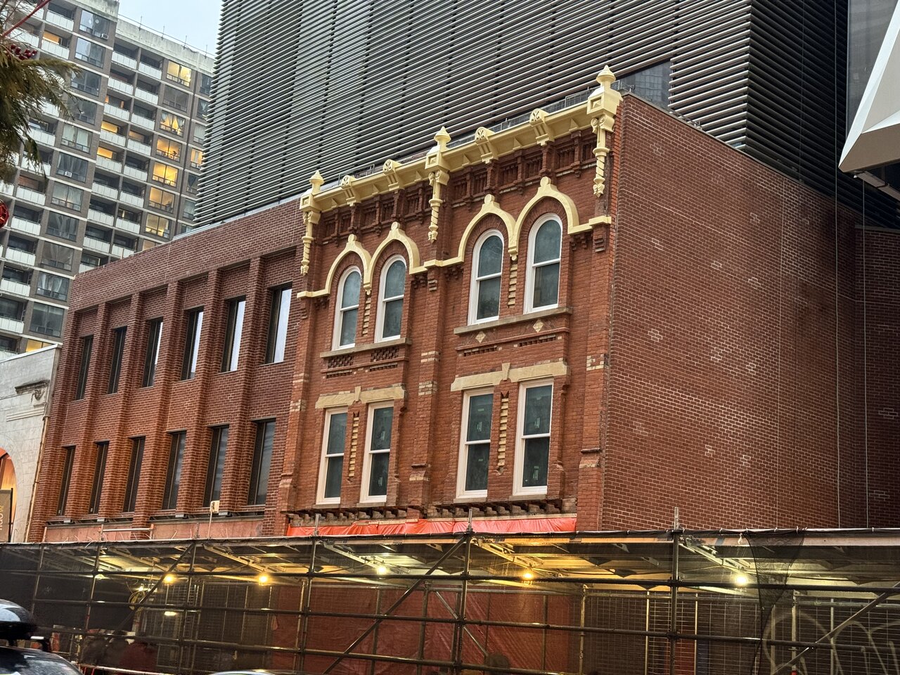
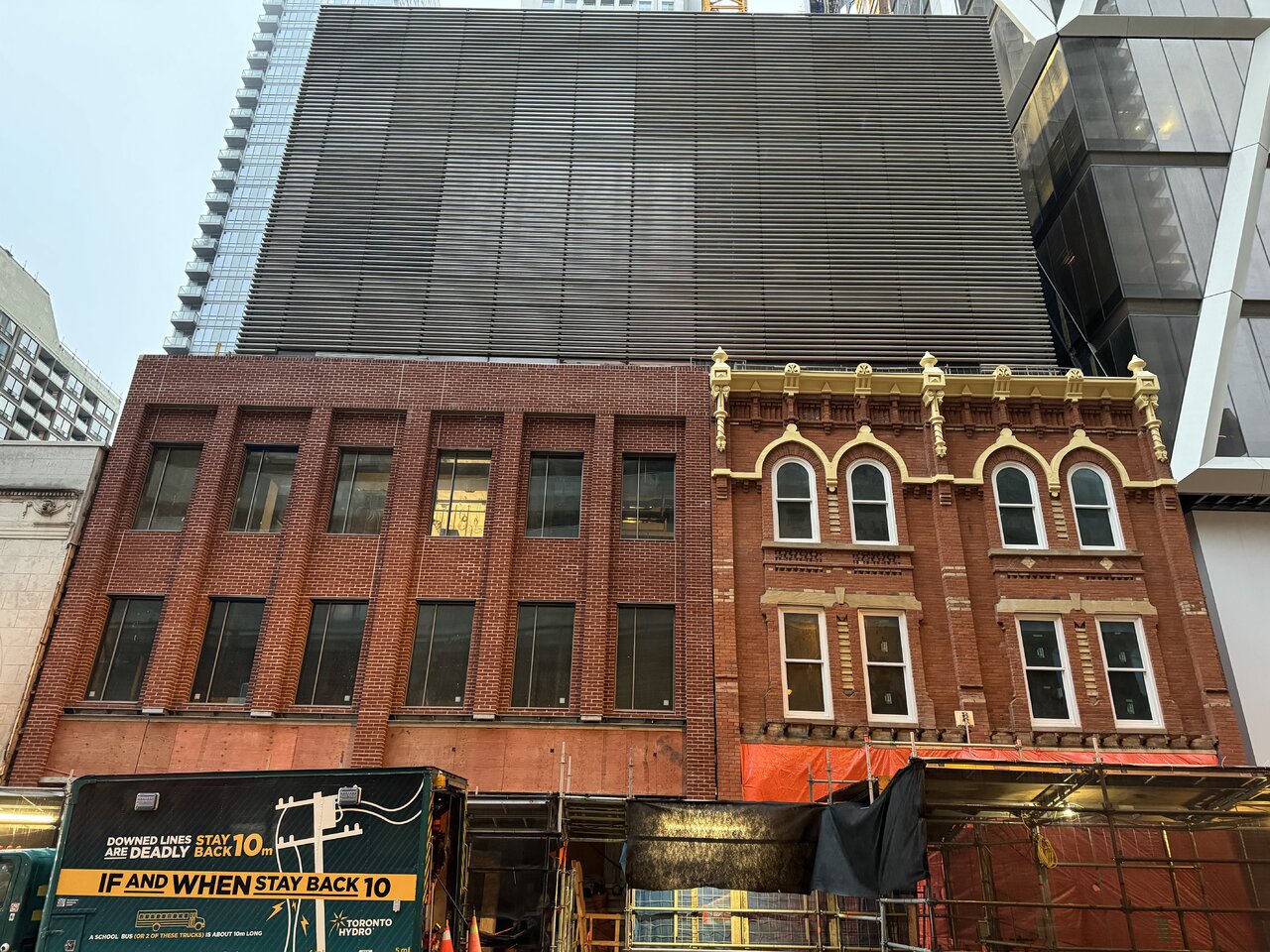
I don't think there's anything wrong with the colour, for me it's the rhythm of the window spacing.It just looks off.
The windows of the heritage structure are not spaced equally, they're spaced in groups of 2 separated by pilasters. The new facade has groups of 3, spaced equally. This is one of those examples where attention to a small detail can result in "respecting the heritage," even with modern materials, details, etc. Combine that with some kind of cornicing, and I think no one batts an eye at the colour.
BloorMan
Active Member
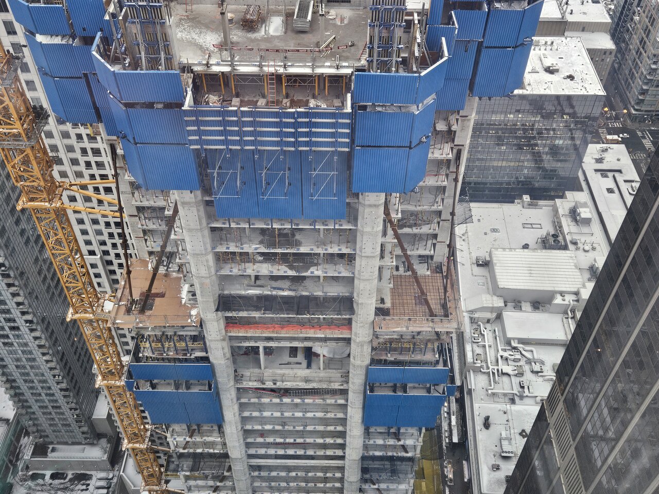
From today:
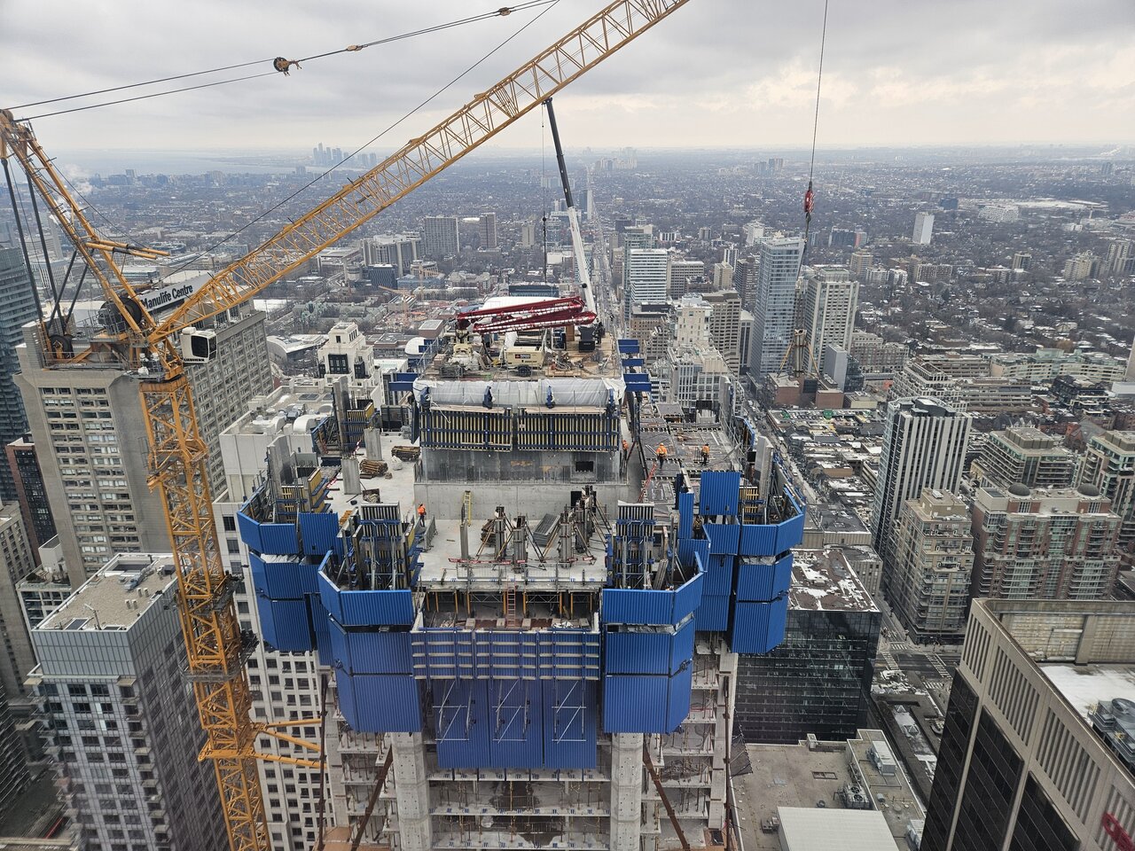
Rascacielo
Senior Member
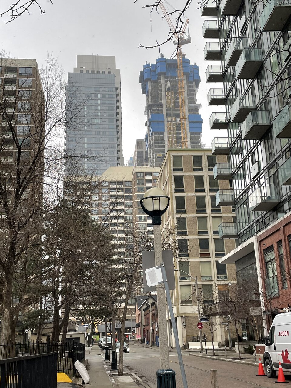
Today
BloorMan
Active Member
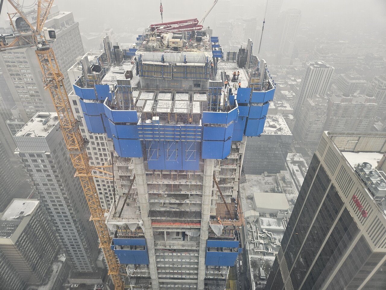
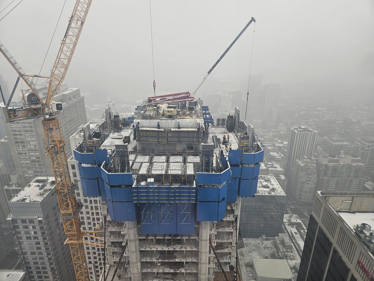
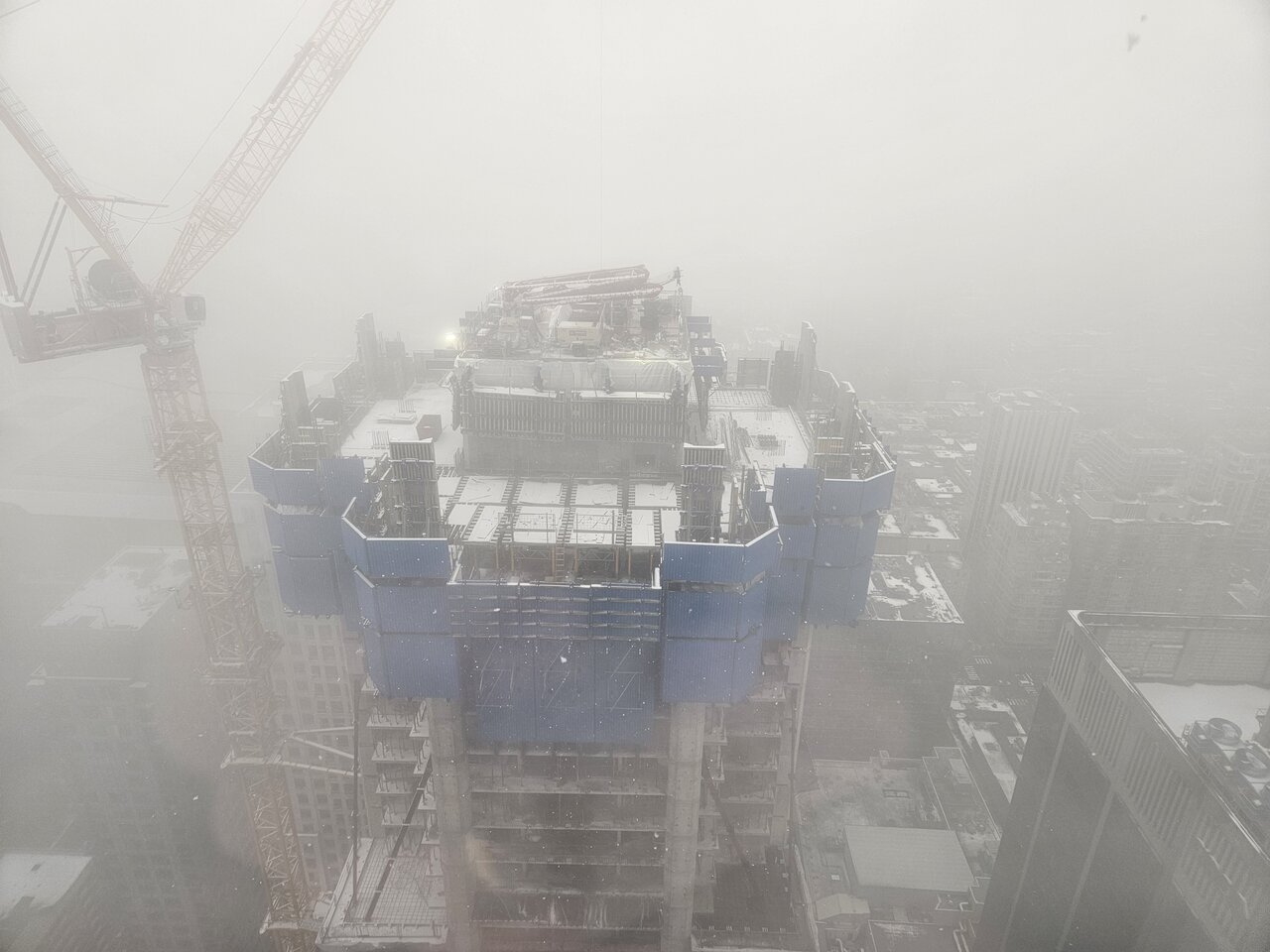
The weather wasn't too favorable for these guys today:
Benito
Senior Member
GenerationLee
Senior Member
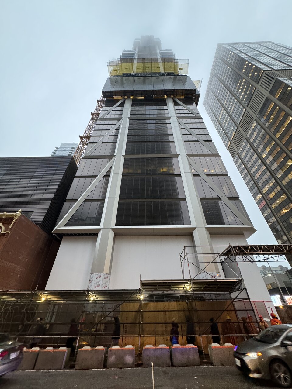
I took these today, just passing through.
The fog was quite intriguing for photographing taller projects like the one discussed in this thread.
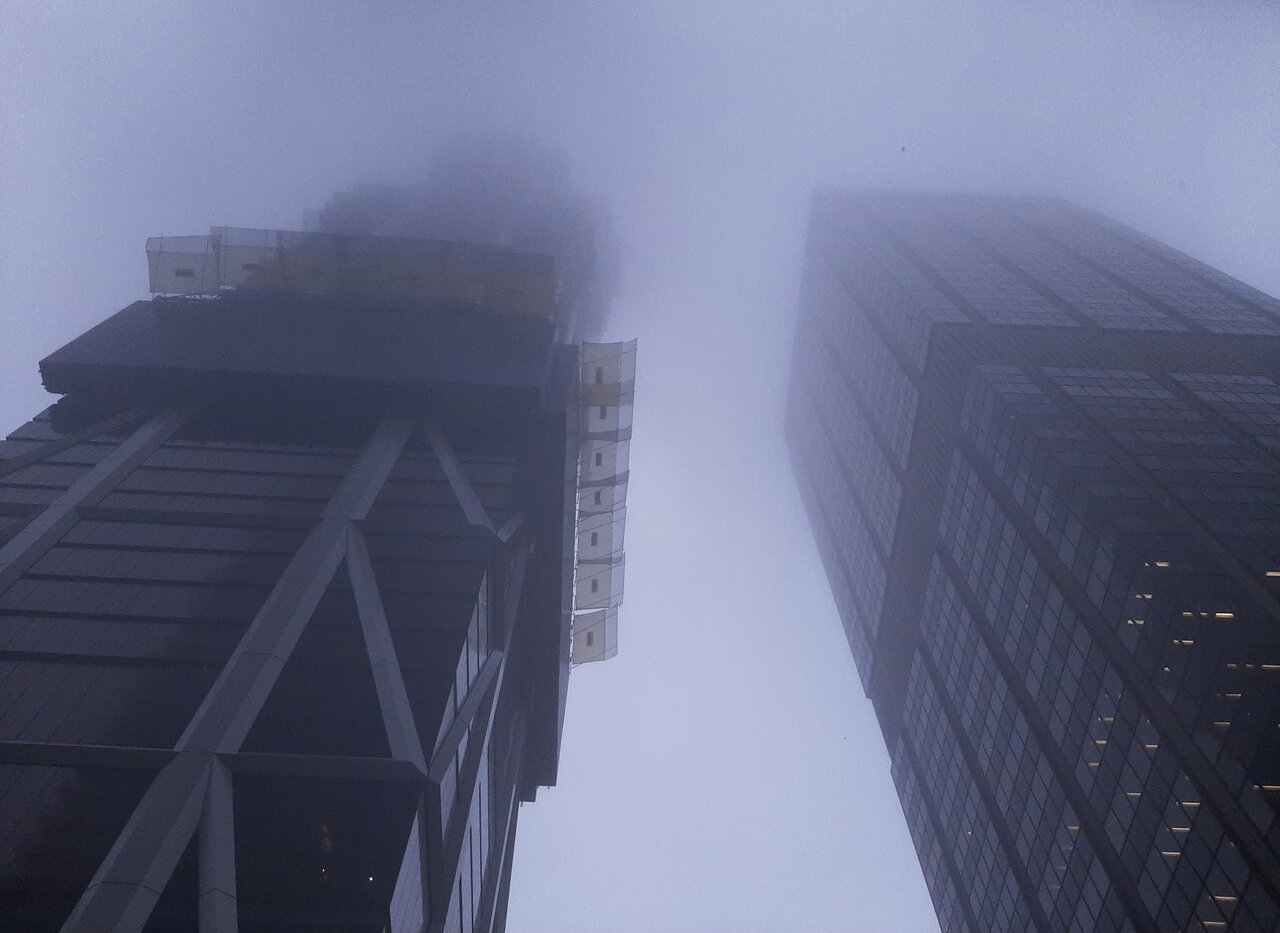
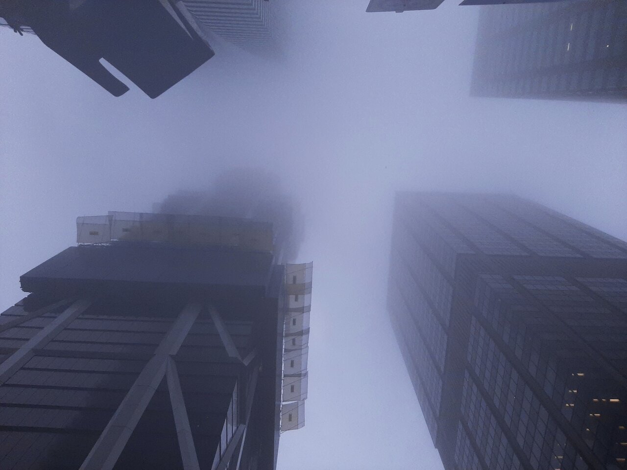
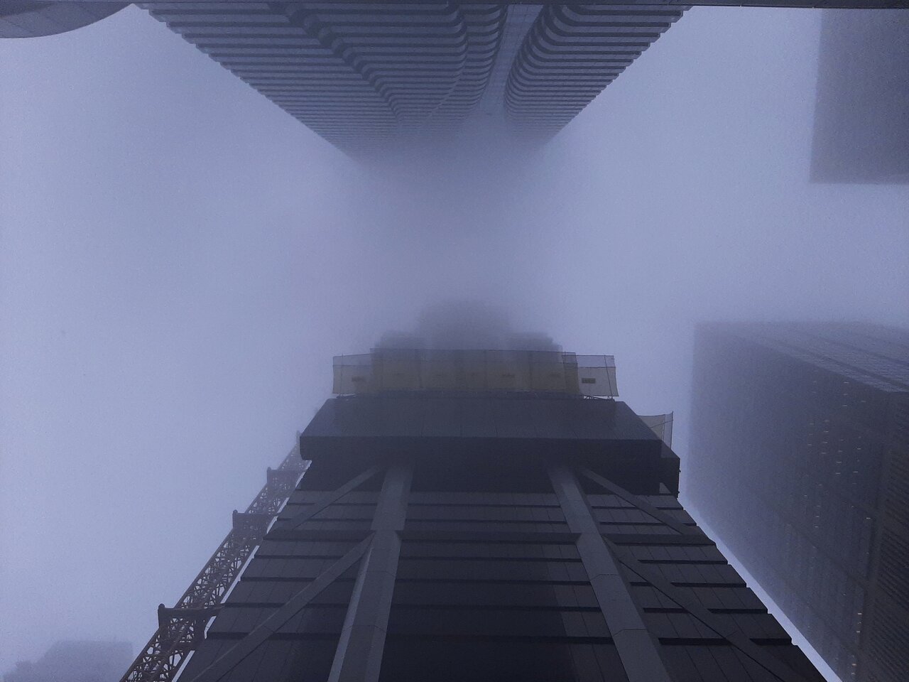
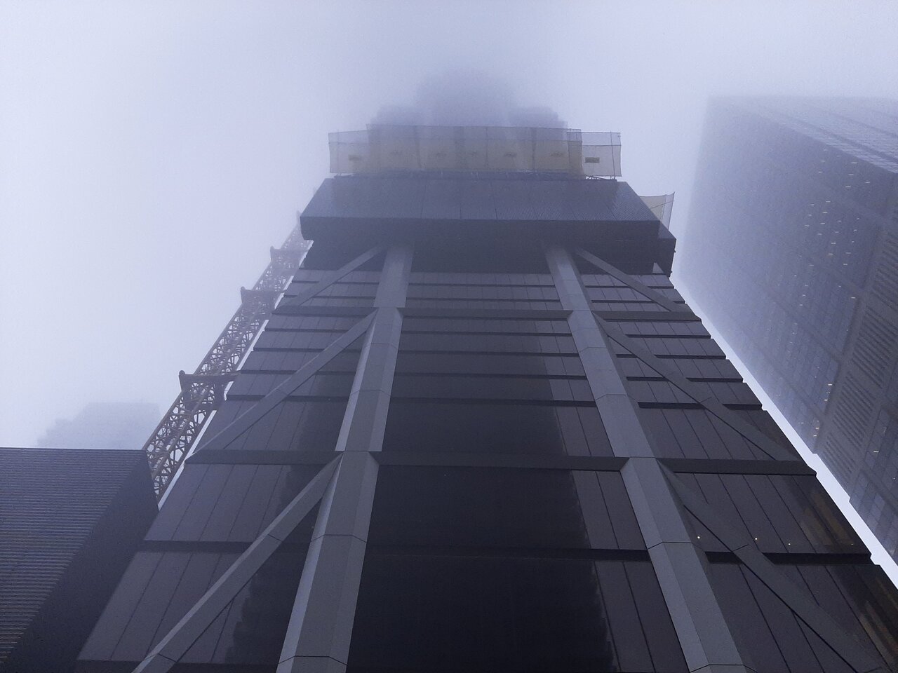
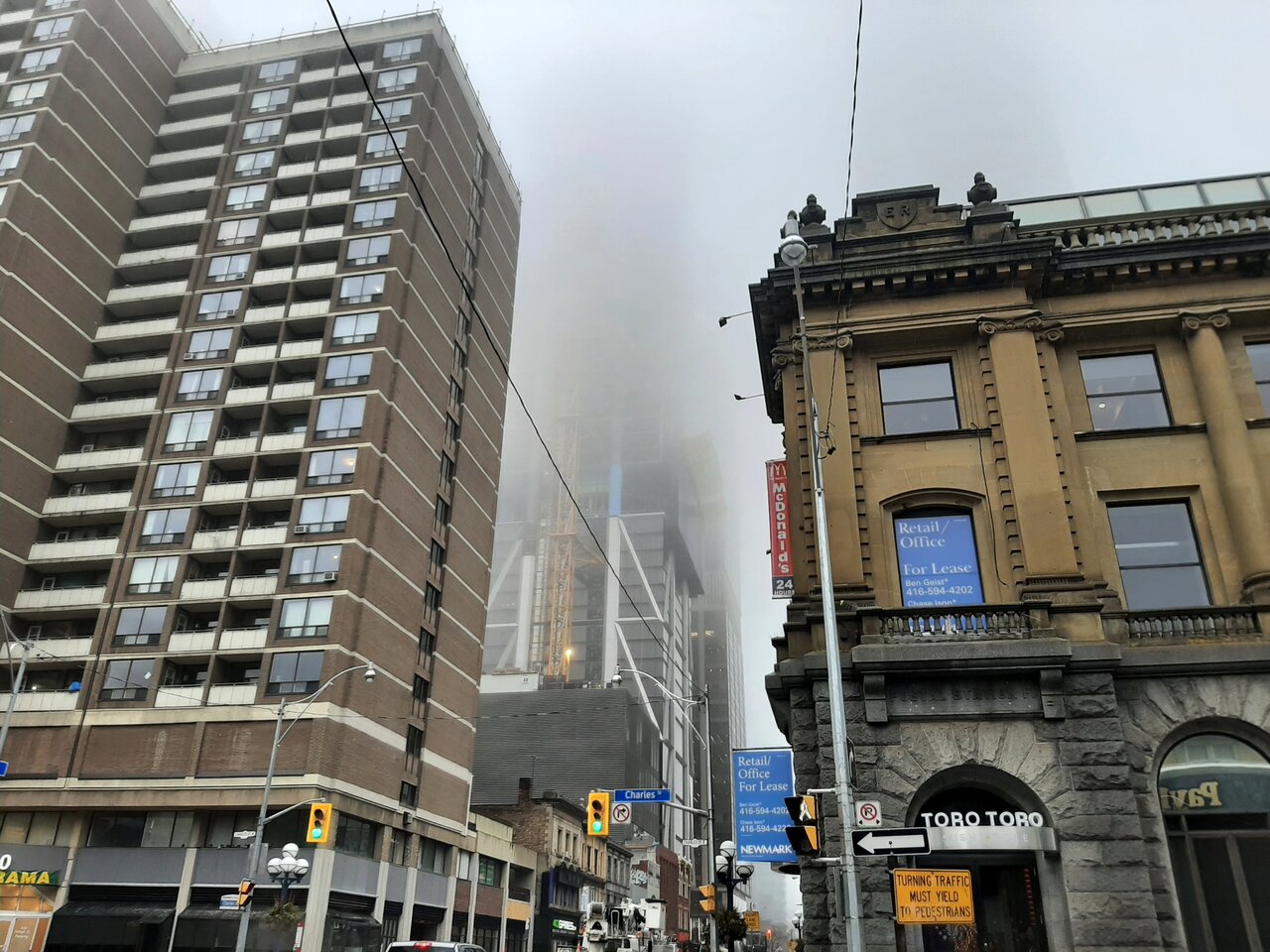
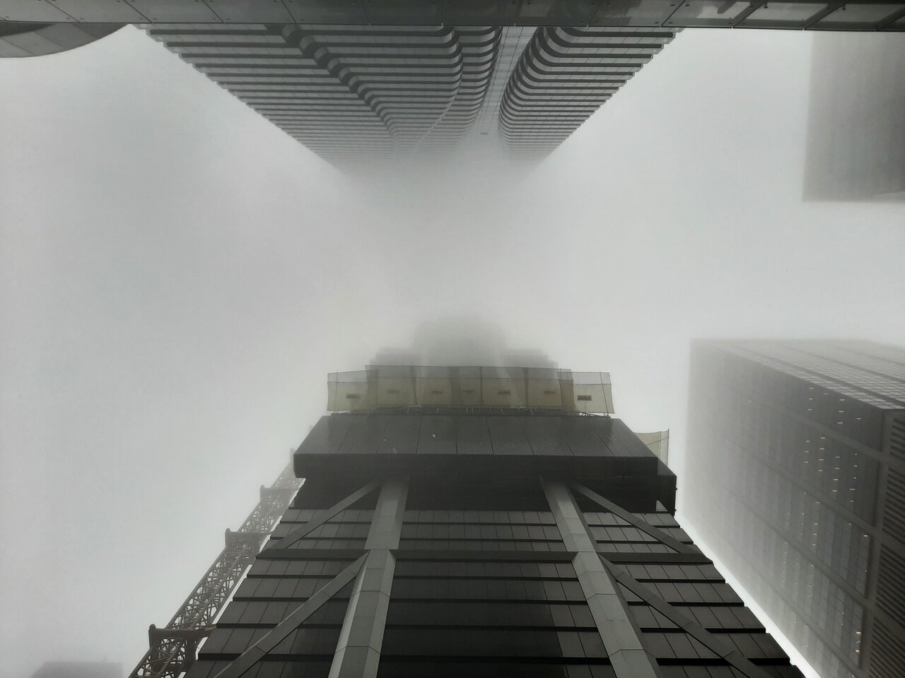
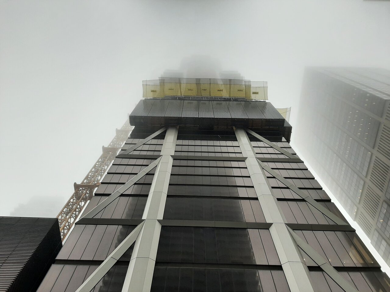
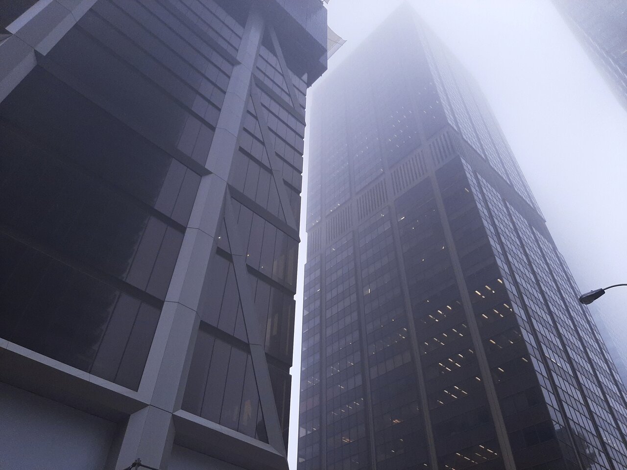
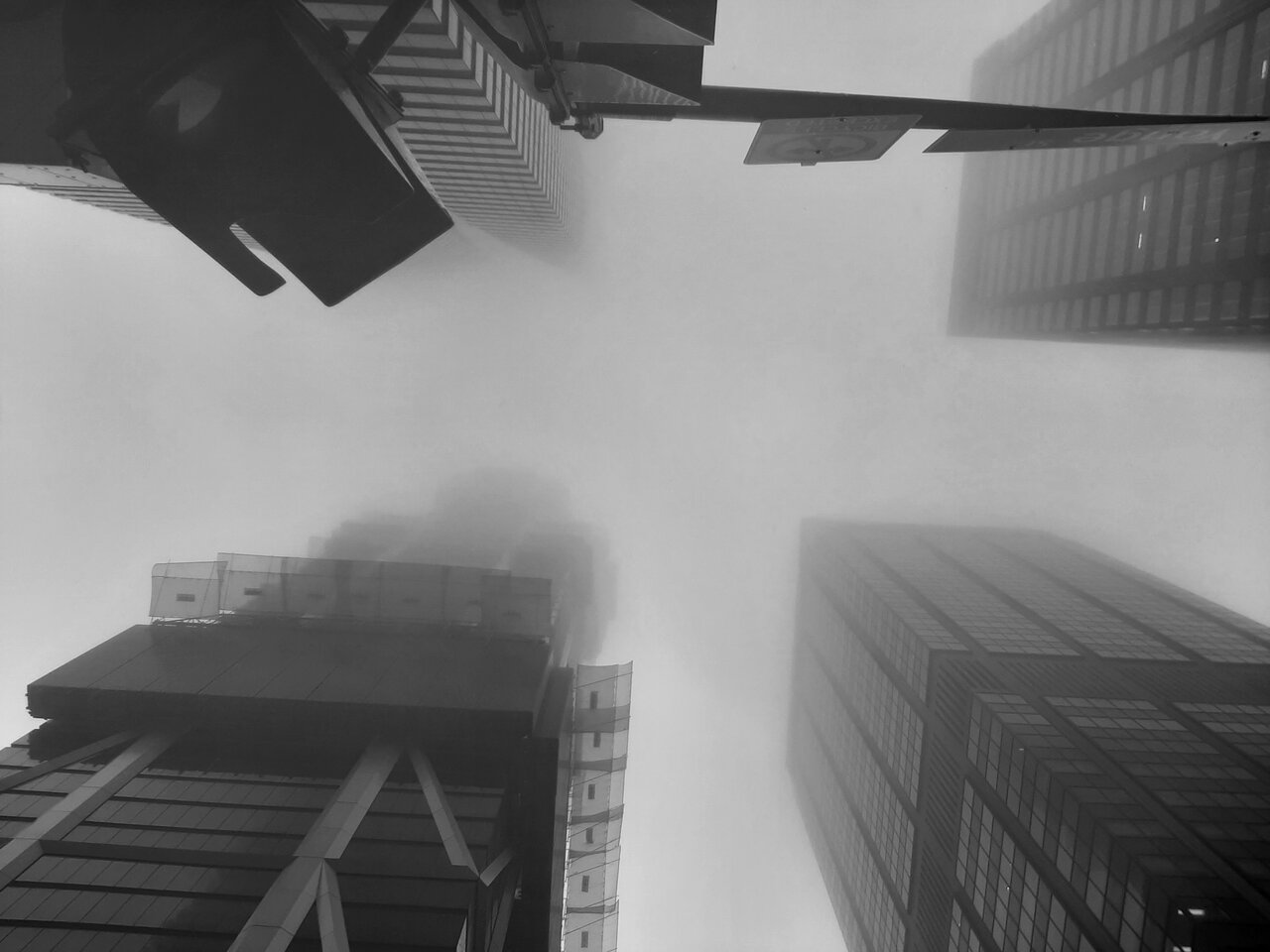
The fog was quite intriguing for photographing taller projects like the one discussed in this thread.
Last edited:
Rascacielo
Senior Member
That her face at first just ghostly ... turned a whiter shade of paleI took these today, just passing through.
The fog was quite intriguing for photographing taller projects like the one discussed in this thread.
View attachment 535055View attachment 535056View attachment 535057View attachment 535058View attachment 535059View attachment 535060View attachment 535061View attachment 535062View attachment 535063View attachment 535064
View attachment 535067
Johnny Au
Senior Member
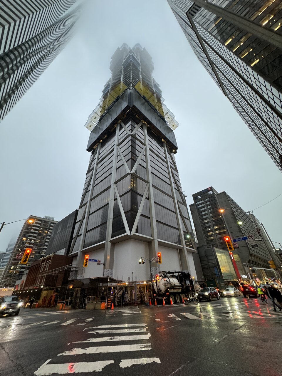
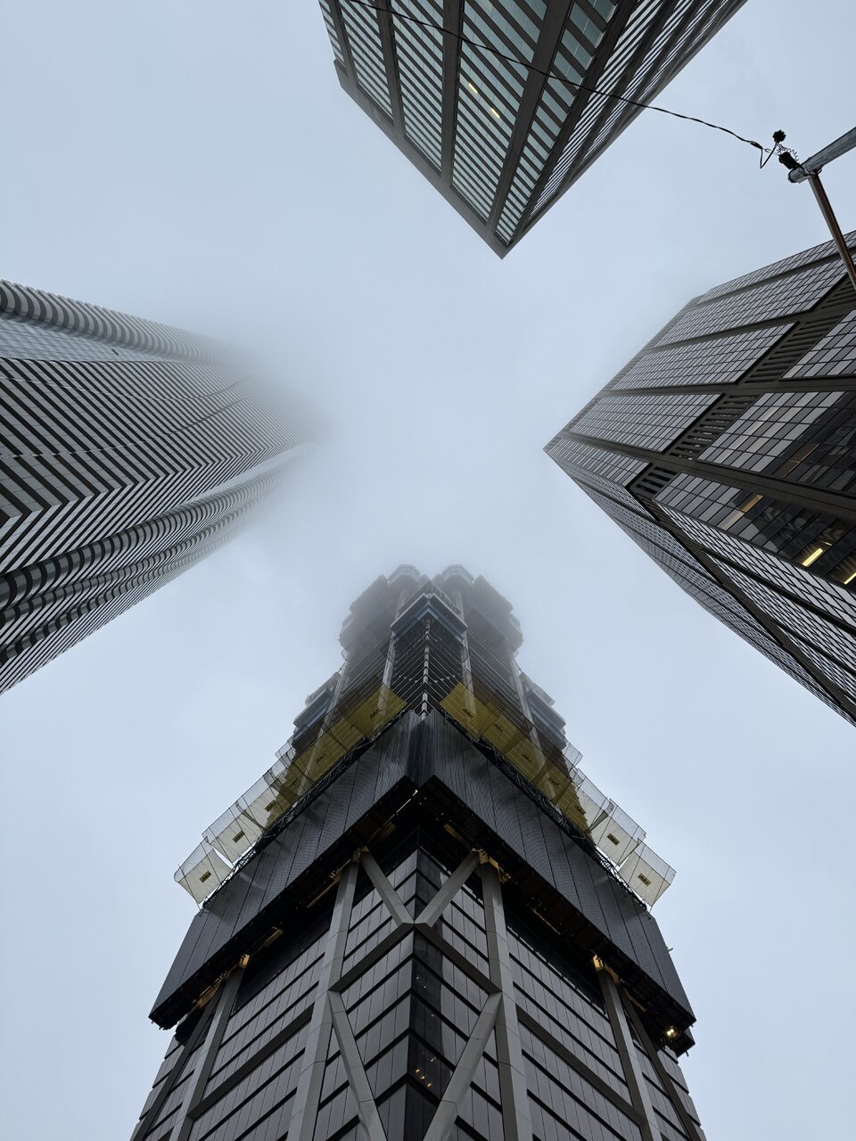
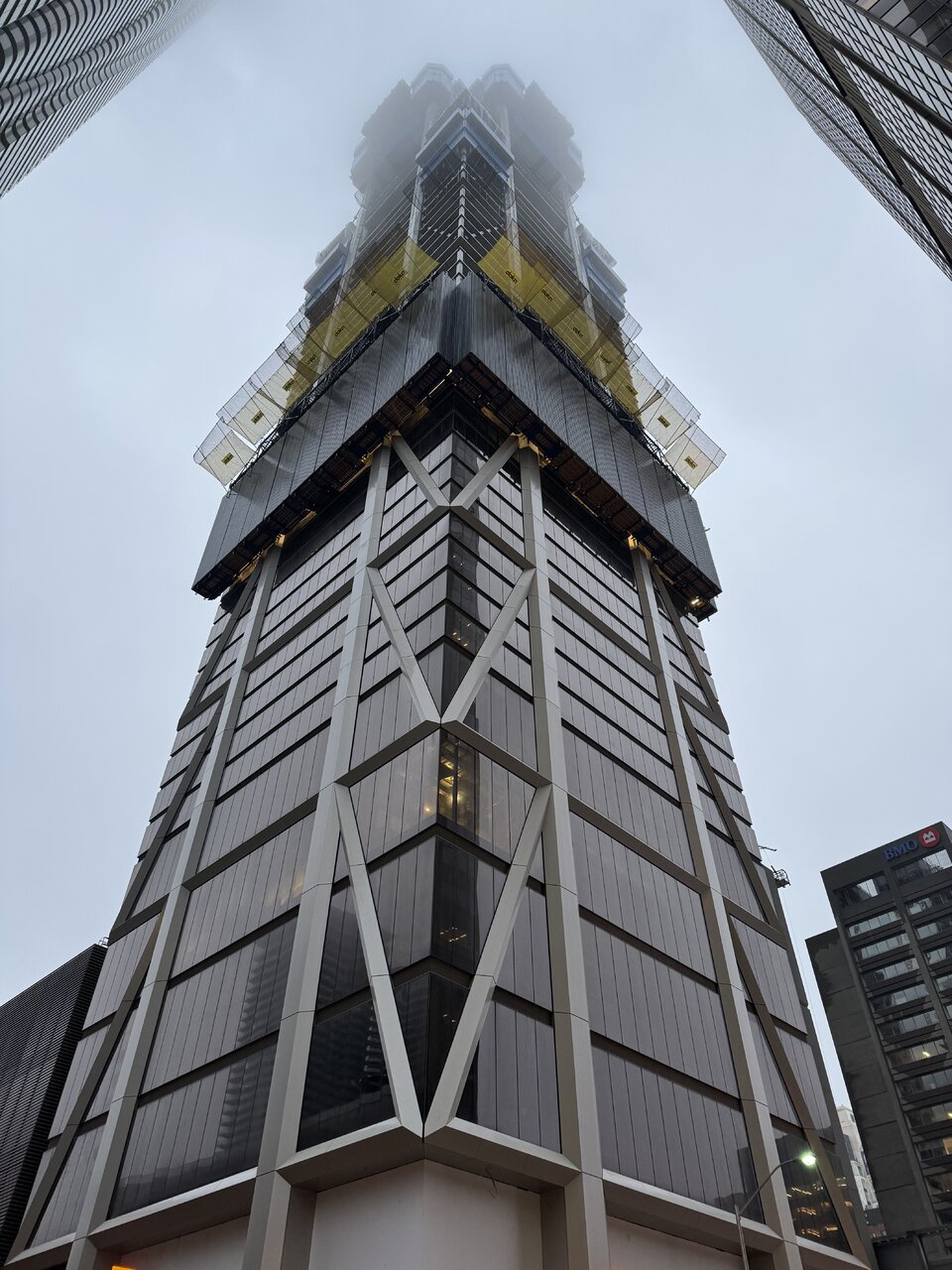
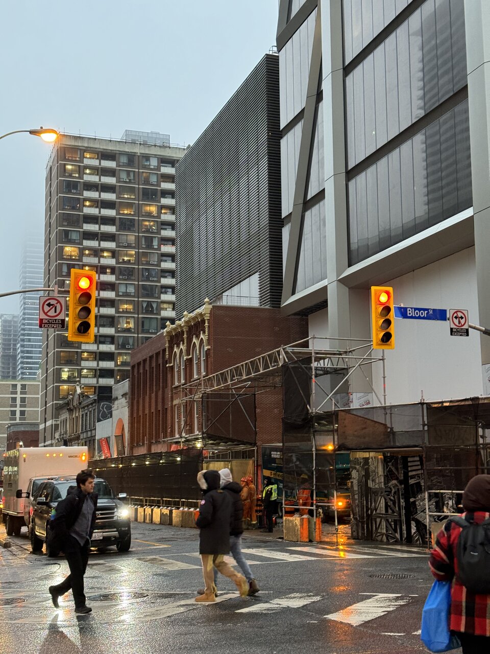
January 24, 2024:
Lyphe
Active Member
Hmmmmmm ...
Feel like going with a British racing green or another dark accent color for the currently painted yellow trim on the heritage building might have worked better.
The yellow feels a bit off there ... will need to see it in person.
Feel like going with a British racing green or another dark accent color for the currently painted yellow trim on the heritage building might have worked better.
The yellow feels a bit off there ... will need to see it in person.