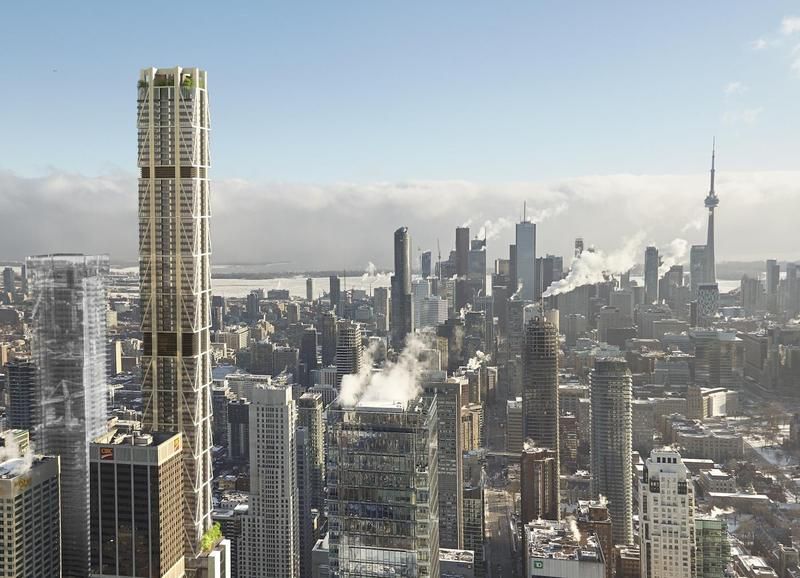
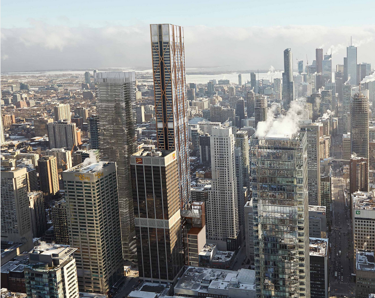
The crown looks great, it actually plays off of Uptown Residences crown a bit, but executed on a much larger and grander scale. And the roof garden definitely screams amenity space of some sorts, with massive roof fins to protect those spaces from winds at those heights - hopefully making it habitable. If that is the case, it will be a spectacular space.
I was going to mention this earlier; this is more or less how the crown on Uptown should have turned out.
 
Yes I agree, the fins on the Uptown should have been much more prominent as in the renderings.
 
While I still miss the diagrid pattern, the top of this new iteration kind of makes up for the loss.
 
I can't say I like the base as much as the previous design, but the roof now looks like it may hold an amenity space or, this is just wishful thinking, a restaurant/public observation deck.

5048-56837.jpeg

I wonder what kind of trees they'll plant that will be able to stay that green in the middle of winter.
 
This crown provides much more of a 'moment' to the structure. This is going to be the tallest building in the uptown cluster (yeah, in the whole country too) so I was hoping for something a little more dramatic than a squared off cap. It could still be pushed a little more?

I like the use of Hue's and really appreciate the strong vertical - almost gothic buttress-like - effect of the grid columns.
 
I like a lot of the new details, and definitely think this is a big progression from when the hanger design was first introduced.

The roof is excellent, and the renderings of how it interacts with Yonge street are also great. I wonder why there's nothing to show Bloor at street level yet.

The one thing that does turn me off, however, is the colour palette. I don't know why that had to change with the design. Personally, I would much prefer this new design in the same warmer redish hues of the former design, rather than beige. That corner has plenty of beige and brown already.
 
The one thing that does turn me off, however, is the colour palette. I don't know why that had to change with the design. Personally, I would much prefer this new design in the same warmer redish hues of the former design, rather than beige. That corner has plenty of beige and brown already.

TBH I actually like a more subdued palette - it's more traditionally Foster. As much truth as there is in the statement that we have too much grey in the city, F+P can work wonders with that colour (think of all the truly iconic structures by that firm and think how many of them are grey?)

AoD
 
I like the old one because it was a thick building with presence. The diagrid to me is more pleasing than the hanger design today.

(I like buildings that look like office towers....)
 
The floorplate has changed, giving it a "skinnier" look.

It still looks around the same height compared to the One Bloor East ghost put in the render.
 

Back
Top