BloorMan
Active Member
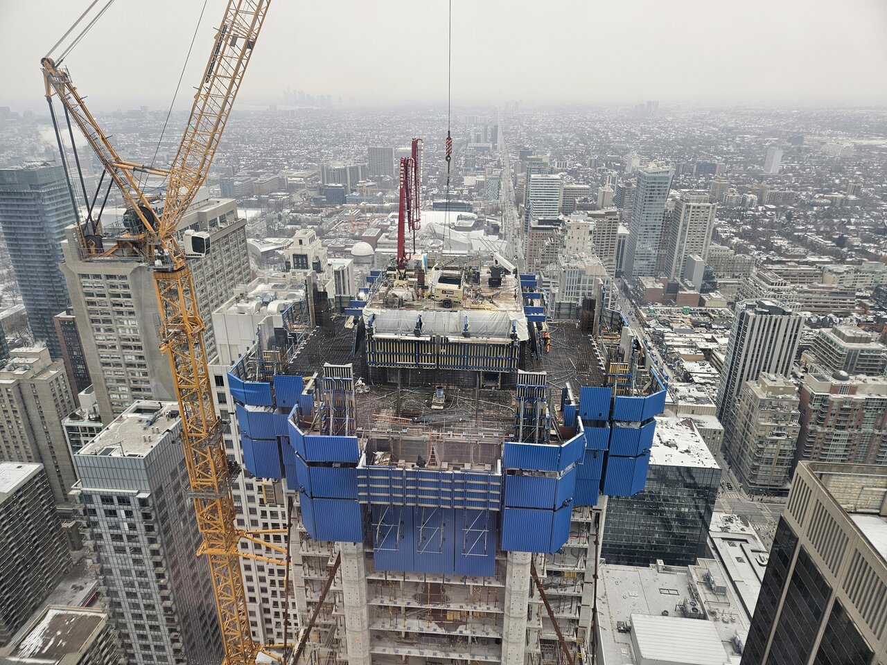
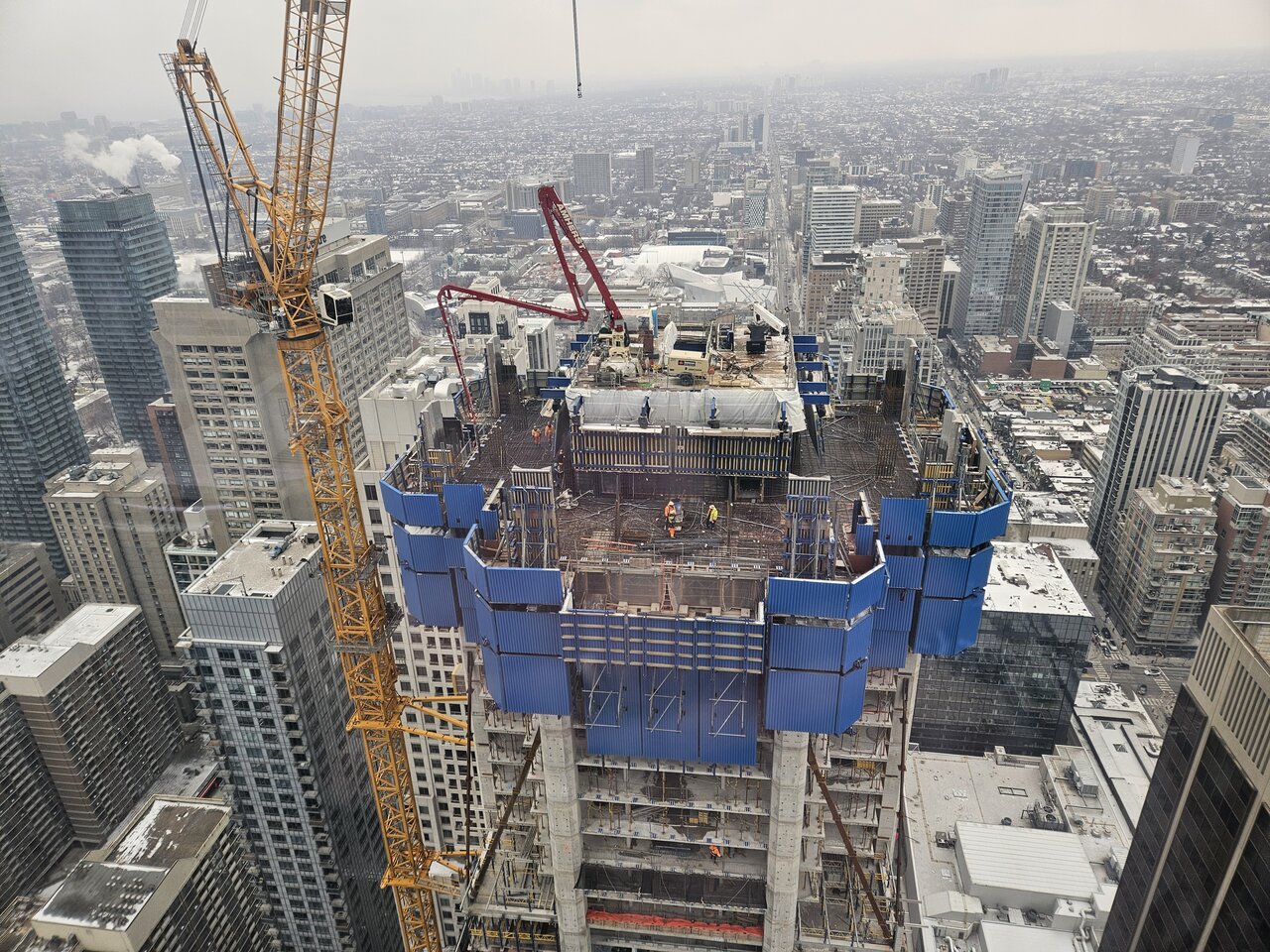
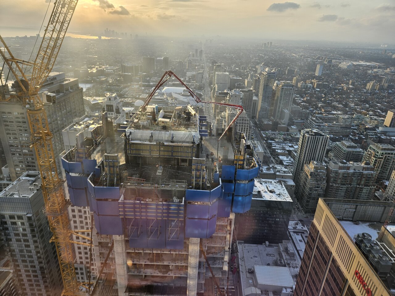
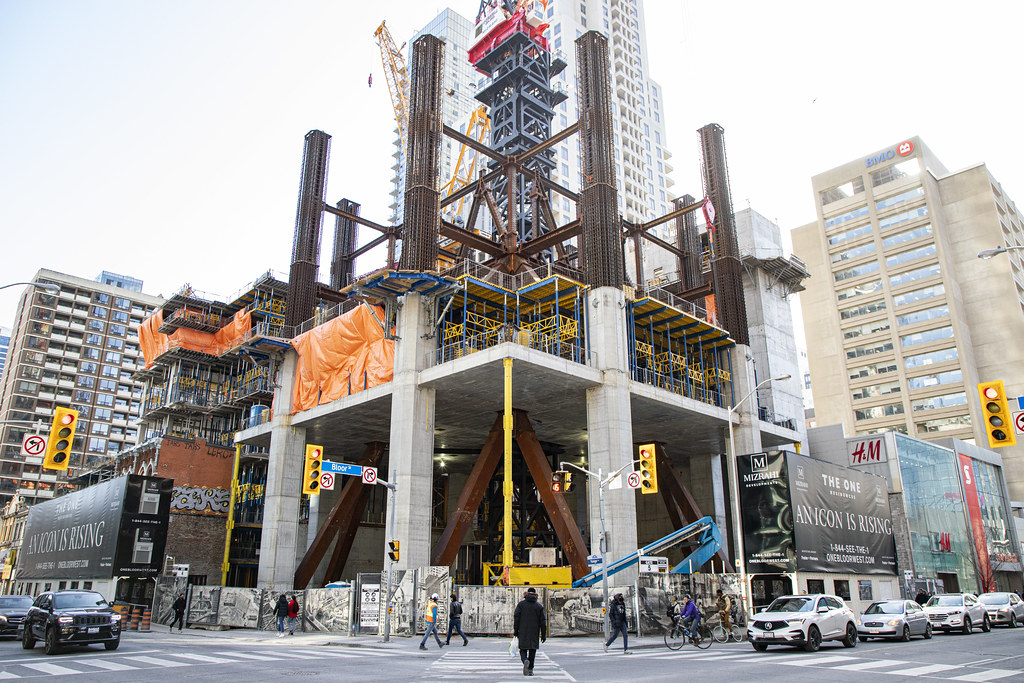
Another floor pour today:


Makes the old Hew’s Kitchen buildin’ stand out, but that shade of brick is….Somethin’ alrightWell, that color of brick and mortar certainly was a choice....

Well, that color of brick and mortar certainly was a choice....
Looking forward to the comments on this one. It looks very 70's suburban office building to me...
It just looks off. It’s not bad or anythin, but I’d figure it would look the same as the original build, but I guess they couldn’t find the same brick color and chose……thatI'm kind of scratching my head with the new brick and the heritage portion here. The new brick in my opinion works well with the upper metal section, and I wouldn't expect them to fully mimic heritage but ....
The question then becomes do they mimic the heritage colour with the risk that potion being lost in the rest of the design? Or do they make it a different colour so the heritage portion is more readily emphasized? I think that's a really tough call for developers who are being honest. And honest, in that there is no apparent cheapening that's going on here. Perhaps they could of done better, but in the end...I don't think this is really going to distract from overall feel and beauty of this project. And in someways, this does seem to be a similar conundrum with the "dull" podium portion of the TD Terrace, I gather... /sighI'm kind of scratching my head with the new brick and the heritage portion here. The new brick in my opinion works well with the upper metal section, and I wouldn't expect them to fully mimic heritage but ....
You know I was thinkin’ the exact same thing. And while that portion of TD Terrace kinda does just makes the rest of the building on the ground level look kinda off to me. But in my opinion, it does not ruin the overall look/aspect of the building itself. Just that specific area along Front Street, but I can see why you don’t like it all that much.The question then becomes do they mimic the heritage colour with the risk that potion being lost in the rest of the design? Or do they make it a different colour so the heritage portion is more readily emphasized? I think that's a really tough call for developers who are being honest. And honest, in that there is no apparent cheapening that's going on here. Perhaps they could of done better, but in the end...I don't think this is really going to distract from overall feel and beauty of this project. And in someways, this does seem to be a similar conundrum with the "dull" podium portion of the TD Terrace, I gather... /sigh