We've got a front page story up on the recladding here.

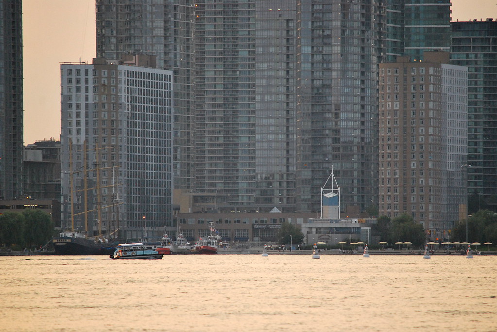
Here's the receding-evening-light-but-not-quite-sunset view of these buildings from Queens Quay a few evenings ago:

42
I dont know how I missed this .. but that contains more information then they provided to the residents. Especially the 5 year plan to renovate all units. We were told the units only get reno'ed if we move out, and we would have to take a new renovated unit vs having the existing one renovated. Infact - we were told construction would be done by November.
 
They have painted some of the grey portions of brick red. Not a fan of it. The red accents were fine as is. Now it just looks messy.
 
From July 30th:

DSC04229.jpg
DSC04231.jpg


42
 

Attachments

  • DSC04229.jpg
    DSC04229.jpg
    350.2 KB · Views: 1,050
  • DSC04231.jpg
    DSC04231.jpg
    365.9 KB · Views: 943
Not a fan of those new red panels.

Heck, I'd rather they just replaced the windows, painted the brick in one colour instead of multiple colours, and then just added interest in the windows like they did with the original red panels. But this is just becoming a mess now.
 
From a few minutes ago:

DSC04900.jpg
DSC04901.jpg
DSC04902.jpg
DSC04903.jpg


42
 

Attachments

  • DSC04900.jpg
    DSC04900.jpg
    369.4 KB · Views: 778
  • DSC04901.jpg
    DSC04901.jpg
    364 KB · Views: 781
  • DSC04902.jpg
    DSC04902.jpg
    375 KB · Views: 771
  • DSC04903.jpg
    DSC04903.jpg
    433.6 KB · Views: 774
Those red panels look haphazard and messy, they should keep them within the windows. It was fine they way they had them before, this looks a little too much.
I also noticed recently that they were replacing some of the windows with Juliette balconies on the lower levels.
 
Disagree. While a little red goes a long way in a new, well-designed project, a more liberal use of red to fix up a crappy, architecturally boring complex creates an eye-catching and bold statement. I'm all for this!

p.s. It's hilarious that people complain about so much grey, grey, grey...then we get some bold colour and people complain that it's now a mess. So should we be just happy with teeny, tiny bits of colour then?
 

Back
Top