To all those enthusing about an aged Uptown, take a walk down to the Cosmopolitan condo at Yonge and Maitland to see for yourself how precast ages. It ain't pretty. There's nothing romantic about precast concrete, new or old.

I know what you mean but.... people always felt the same way about old brick townhouses and old stone buildings which had their outsides blackened by the Industrial Revolution. History really does repeat itself. In hindsight I don't think we're going to mind those precast beasts we're building all that much. We will in the way we regret all architecture, but not in any way we need to be alarmed about.
 
From AndrewJM3D at SSC:

4613861765_b2eeb4f0af.jpg


Criticism of the pre-cast aside, I've no doubt that this tower will look quite pretty from a distance.
 
Last edited:
i think most of the aesthetic shortfalls of Uptown could have been easily mitigated with the following (and relatively inexpensive) adjustments:

[A] Have the black granite wrap around the entire podium. It looks tacky and incomplete to have only the facade covered. Moreover, the windowless and formless precast podium is [1] overly bulky, [2] inconsistent with the the rest of the tower's shape and design, and [3] angrily looms over the low-rise and historic nature of Yonge.

and

Use black window frames instead of grey ones. Black compliments the colour of the precast far more than grey. Black matches (almost) everything. Black frames would have also matched the podium, consequently tying various sections of the building together.

Whether my suggestions are indeed overly expensive or the developer and/or architects are simply unfamiliar with the elements and principles of design is uncertain. I do not think Uptown is an ugly building. I'm sure it will look relatively attractive (a 7/10?) when it is done. Still, I feel Toronto could have been given much more.
 
Last edited:
May 21st, more views under the Crystal Blu thread

Click on the thumbnail to enlarge, then click again on the image for full size.

 
Last edited:
^^^^ uptown looks like garbage in that shot :p! the plastic wrap thats everywhere looks so bad! But the granite looks good :D
 
^^^^ uptown looks like garbage in that shot :p! the plastic wrap thats everywhere looks so bad! But the granite looks good :D

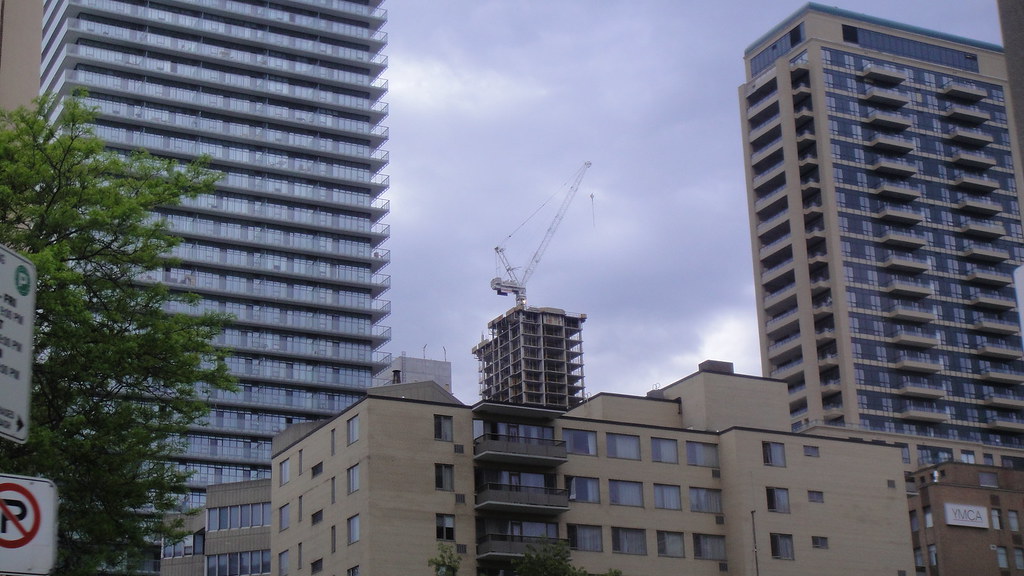
I hadn't been by in a while with my camera so I thought I'd grab a shot. We'll see how it works as it nears completion along with Crytal lite Blu's Balmuto Street frontage.
 
I'm not feeling those grey panels. Kind of detracts from the look of the granite; we'll see when it's done though.
 
Uptown rising behind Blu from Yonge Street south of College & north of College

Click on the thumbnail to enlarge, then click again on the image for full size.

 
Nice shot Cal! Really shows how Uptown has passed Crystal Blue in the height department!
 
Now that's a new kind of cool ! And, it's only going to get better with the new builds . Shots like this remind me why I love this city so much. TO was cool in the late sixties too, ( my Rochdale College interlude ), and I think it had something to do with optimism, the idea that anything is possible. Toronto's got mojo.
 
Last edited by a moderator:
Buildings like Manulife, Uptown, BSN, and One St thomas only add to that manhattan feel :D! Uptown res should look nice next to one st thomas.


Top out in a month and a half/two months?
 

Back
Top