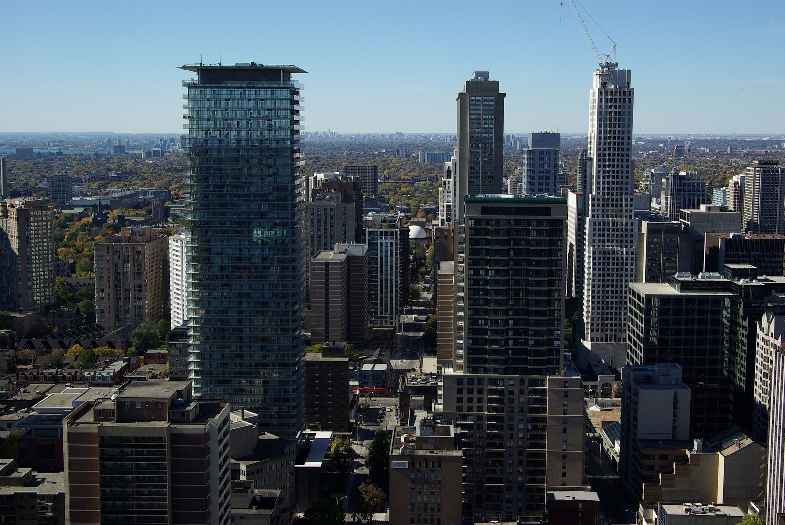
Spire and Murano both offer retail along the main streets, what more can they do? Although I don't like the idea of windows or flashing lights being passed off as art components, Murano also offers a good art piece of window wall above the retail area all along Bay Street which looks good by day, but admittedly isn't very successful by night.
There's a lot more to creating an engaging retail streetscape than just offering retail. The traditional retail strips like Queen West have lots of design elements that many new condos lack. Things like vertical massing to visually break up of the building into smaller chunks, store entrances being recessed instead of flush with the front wall, narrow storefronts, taller podiums to enclose the street, a change in material between the first and upper floors, prominent signbands, etc. Basically, as a pedestrian, you have to be looking at something new every 20 feet or so to stay interested, and the emphasis at street level should be on the stores. One of my pet peeves is long, unbroken horizontal lines on podiums, something architects love right now.

There are lots of examples of beautiful towers that fail at street level and otherwise ugly buildings that excel at it. For all its faults, Toronto Life Square actually does a decent job of the Yonge St retail streetscape. So do the Quantum towers at Yonge and Eglinton, although i don't like how they did their signbands.
 
Last edited:
Fair enough, good points.
 
I can't speak for others, but I didn't mean the lack of retail was what irked me about CASA's podium in the urban context. Not at all. I mean, it's cool and dramatic and modern how it meets Charles Street, but there's such a striking difference in place-making, between something engaging like this:

vancouverolympicvillage.jpg


and something like this...

Casa2_Jan31-10.jpg

(Which many UTers feel a connection with because of how familiarized we are with CASA. But to a passer-by, it's not quite the same.)

And please don't bring up "oh, but at night it's so----". No. In terms of creating a sense of space and place, it does nothing.(Though it absolutely has "cool" factor which I quite enjoy about it.) Which I suppose can be blamed on the city's zoning and planning requirements because Charles Street badly needs wider sidewalks and a better "plan" to create a sense of space and place.

Anyways, back on topic. I shouldn't have made any direct comparisons in the first place!
 
meh, I'm not seeing the argument.

The picture you posted, while interesting, is really similar to what I see in the Casa picture - the difference clearly being everything was built up side by side and it's a pedestrian only street.

Given the context of the neighborhood, neither of those could be accomplished anyway.
 
Which many UTers feel a connection with because of how familiarized we are with CASA. But to a passer-by, it's not quite the same.)

I honestly can't see how neighbours and visitors can't turn their head to observe Casa's lobby, it's so eye-catching and visually pleasing, especially at night.

Also, that's an old photo from early last spring with those creepy, leafless, Poltergiest-like trees framing the view well before completion. The entrance is now finished, there's no construction materials & equipment about, granite pavers have been laid in front of the building/around the front garden and landscaping complete.
 
In a sense Spire has it right with the 'Casa-is-the-glass-Hudson's-Bay-Center' tack, but the building's outright sexiness and overall perfection persuade many (including myself) to overlook such faults. The problem with Spire's logic is that Charles is far from fully formed and assessments of its success are based on what information we have currently. Posting pictures of the Olympic village won't help any argument, positive or negative, as there are no plans to brick over the street and convert it to a woonerf.
 
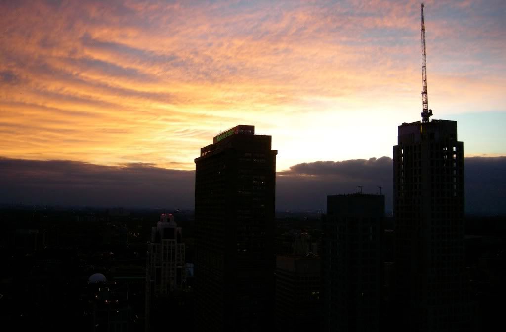
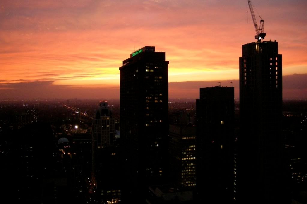
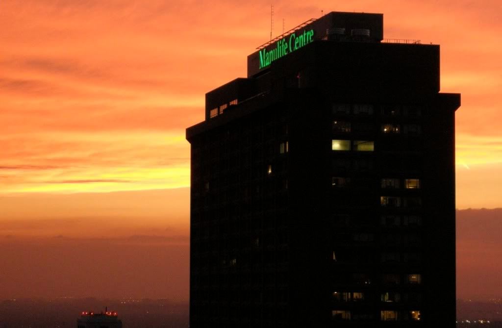
Was it Wednesday evening when the sky appeared to be a pink haze? Looked fantastic, but my crappy camera failed to get the colouring right.:( Last night (1am this morning actually) there was a giant crescent moon low in the sky over Yorkville (fmpov.) Looked amazing as well.
 
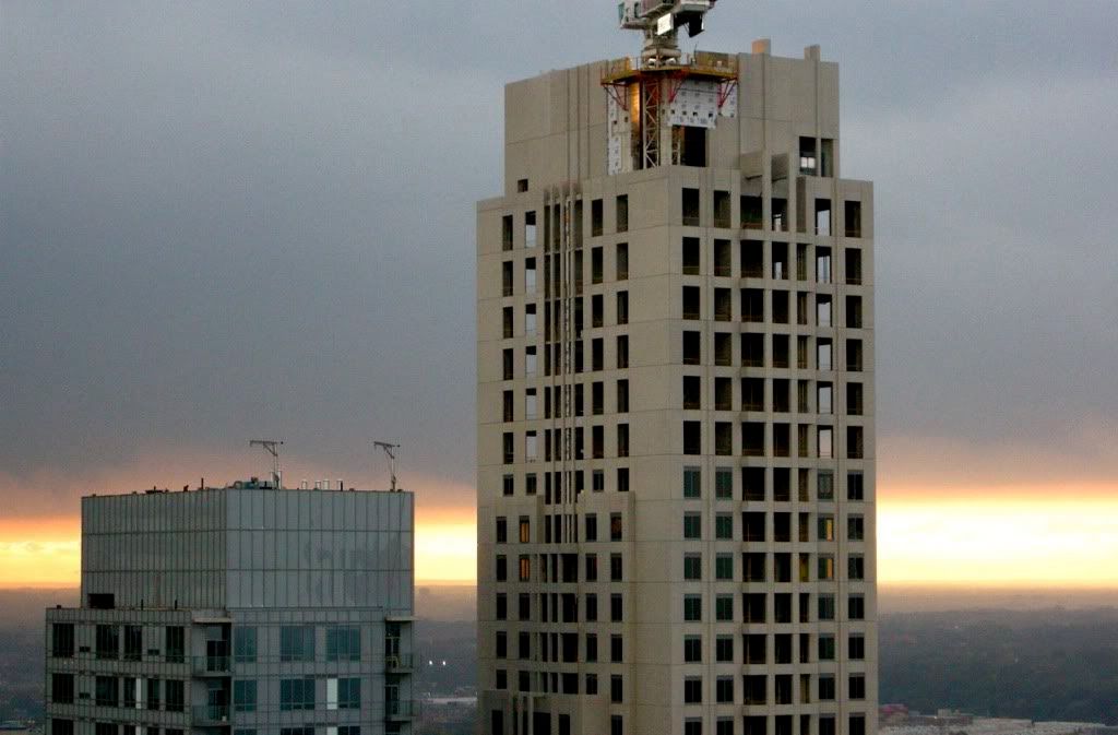
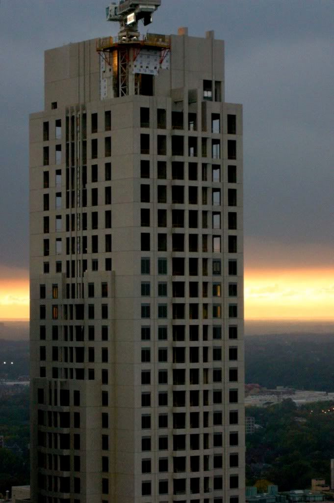
Horrible Cheapening of the rooftop element - this tower basically went from hero to zero for me.
 
cheapening? How different is it from the render? It needs huge gargoyles like the tower in Mississauga city centre.
 
The crown looks better in person, looking up from say Yonge and Bloor, than it does in pictures.
 
I still have the oddest soft spot for this tower. As in, I actually love it. In many ways it doesn't deserve it, but... I feel like without meaning to be, it's a contemporary, stripped-down art deco-- a 7/8th scale, "works-when-viewed-from-the-ground" sort of deal.
 
It's not bad and not great. It looks vaguely art decoey, as if one of Raymond Hood's turds grew exponentially and travelled to the future.
 
Uptown by Taller, Better at SSC....

IMGP7325.jpg
 

Back
Top