You are using an out of date browser. It may not display this or other websites correctly.
You should upgrade or use an alternative browser.
You should upgrade or use an alternative browser.
- Thread starter someMidTowner
- Start date
Rascacielo
Senior Member
Obviously inspired by Mies van der Rohe 
whatever
Senior Member
It looks less bad now that more of it is up, but there's something about it that just doesn't work.
I don't like it, but I think it beats CampusOne and Design Haus. Though that has more to do with CampusOne and Design Haus than is does with Theory.
I don't like it, but I think it beats CampusOne and Design Haus. Though that has more to do with CampusOne and Design Haus than is does with Theory.
.dwg
Active Member
Obviously inspired by Mies van der Rohe
Don't even. Don't.
AlbertC
Superstar
April 11, 2020


isaidso
Senior Member
The added scale is doing wonders for this stretch of College. It has always felt so underwhelming and under developed due to how wide the street is. The proportions between road and buildings is much much better now. It will take another 10-15 years before this stretch is built out and then they can turn their attention to the public realm.
Benito
Senior Member
Today.


Lyphe
Active Member
Really? I think its a great looking building. Not sure why you think it doesn't work - I find it well balanced and visually high quality.It looks less bad now that more of it is up, but there's something about it that just doesn't work.
Different tastes I guess.
AlbertC
Superstar
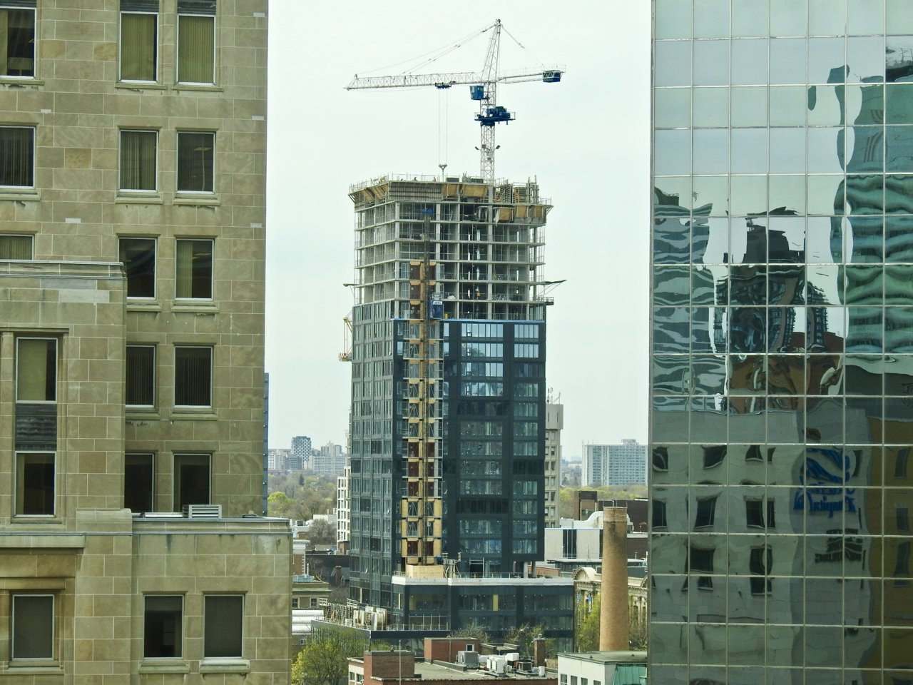
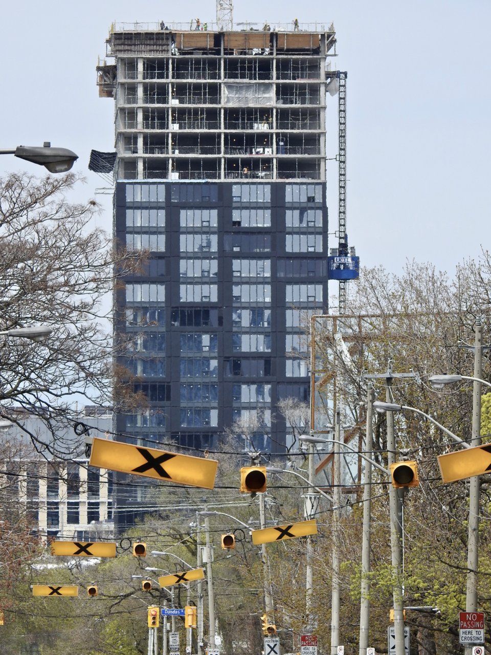
Glazing has started going up at grade level, they're also up to around the 23rd floor now:
April 19, 2020


April 19, 2020
whatever
Senior Member
Really? I think its a great looking building. Not sure why you think it doesn't work - I find it well balanced and visually high quality.
Different tastes I guess.
It's the way the volumes are broken up. Those four-storey tall volumes of clear/blue glass are interrupted up by the bands of lighter grey spandrel between floors. The grey "cut-outs" look weird because they're flush to the rest of the wall and not inset. It also really bugs me that the cut-outs have that one small grey panel that lines up with the panels below. Having that line running continuously up the building detracts from how the volumes were meant to be rhythmically interrupted. And then the wide gaps between the panels that are framing the volumes further interrupts the motif. I really wish they'd kept those gaps tighter.
I don't hate it, and I think it's the best of the new builds along that stretch, but the details just aren't working for me.
Towered
Superstar
If you stand closely, you'll notice that a lot of the grey metal panels are uneven, as if they had dents in them, and there are all kinds of sloppy gaps in the fixtures.
SO CHEAP.
SO HORRIBLE.
SO CHEAP.
SO HORRIBLE.
Benito
Senior Member
Today.


Red Mars
Senior Member
Tue May 5, 2020
Looking West.

Looking North.

Looking West.
Looking North.
Benito
Senior Member
Today.

AlbertC
Superstar
May 16, 2020

Cherry blossoms outside of the George Brown House on Beverley:


Cherry blossoms outside of the George Brown House on Beverley: