Today

1617324223908.png
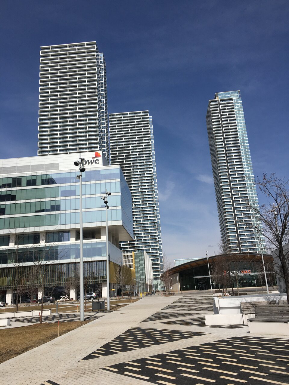
Overall they've done a decent job with the public realm although it's awfully grey. Canadian cities (Lower Mainland BC excluded) are going to look that way for 5 months of the year. They really needed to go with a strong rich colour with those lamp posts and perhaps a few other elements. Fire engine red, bright blue, etc. Something to mitigate all the drab hues.

Toronto is steadily getting better at public realm. If we paid attention to some of these final details like colour we'd be almost there.
I think they want it to look classy, that's why all the grey and black and white.
 
I'm very impressed with the quality of these. They look even better in person. Even the garage cladding is excellent. My only criticism is the sterile ground level. Hopefully increased foot traffic after the area is built out makes it more lively.

From today:

20210502_175440.jpg
20210502_175535.jpg
20210502_175608.jpg
20210502_175613.jpg
20210502_175833.jpg
20210502_175855.jpg
20210502_175905.jpg
20210502_175943.jpg
20210502_180106.jpg
20210502_180132.jpg
20210502_180200.jpg
20210502_180207.jpg
20210502_180210.jpg
20210502_180408.jpg
20210502_180517.jpg
 
Glad Centrecourt did a good job here. I heard they were generally a crappy dev?
 
I agree. I love them but Absolute towers are even better.
I'm with deadpool on this one. Absolute towers are the top for me. These are up there. If the materials at M1 and M2 were better they would take the cake.

M3 in mississauga and CG tower here in Vaughan (if executed well) I think will jump to my top 2
 
Absolute has a more creative base idea but seriously lacks in execution. The podium is beyond terrible and the material selections are poor.

This one is well detailed with excellent materials, and possibly the single most attractive parking garage in the country. It's a true looker, even if the base concept is more "traditional".
 
Glad Centrecourt did a good job here. I heard they were generally a crappy dev?
Centrecourt buildings are always attractive. They usually go with IBI architects, and bring the best out of them. I think they went with Diamond Schmitt here because of the partnership with SmartCentres, which has pushed the quality of execution even higher.

SmartCentres is surprisingly turning out to be a fairly good developer in terms of developing attractive buildings so far, which is surprising given their history of godawful power centres. (they do have a few proposals that are.. lacking as well though)
 
I think they want it to look classy, that's why all the grey and black and white.

Sticking to grey, black, and white isn't what makes something sophisticated ....or classy. Design, colour hue chosen, and quality dictates these things.
 
Last edited:
Absolute has a more creative base idea but seriously lacks in execution. The podium is beyond terrible and the material selections are poor.
I dunno I can agree with you on this. As for me any sign of something that's amazing is when I feel compelled to sit down in front of it, smoke something interesting and stare at it for awhile...hopefully with my mouth closed. Especially those fin bits...

...although, they probably could have used better materials. As we'll see if this looks as visually compelling in the next 10 years. For now, thumbs way up for me on this one.
 

Back
Top