You are using an out of date browser. It may not display this or other websites correctly.
You should upgrade or use an alternative browser.
You should upgrade or use an alternative browser.
- Thread starter UrbanFervour
- Start date
AlbertC
Superstar
AlbertC
Superstar
AlexBozikovic
Active Member
AlbertC
Superstar
AlexBozikovic
Active Member
Towered
Superstar
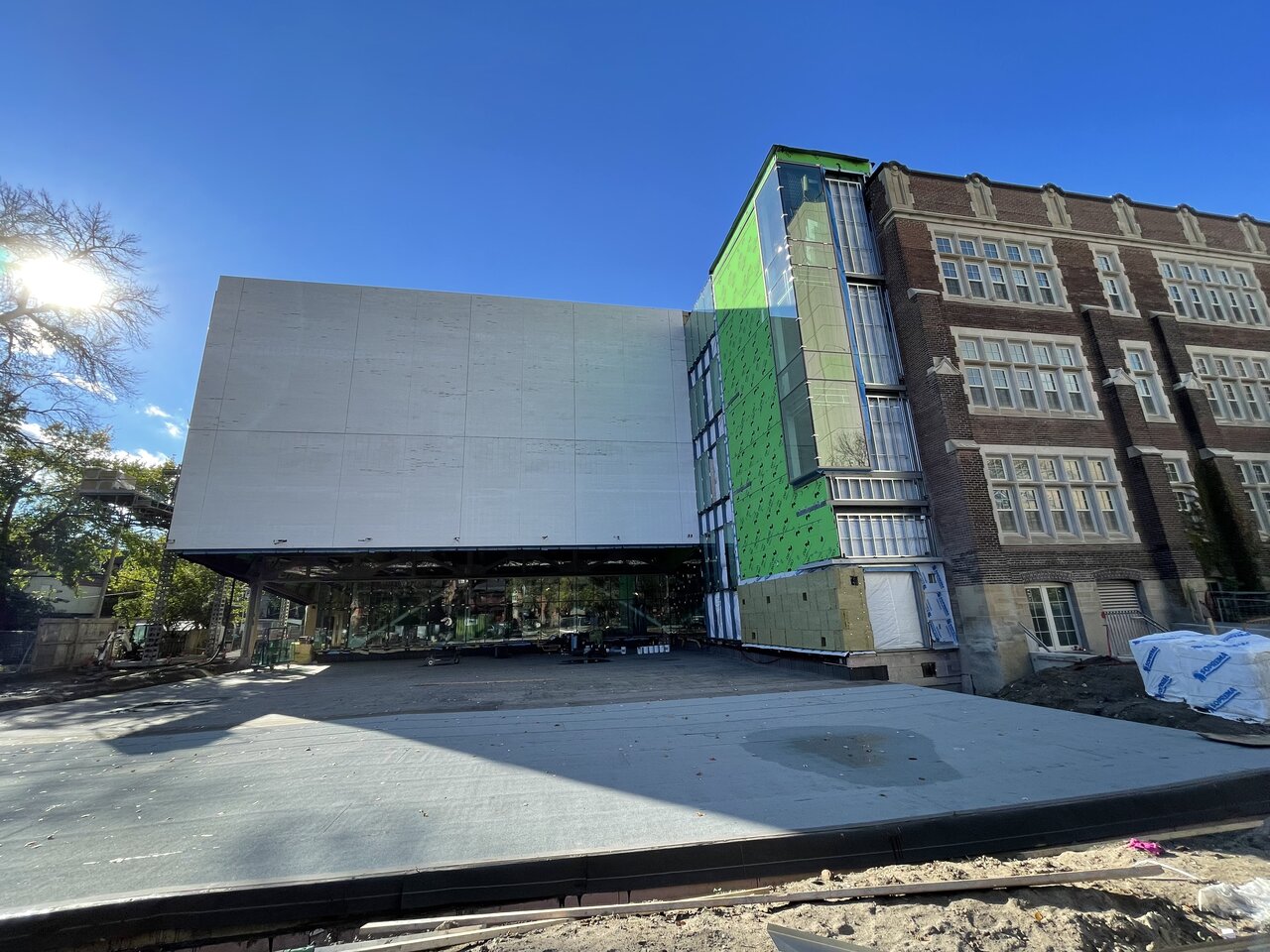
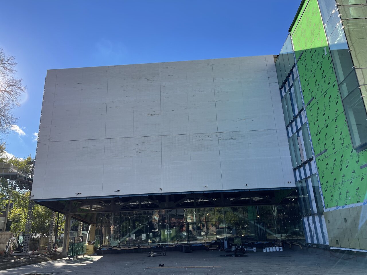
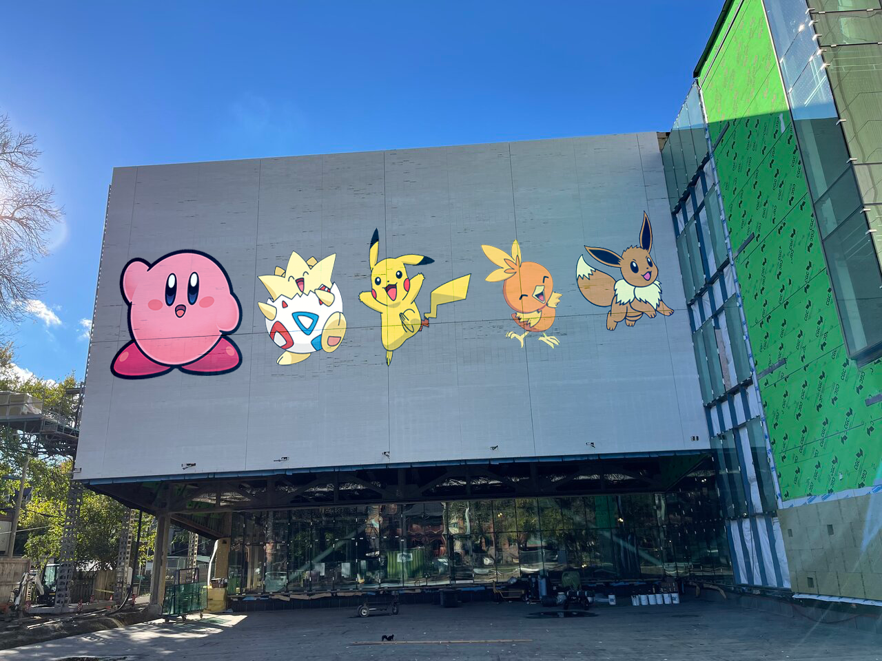
Perfect wall for a giant art piece!
AlbertC
Superstar
@Johnny Au would be happy if Kirby and friends made a return in such a fashion. 
DavidCapizzano
Senior Member
This.... kind of sucks!
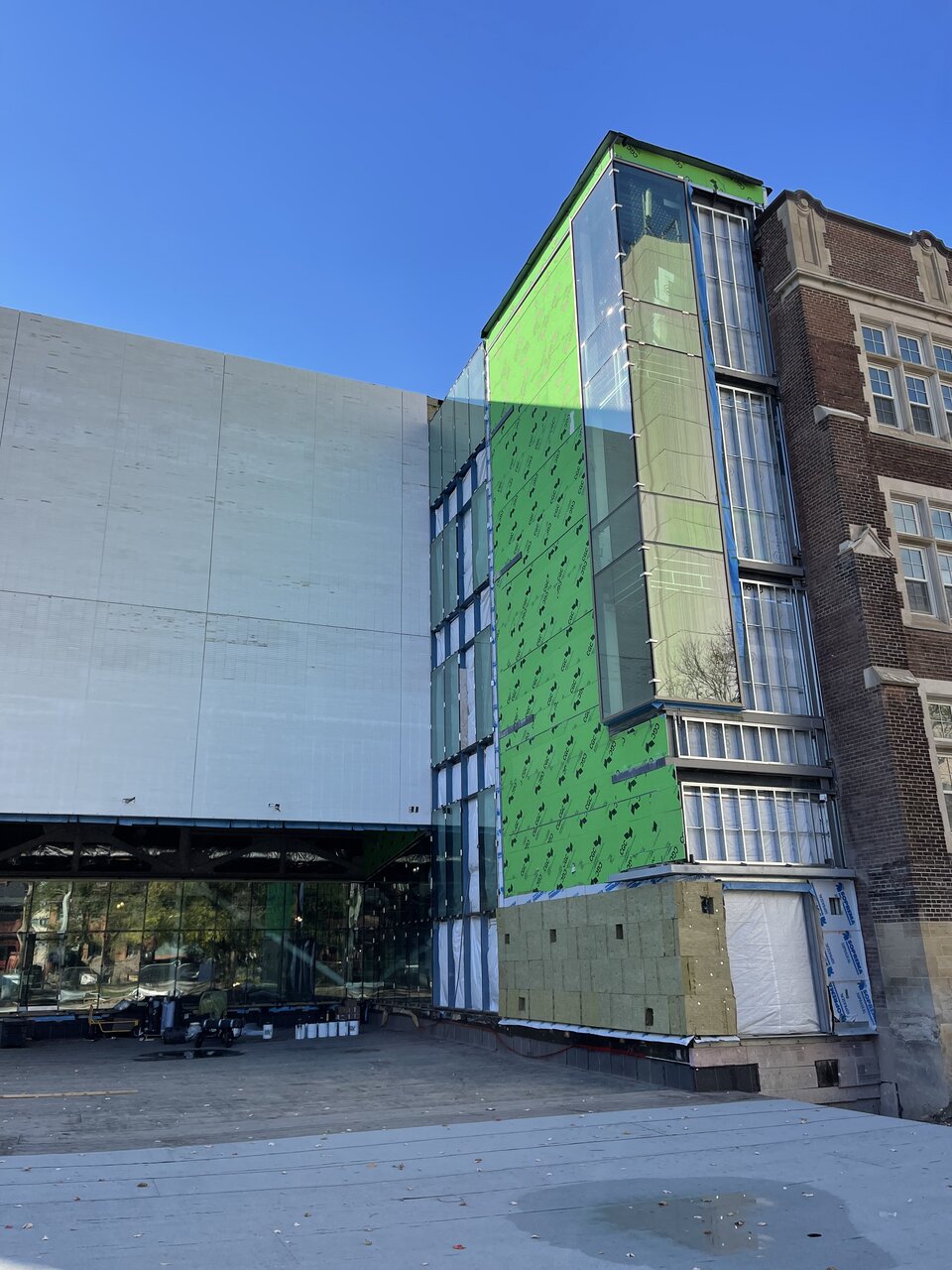
They could have had some fun with the brick coursing by adding some texture / relief but instead it's void of any personality. I guess on the bright side, this is hidden at the rear of the building so it's not really visible from Bloor.
They could have had some fun with the brick coursing by adding some texture / relief but instead it's void of any personality. I guess on the bright side, this is hidden at the rear of the building so it's not really visible from Bloor.
egotrippin
Senior Member
Yep, unfortunately the most prominent feature is the large gaps that make it look like precast panels as opposed to real brick.This.... kind of sucks!
They could have had some fun with the brick coursing by adding some texture / relief but instead it's void of any personality. I guess on the bright side, this is hidden at the rear of the building so it's not really visible from Bloor.
UtakataNoAnnex
Senior Member
...what wonders board formed concrete could have done here since they went for the banal.
AlvinofDiaspar
Moderator
This.... kind of sucks!
They could have had some fun with the brick coursing by adding some texture / relief but instead it's void of any personality. I guess on the bright side, this is hidden at the rear of the building so it's not really visible from Bloor.
I don't know, I quite liked it - it almost looked like Travertine from certain angles.
AoD
Johnny Au
Senior Member
October 31, 2021:


Kirby & the Pokémon make a triumphant return to the University of Toronto Schools!
Behold!@Johnny Au would be happy if Kirby and friends made a return in such a fashion.
Kirby & the Pokémon make a triumphant return to the University of Toronto Schools!
Hamiltonian
Active Member
I don’t know... I think there’s some sort of muted simplicity to be found here. It’s monolithic in volume but serene or calming in its materiality and colour. It gives precedence to the architecture of the original building while straying outside the conventional Toronto approach to heritage, which recently has become some form of a glass box attachment (e.g. Broadview Hotel, Robarts, Spadina Crescent, 2 Queen Street, etc).
