Fab render as always Steveve.

I too was hoping for a re-design and also agree with Amare that one office tower (though I think taller) is best.

If re-design was in the cards, the over the top original faceted/kinked diamond tower design (convention centre portion seen below) by Foster could have been exhumed ... it even gives a nod to CIBC Sq. diamonds.

I remember pasting my invented Roy Thomson Hall tower (below) into the Foster pic but Oxford said it "makes no sense" even though the top obviously "opens to the sky" (like SkyDome get it?). They still have my email if they want to chat. ;-)
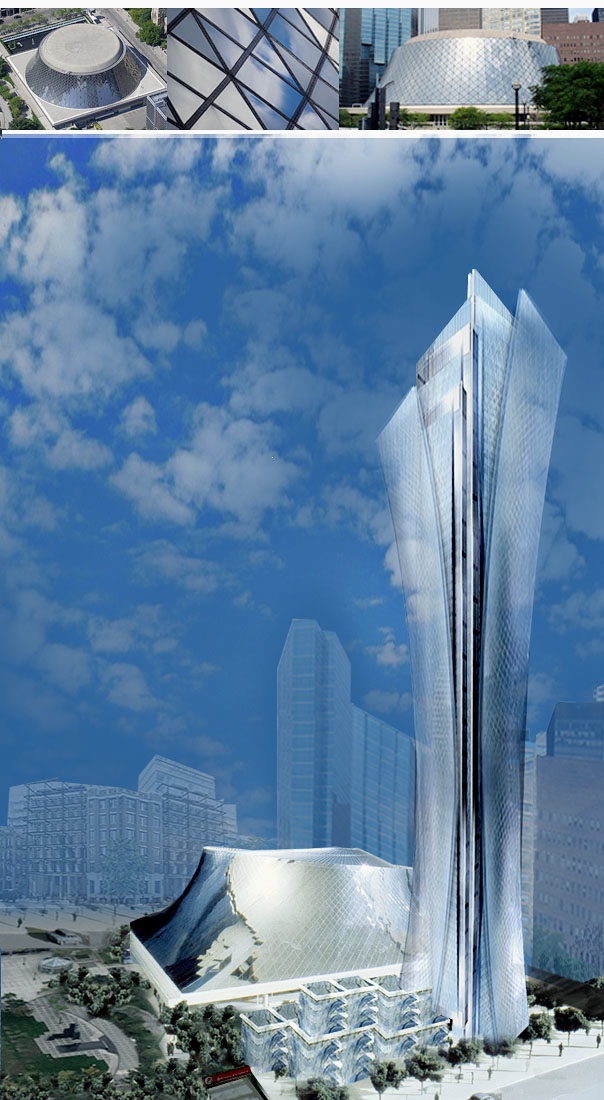
rth-Oxford.jpg

^^^^ and yes, that is the RTH exterior Erickson designed (he kindly sent the pic to me) ... vs. what was built.

FOSTER
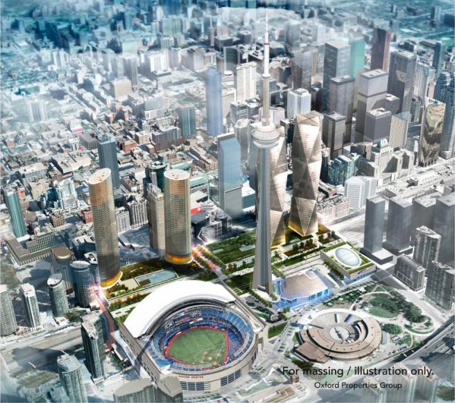
20121011-oxfordplace800-jpg.9451
 
Last edited:
The western tower really needs to go. I understand Oxford wants to be greedy and get the return on their investment but this is not your typical development site; this development has a significant impact of the skyline views of the city.

Get rid of the western tower, and push the centre tower to the west and then we'll have something that will truly complement this prominent site.

On a side note, @steveve I have no idea how you do these models and I wish I knew how to do them myself, but I absolutely love what you do!

Oxford needs the density to pay for the park. Park overbuild is $250M.
 
Does nobody here have a problem with the Front streetscape? A 200-metre-long glazed office lobby?
View attachment 251363
It's a pretty lazy and lifeless treatment to be honest. There should be some fenestration or material articulation to distinguish the atrium section from the lobby sections of the adjoining towers.

I fear we're on track for a lifeless long glassy streetscape void. Glassy flat facades, do not make good streetscapes by themselves, they need supporting elements.
 
I really don't like this newer proposal. I preferred the diamond shaped Foster design for sure. This is boring. I don't like the spandrel or the exposed columns, or even the colour choices.
 
The Foster-designed office towers were for the convention centre, not this section. This section replaces the casino part of the proposal that had the two generic-looking hotel towers with the ovular floorplates.

At this point it is pretty unclear if the Foster-designed towers will return as part of the second phase. They still existed in the early promotional materials for Union Park back in 2017, but I wouldn't be surprised if things have changed.
 
Does nobody here have a problem with the Front streetscape? A 200-metre-long glazed office lobby?
View attachment 251363

This isnt the most recent render? I thought it was mostly retail now.

Update: Most recent below. Retail added at the corners, along the front, on L2, and behind the escalators. Looks like it is maybe 50% lobby frontage now?

39006-129840.jpg
UnionPkFrotnStS1667.jpg
re's the latest.
 
Last edited:
Anything but vast expanses of featureless glass at street level!

Given the nature of office developments in this town - I wouldn't hold my breath. I would consider it a win if they don't eventually block off the glass.

What I do ask for is high quality implementation (no cheap unitized glazing; landscape design that goes beyond going through the motions)

AoD
 

Back
Top