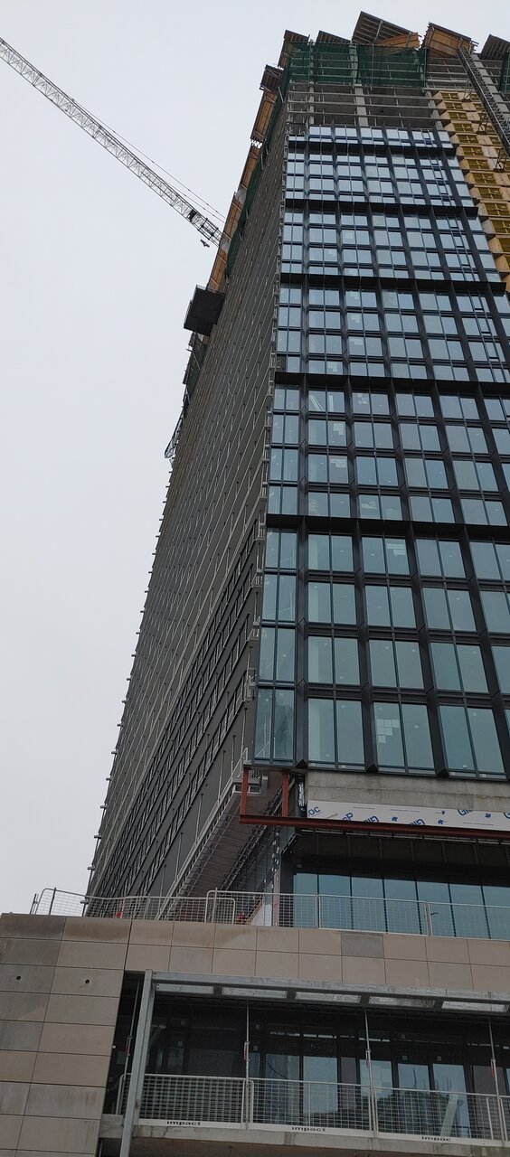
Today:
20210131_103827.jpg
 
What's up with the white balcony panels? Maybe some regret re: switching the design to black bands? Seems like it would be a massive undertaking to change all of them out to white.
 
What's up with the white balcony panels? Maybe some regret re: switching the design to black bands? Seems like it would be a massive undertaking to change all of them out to white.

Those two lower white panels have been there since the fall. Not sure their purpose, but seems like they're temporary.

P1220459.jpg


P1220457.jpg


P1220455.jpg
 
I dont mind it, except for the 3 goofy cheap looking pillars.

I like the stone used at the base as well as the louvers on the west tower.
 
Last edited:
Photos taken February 21st, 2021:

First, from outside Castlefrank Station: (note the Toronto-class intrusion of the opened waste receptacle in the 1st shot!)

1613948192121.png


1613948220418.png


Bit closer, from the east end of the bridge over Rosedale Valley:

1613948265589.png


1613948302801.png


Now, up close:

1613948339930.png


1613948368330.png


1613948394522.png


1613948419995.png


1613948487322.png


1613948516302.png


1613948546278.png
 
Is this really an aA project? The window wall looks low end, and the design of the podium has little to do with the design of the towers. The proportions of the towers are inelegant. It seems considerably worse than their projects 10 years ago.
 

Back
Top