Red Mars
Senior Member
Mar 23, 2022
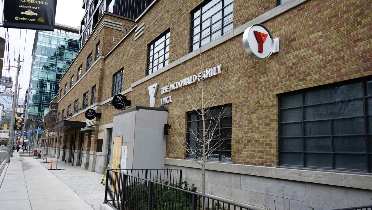
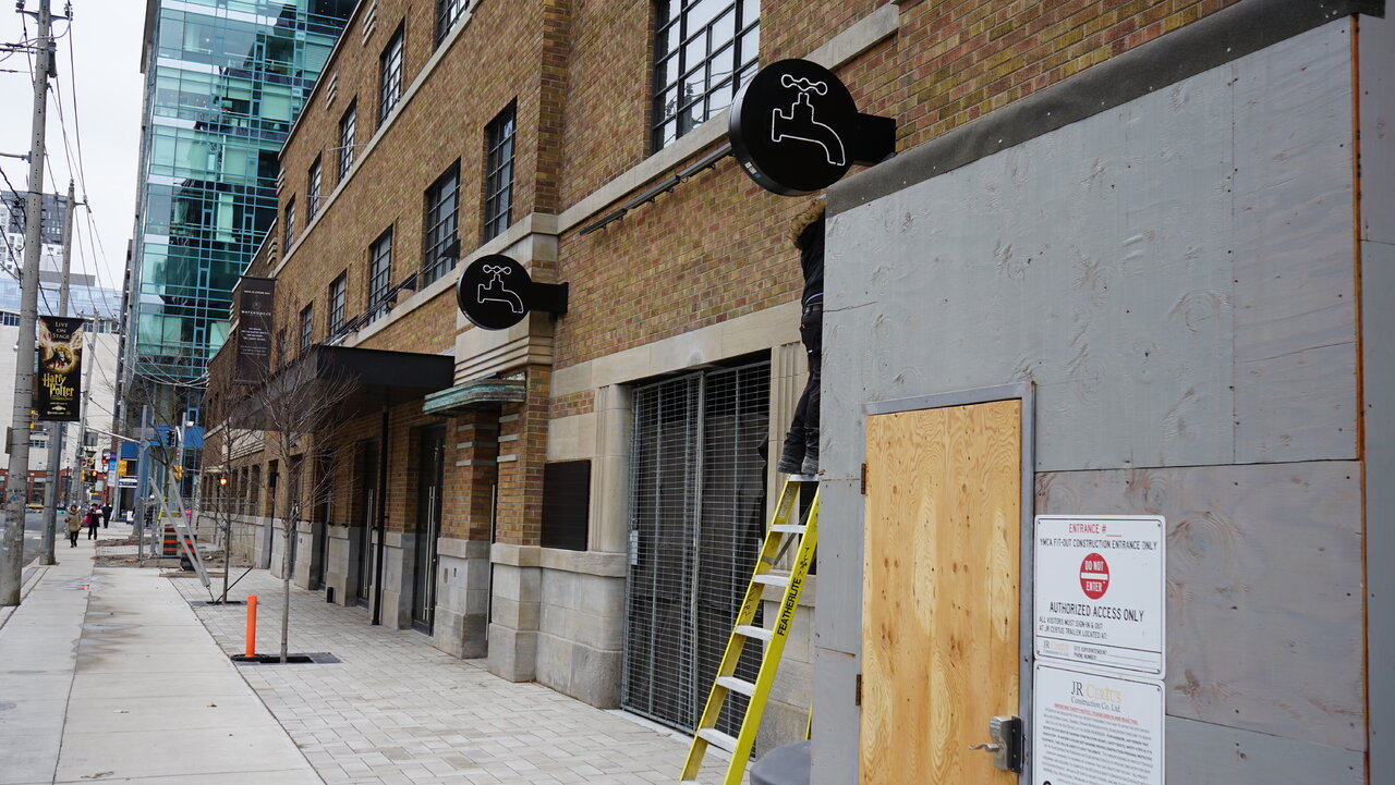
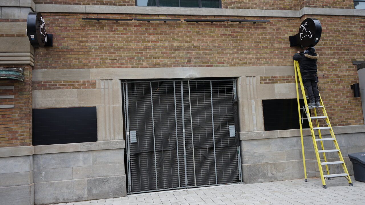
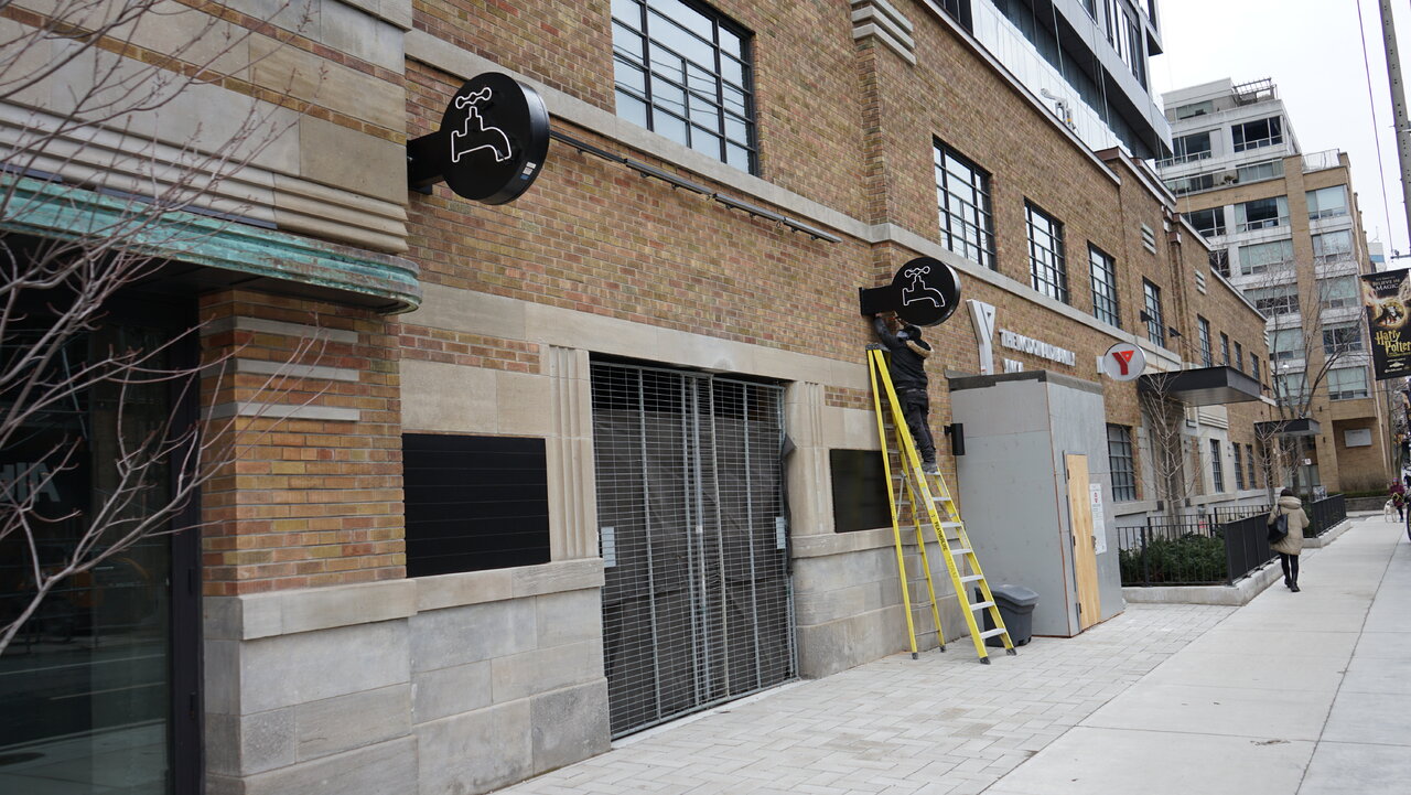
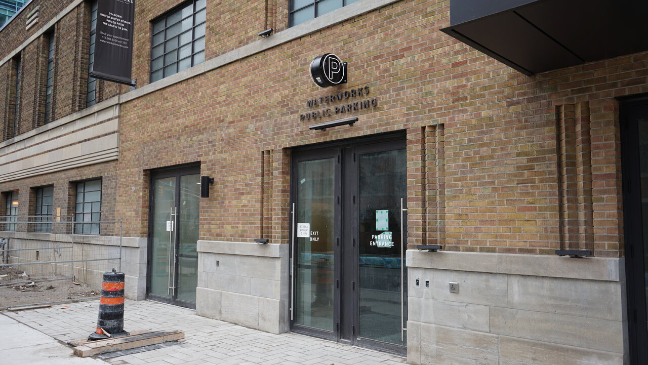
Yes, coming very soon!I wonder if the residential entrance is going to get any signage above?
I did not even notice. That's unfortunate.This is sooo minor and maybe not worth mentioning by why is one side of the signage flipped with the water spout facing the building
GREAT eye!This is sooo minor and maybe not worth mentioning by why is one side of the signage flipped with the water spout facing the building
Why would commercial signage have anything to do with a residential condominium technical audit?GREAT eye!
I'm sure this will be fixed with the building's official deficiency audit. Now that the condo is registered, I'm sure this will be changed in the next 6 months or so (any residents on here, take note when you get sent the audit survey).
Good point!Why would commercial signage have anything to do with a residential condominium technical audit?
Cool. I like how you know that! Any updates on when the Y is going to open?Yes, coming very soon!