SP!RE
°°°°°°
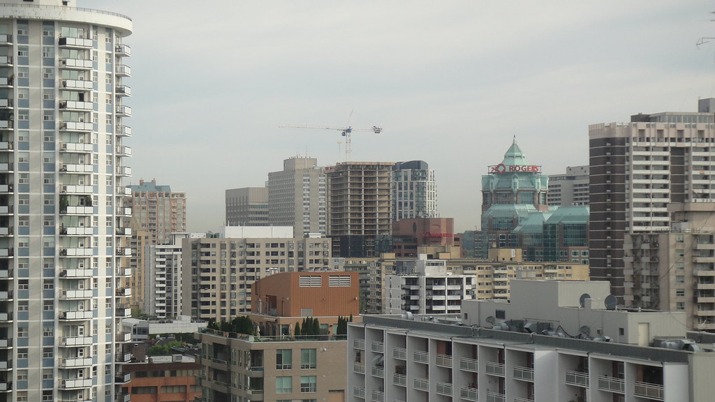
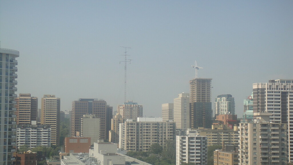
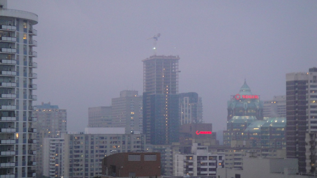
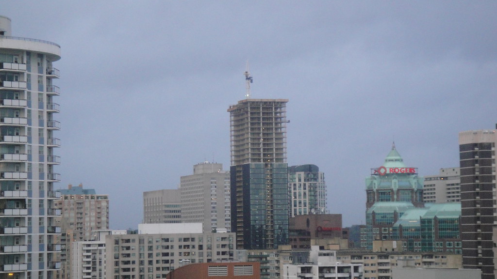
I think the best way to explain this building to someone is that it's an Andy Warhol take on Mies Van Der Rohe.... and it's brilliant. I am so happy with what a sleek building it is. And true enough to the original on a surface level that anyone can draw the comparison.
That last shot someone took looking up the side of the tower, forming the gridiron pattern-- that's what made me think about the comparison. It reminded me of all those types of shots taken up the side of the TD Centre.
As for the putting green location... that seems a bit strange, but we'll see how that bottom area looks when completed. I do think that many of the features being included into condos are gimmicky. Plus, people want to leave home to do fun stuff, not take their friends out around back to do fun stuff.


