News   GLOBAL  |  Apr 02, 2020
 9.4K     0 
News   GLOBAL  |  Apr 01, 2020
 40K     0 
News   GLOBAL  |  Apr 01, 2020
 5.3K     0 

Donlands station mini update:

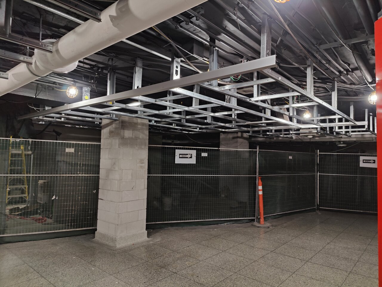
A bit of progress on the ground level, and they've started framing the ceiling on the mezzanine. Also, the hoarding on the mezzanine has been replaced with a fence.
1000018525.jpg
1000018527.jpg
 
Donlands station mini update:

A bit of progress on the ground level, and they've started framing the ceiling on the mezzanine. Also, the hoarding on the mezzanine has been replaced with a fence.
View attachment 571577View attachment 571578

The opening up of the top of the stairwell to more natural light is welcome, the elevator, of course, a great addition; but sadly, those awful ceiling finishes are going in throughout the station.

The ceiling on street level previously, while a bit dated (a variation are the typical TTC slatted ceilings) was among the nicer looking in the system, in conjunction w/better than average lighting. Here we go spending real money to cheapen the look.
I didn't bother posting the ceiling/wall treatment. It's... Meh

Edit: but here it is. Not a great angle
1000018526.jpg
 
Last edited:
Donlands elevators are open! I didn't notice them open this morning as I entered the station and went right onto my bus. Anyway, it looks okay at the surface (with the exception of those large tiles above the stairs). I didn't have time to take a photo, but the little passageway from the elevator to the mezzanine seems small and closed off... some might find it unsafe due to lack of sightlines. I'll try to get a photo tomorrow.

(Edit: me no spells so good)

1000021501.jpg
1000021502.jpg
 
Though one obviously needs to stop somewhere and I suspect this is outside the area of the reno, it's a pity nobody TTC or City, thought to fix THIS adjacent piece too.

View attachment 589180

I'm not sure that yellow isn't required for something in scope.........have a look at the furthest right light fixture on the entrance canopy.......... maybe my eyes are deceiving me, but something doesn't look right there......... ...oh, and don't get me started about all the exterior lighting being on in the midst of bright, daytime sunshine.
 
The Donlands second exit got a photo series from Damian W.K. Baranowski on Twitter:


For the preview impaired, and the click averse, the pics, from the above:

1724692781358.png


1724692817309.png


1724692840842.png


1724692896325.png


@AlexBozikovic is not a fan:

1724692929895.png


One can take or leave the exterior aesthetic, though its certainly better than some of what the TTC has delivered through the years........ having been to Banff.......I can't say I remember many houses like that; but that was 20 years ago.....so maybe... LOL

As to the interior, the upper portion reads as spacious and airy, which is nice, the cheap, ugly ceiling finishes I could do without, I'm curious as to the decision to make the stairs so shallow and long, its certainly not the most efficient layout.

The lower level is just monotonous though, and duller than dirty dish water.
 
Also meant to mention, I walked past the College Station work site yesterday, the pit is fully open to the correct depth and to the completed work on the west side of the street.

Columns and Beams have not yet been installed, except for limited perimeter supports, so far as I could discern.
 
The Donlands second exit got a photo series from Damian W.K. Baranowski on Twitter:


For the preview impaired, and the click averse, the pics, from the above:

View attachment 591257

View attachment 591266

View attachment 591268

View attachment 591271


@AlexBozikovic is not a fan:

View attachment 591272

One can take or leave the exterior aesthetic, though its certainly better than some of what the TTC has delivered through the years........ having been to Banff.......I can't say I remember many houses like that; but that was 20 years ago.....so maybe... LOL

As to the interior, the upper portion reads as spacious and airy, which is nice, the cheap, ugly ceiling finishes I could do without, I'm curious as to the decision to make the stairs so shallow and long, its certainly not the most efficient layout.

The lower level is just monotonous though, and duller than dirty dish water.
I for one appreciate the fact that the TTC has taken some liberty with these secondary entrances to make them a bit quirkier here and there. Certainly makes for a more aesthetically-varied transit system while still remaining within the same design language.

I fail to see, however, how a hallway and some sets of stairs constitute a tripping hazard.
 
I don't hate it like some, but I do hate this pic for sure. Even a tiny bit of colour could have gone a long way here...

There is a reason that most stations have a trim colour. One doesn't have to offer a second shade/colour in that way, but there is just a need to break up one long unwavering mass of same, somehow, vertically or horizontally.
 

Back
Top