Northern Light
Superstar
Oops:
TTC investigating after hit by ransomware attack
The Toronto Transit Commission says it is investigating a ransomware attack that knocked down some of its communications systems and affected a number of its services Friday.www.cp24.com
AoD
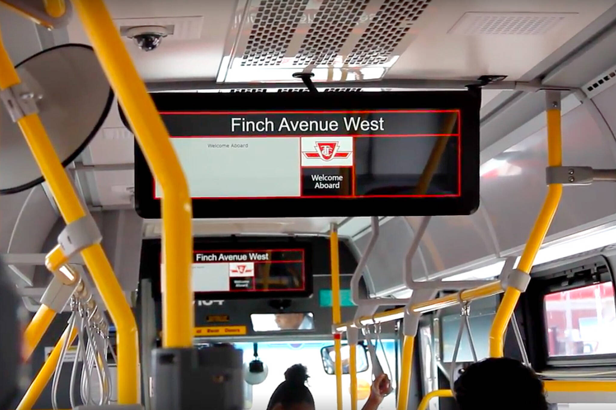
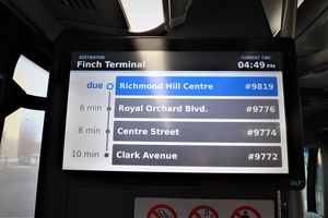
Explains why Next Bus /Umo said there were no buses on my route tonight............
The TTC has no idea whether there are either (The VISION system that tracks/communicates w/vehicles is among those affected)