A
AlvinofDiaspar
Guest
From Building.ca
Quantum leap
WATERLOO, Ont. - Toronto firm Kuwabara Payne McKenna Blumberg Architects, and laboratory specialists HDR Architecture, are designing a new $70-million complex for Quantum Computing and Nanotechnology at the University of Waterloo. The team beat out more than 20 others who were interested in designing the building.
"There was an interview process, and they certainly look at your design credentials, and we just had good chemistry," says design architect Mitchell Hall. "We knew there were cost issues from the beginning, we'd done our homework and planned accordingly."
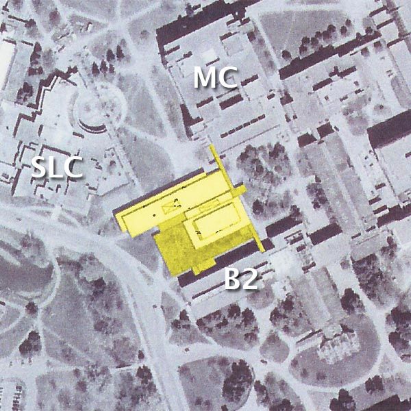
The site for this 225,000-sq.-ft. project is a snug fit, but it's also strategically located, so that interaction between engineering, science and mathematics disciplines is made easier. "Luckily, our client is very interested in providing interaction and creating spaces for that. Space was programmed in from the very beginning and we have an atrium with lounge spaces to encourage these levels of interaction between the groups," Hall says.
It can be a daunting task to create what will be a publicly accessible building that's also home to some very sophisticated and delicate laboratories, particularly on a site where space is an issue.
"As far as the technical aspects of architecture go, that's something you can learn if you have the time and the patience. We're used to taking on projects that we haven't done before," Hall says.
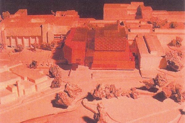
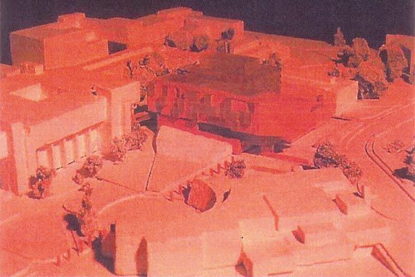
Hall and lead architect Marianne McKenna had to come up with an elegant plan that would make it all come together. In order to keep the facility from being a towering monstrosity, they're proposing that a portion of the building be buried in the ground. Not only will this preserve green space on the campus and give it the benefits of a green roof, it turns out that nanotechnology and quantum computing labs are very picky about things like vibrations and solar radiation, so putting them underground is ideal.
Above ground, a bar levitates over this landscaped section, which Hall refers to as the "plinth." That bar is designed in two pieces to reflect the dual disciplines. A materials palette hasn't been settled upon yet, as universities are notoriously budget conscious, but whichever products and finishes are used, they will be employed in a unique manner.
"We really enjoy exploring materials," he explains. "The structure of the nanotechnology section is based on an abstraction of a carbon nanotube. And the [quantum computing] bar will have something to do with microchips and plastics."
There will be an emphasis on sustainability, with recycled materials used where possible. In addition to the green roof, KPMB is planning an outside green wall of living plants. The Quantum Computing and Nanotechnology building will be a metaphorical and physical bridge between disciplines.
"The building has bridge-like qualities," Hall says. "On campus, there's a series of landscaped courtyards and often there are pedestrian bridges overtop or tunnels underneath. We need to make the connection to the environment and connect with math, physics, biology and computing, all of which play a part in nanotechnology and quantum computing."
The facility already has $50 million of its budget, thanks to a huge donation, and the team expects to be tendering within a year, and then plan for a 24 to 48 month construction period.
AoD


