News   GLOBAL  |  Apr 02, 2020
 9K     0 
News   GLOBAL  |  Apr 01, 2020
 40K     0 
News   GLOBAL  |  Apr 01, 2020
 5.1K     0 

dencity:

I'm going to contradict myself... the last font you used (with 2 colours) looks great even though it's a serif font. The tallness of the font really works well with the "towers".
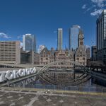
 
3D: I was looking at the font aswell, and thought that it looks like a stronger foundation to mount the skyscrapers on top of it. I believe both fonts work, it's just a matter of which one stands out more.

Thanks for all the input guys!
 
And the blue-version is great - it is almost reminiscent of blueprints - which is part of what this forum is about - new projects.

GB

PS: I wonder what the effect of changing the colour of "UrbanToronto" to red (in the case of the blue-version) is. Afterall, it would reflect nicely with the City of Toronto flag - with its' own blue, white and red...
 
Thanks GB,

It's hard now to pick my entry because everyone likes a different one. I will make some changes then see what they say about my next batch of variations.
 
Density after you come out with your next batch of variations just have a poll to find wich one we find most popular.
 

Back
Top