News   GLOBAL  |  Apr 02, 2020
 8.6K     0 
News   GLOBAL  |  Apr 01, 2020
 39K     0 
News   GLOBAL  |  Apr 01, 2020
 4.8K     0 

interchange42

Administrator
Staff member
Member Bio
Joined
Apr 23, 2007
Messages
27,183
Reaction score
35,520
Last edited by a moderator:
The tower is alright - but I'm not sure if I like all these developments along Etobicoke's waterfront. I think I'd prefer to have such density along subways lines rather than our parks.
 
also Graywood and Beaverhall did Europa at College and Bathurst streets together. Which means this is more than their second collaboration.
 
This areas needs commercial/retail/office space in the worst way. I'm glad to see that they're dedicated a building to those purposes. Also, I'm suprised it's taken developers this long to realie the potential of putting restaurant patios along Marine Parade Drive. There's only one there as it stands but it does amazing business.

The design of the tower itself is beyond dated.
 
I cant help but like the tower as well... really cool how it has distinctly different looks from each angle. But yes, the colour is a bit regrettable.
 
One of the better looking towers to come along. The end product, however, hardly ever looks as interesting as the early renders.
 
Seriously, what are the developers in this city trying to do? Set a world record for the most green glass used in one area code?
 
The tower portion looks good but the boutique building is totally out of place. I don't quite understand why it's behind the taller tower with every view blocked? It would make more sense to have the smaller building facing the lake with the taller building BEHIND it.

And I know it's just marketing but come on, Ocean Club? We also have Beyond the Sea. Toronto is not Miami and I fail to understand why developers are trying to create this idea of escapism. What's wrong with being on a lake in Toronto in Ontario. I don't know why we have to have these fantasy names. It sounds really dumb.

Re: Glass colour. If you think about it, there's only really 3 colours that work on a condo. Clear, blue (various tints) and green (various tints). What else is there? That means, at a minimum, 33% of the condos are going to have some form of green glass. Get used to it.
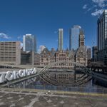
 
Using Ocean Club as a name for a condo on one of the world's greatest freshwater lakes is, well, stupidly insecure. But maybe Lake Club isn't available.
 
Ugly. Parts of it are cool, but otherwise it's an ugly mish mash. The smaller building should be closer to the lake, with the tower behind it as someone else pointed out. The glass colour is crap. The name is just UGH!
 
Continuing my dislike for the stupid names given to most condo developments in this city, I'm curious to know what 'ocean' its name is referring to.

Otherwise, I don't hate it. A little generic but it has some nice details that I like.
 
I like it, if only it reminds me of some condos built in australia. Looks like a building you'd see in a warmer climate. The green glass looks good on this one, especially by the lake.

Ocean Club, great name. Will make me dream of bahamas.
 

Back
Top