You are using an out of date browser. It may not display this or other websites correctly.
You should upgrade or use an alternative browser.
You should upgrade or use an alternative browser.
- Thread starter Daveography
- Start date
Glenco
Senior Member
I agree they have to come up with a consistent brand it is as if no one has taken ownership of the transit system. Hopefully the new regional transit authority will do just that. That old logo would work well but blue has to go as it does not stand out a more distinctive colour such as red, yellow, orange or at the risk of offending someone’s sensibilities sea foam would work.View attachment 386283
just gonna leave this here to stir the pot a little...
better signage for churchill on all entrances would be hugely helpful. Used to work in the area, the number of people confused about how to get to the train (which has great access to stuff, you just gotta know where to look) was surprisingly high. more prominent signage and a recognizable transit brand (ideally beyond 3 generic letters in bold italic arial font, please see above) That clearly indicate public transport access/entrances/facilities would be great. Churchill has all kinds of pedway entrances and a decent number of public stairs; but none of them are well-identified, including this new one. consistent, concise signage is needed here imo.
The_Cat
Senior Member
Bonnie Doon Station:
Avenuer
Senior Member
The_Cat
Senior Member
Connors Road also has the lane control signals back up: https://www.facebook.com/yegValleyLRT/
Gronk!
Senior Member
Edmcowboy11
Senior Member
But now the Connors hill pylon moving guy has lost his job.
The_Cat
Senior Member
Don't worry, plenty of more make work projects available from the City!But now the Connors hill pylon moving guy has lost his job.
itom987
Active Member
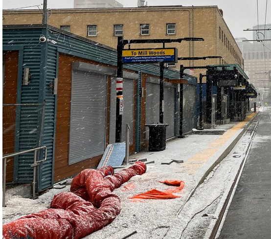
I am concerned about the LRT station in the last picture. The station shelters take up more than half of the width of the sidewalk leaving little room for pedestrians to walk amongst each other.
The_Cat
Senior Member
I think there's a sidewalk on the north side of 102 Avenue. Also, I think there's a crosswalk on the west side of the Quarters for all pedestrians. I don't think the south sidewalk of 102 Avenue is intended as a right-of-way.
Gronk!
Senior Member
I'm guessing that this building MAY get demolished since I don't see any purpose for it other than blocking pedestrians from the LRT. The Liquor on 96 shop is its neighbor but is a powder keg waiting to explode if you ask me.

Last edited:
cliffapotamus
Active Member
The Salvation Army runs the taller of those buildings and recently listed its facilities in the area as for sale. They have a newer building across the back alley from this that was shown in the listing, but i think it might have included the older building fronting onto the LRT as well. I found that listing a bit unclear as to what was actually for sale. Anyways, my point is that those two structures may not be there long-term. the City can impose a ROW easement, setback, or plain-old buy out 2-3m of space from those sites once they hit the market to get that space back, and I suspect there might be some kind of plan in place for that already.
It is a suuper odd design choice though, having the shelters right up against the building like that. I kind wonder if there could have been a better design choice for that.
It is a suuper odd design choice though, having the shelters right up against the building like that. I kind wonder if there could have been a better design choice for that.
tbjarnason
New Member
I really hate to be the one that says this - but I’m honestly scared for this stop. If you don’t think the area looks sketchy enough in the photos, just visit the area in person; it’s the definition of SKETCHY. I know the quarters area has seen some positive redevelopment in recent years and the LRT will certainly help support that, but it’s got a long, long way to go. With all the bad rep ETS has gotten lately in regards to safety, especially on the LRT, I really hope the city has a good plan for security at this stop. If not, then the better design choice might have been to just skip this stop all together, sadly. If the city is under the impression that this stop is going to look exactly like it does in the project renderings with tons of families and yuppy bystanders with gourmet coffees, sunshine and rainbows - all without dedicated security - they are sadly mistaken.
Last edited:
Edmcowboy11
Senior Member
Well unless they recently closed there is a convenience store right on the corner of that building with the roll shutters.
The_Cat
Senior Member
I think it's going to take a while to attract development around the Quarters Station, as well as passenger traffic. I hope that security makes its rounds here.