Logan
Active Member
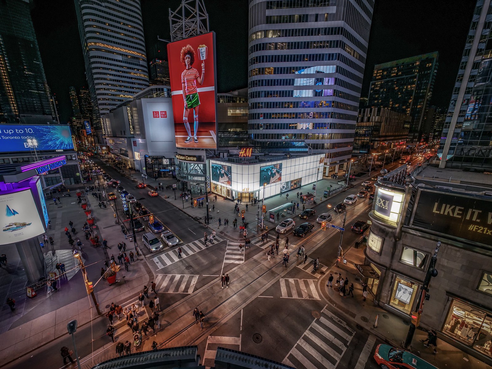
 Yonge-Dundas square by Karina, on Flickr
 Yonge-Dundas square by Karina, on Flickr
Posts about the signage should be in the 10 Dundas thread: https://urbantoronto.ca/forum/threa...uare-ent-prop-trust-10s-baldwin-franklin.460/The sign is an improvement and will finally get rid of the botched light placement of the current sign that for whatever reason no one thought warranted fixing. (eh, who's gonna notice at this obscure location, right?) It's too bad they can't come up with an even bigger sign that will cover the entire wretched building--or at least those stupid fake fans.
Posts about the signage should be in the 10 Dundas thread: https://urbantoronto.ca/forum/threa...uare-ent-prop-trust-10s-baldwin-franklin.460/
The sign is an improvement and will finally get rid of the botched light placement of the current sign that for whatever reason no one thought warranted fixing. (eh, who's gonna notice at this obscure location, right?) It's too bad they can't come up with an even bigger sign that will cover the entire wretched building--or at least those stupid fake fans.

What's happening?
They're tearing down 10 Dundas East.
Wait...nah. A new curved screen. About as exciting as it sounds.
AoD
I actually do think it’s exciting. It’s correcting one of the most visible mistakes of 10 Dundas East — though one can argue the whole building was a mistake. The original screen was off center and had these weird mini screens that were also misaligned. Yet, they left it up there for a decade.
Additional benefit: the new screen is so large it will cover up a large part of the ugly underside of the building that was left exposed with the old screen.


