Lone Primate
Active Member
I take your point on fussiness & forgetableness, so here's a wee quiz ....and no cheating ;-)
Okay, I wanna try this.
")
1. What heraldry is besides the sun on the BC flag?
There's a stylized view of the Pacific beneath it, if that's what you mean. There's also one of the ugliest crowns I've ever seen superimposed on the Union Jack at the top.
2. How many mountain peaks on the Alberta flag? How many have snow?
Two, I think, and on both of them. But I admit I'm kind of vague about it.
3. What is on the shield of the Saskatchewan flag? What colour and position of the background colours?
Wheat sheaves, I think, annnnnnnnd the cross of St. George...? The background is green above and yellow below.
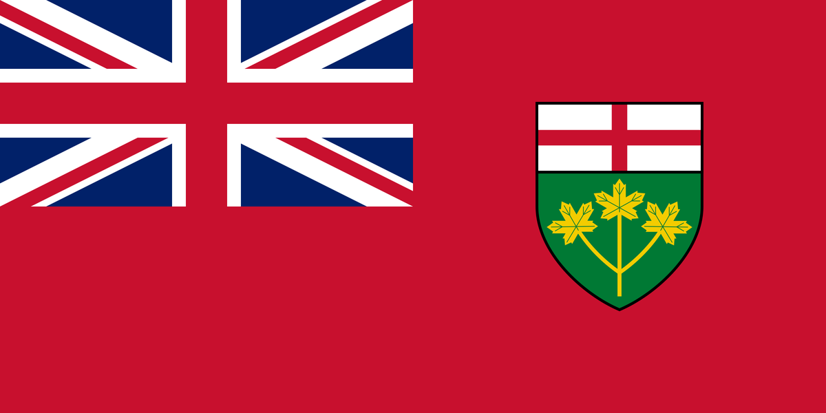
4. What animal on the Manitoba flag?
A bison. It's practically the only thing that makes it different from Ontario's flag, which is another reason we might just consider rejigging ours...
5. What animal on the NB flag? What colour is it?
A lion, at the top, red, one paw raised, and facing left.
6. What animal on NS flag? What direction is it facing?
Another lion, also red if I remember correctly, and he faces right, depicted on the provincial shield, backed by a colour-reversed Scottish flag. Was my flag till I was 12.
7. What objects are on PEI flag? How many?
Oak trees. Two of them, I think; one large on the left and one smaller on the right. It's possssssssssible there are three? One for each county? But I think it's two. I might be thinking of an acorn.
8. On the Newfoundland flag….sorry, even I cannot remember.
Essentially a stylized Union Jack.